
4
Data Handling and
Presentation
If you ask your classmates about their favourite colours, you will
get a list of colours. This list is an example of data. Similarly, if you
measure the weight of each student in your class, you would get a
collection of measures of weight—again data.
Any collection of facts, numbers, measures, observations, or other
descriptions of things that convey information about those things is
called data.
We live in an age of information. We constantly see large amounts
of data presented to us in new and interesting ways. In this chapter,
we will explore some of the ways that data is presented, and how we
can use some of those ways to correctly display, interpret and make
inferences from such data!
4.1 Collecting and Organising Data
Navya and Naresh are discussing their favourite games.
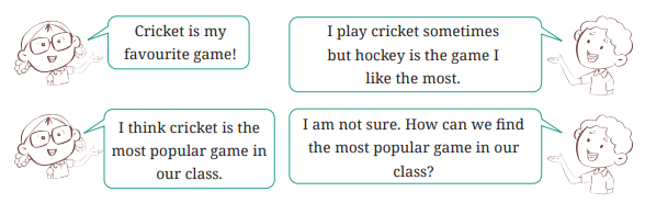
Cricket is my
favourite game!
I play cricket sometimes
but hockey is the game. I
like the most.
I think cricket is the
most popular game in
our class.
I am not sure. How can we find
the most popular game in our
class?
To figure out the most popular game in
their class, what should Navya and Naresh
do? Can you help them?
 Naresh and Navya decided to go to each student in the class and
ask what their favourite game is. Then they prepared a list.
Naresh and Navya decided to go to each student in the class and
ask what their favourite game is. Then they prepared a list. Navya is showing the list:
| Mehnoor – Kabaddi Jubimon – Hockey Simran – Kabaddi Nand – Satoliya (Pittu) Ankita – Kabaddi Imon – Hockey Yuvraj – Cricket Rehana – Hockey Aarna – Badminton Kompal – Football Tahira – Cricket |
Pushkal – Satoliya (Pittu) Densy – Badminton Jivika – Satoliya (Pittu) Leela – Hockey Afshan – Hockey Keerat – Cricket Gurpreet – Hockey Arsh – Kabaddi Bhavya – Cricket Sarah – Kabaddi |
Anaya – Kabaddi Jivisha – Satoliya (Pittu) Rajesh – Football Thara – Football Soumya – Cricket Navjot – Hockey Hemal – Satoliya (Pittu) Debabrata – Football Ananya – Hockey Hardik – Cricket |
She says (happily) , “I have collected the data. I can figure out the
most popular game now!”
A few other children are looking at the list and wondering, “We
can’t yet see the most popular game. How can we get it from this list?”
Figure it Out - What would you do to find the most popular game among Naresh’s and Navya’s classmates?
- What is the most popular game in their class?
- Try to find out the most popular game among your classmates.
- Pari wants to respond to the questions given below. Put a tick
 for the questions where she needs to carry out data collection and
put a cross
for the questions where she needs to carry out data collection and
put a cross  for the questions where she doesn’t need to collect
data. Discuss your answers in the classroom.
for the questions where she doesn’t need to collect
data. Discuss your answers in the classroom.
a. What is the most popular TV show among her classmates? 
b. When did India get independence?
c. How much water is getting wasted in her locality?
d. What is the capital of India?
Shri Nilesh is a teacher. He decided to bring sweets to the class
to celebrate the new year. The sweets shop nearby has jalebi, gulab
jamun, gujiya, barfi, and rasgulla. He wanted to know the choices
of the children. He wrote the names of the sweets on the board and
asked each child to tell him their preference. He put a tally mark
‘|’ for each student and when the count reached 5, he put a line
through the previous four and marked it as  .
.
.| Sweets | Tally Marks | No. of Students |
|---|---|---|
| Jalebi | | |
6 |
| Gulab Jamun | |||| |
9 |
| Gujiya | ||| |
---------- |
| Barfi | ||| | ---------- |
| Rasgulla | || |
---------- |
Figure it Out 1. Complete the table to help Shri Nilesh to purchase the correct
numbers of sweets:
•
- How many students chose jalebi?

- Barfi was chosen by students?
- How many students chose gujiya?
- Rasgulla was chosen by students?
- How many students chose gulab jamun?
2. Is the above table sufficient to distribute each type of sweet to
the correct student? Explain. If it is not sufficient, what is the
alternative?
To organise the data, we can write the name of each sweet in one
column and using tally signs, note the number of students who prefer
that sweet. The numbers 6, 9, … are the frequencies of the sweet
preferences for jalebi, gulab jamun … respectively
Sushri Sandhya asked her students about the sizes of the shoes
they wear. She noted the data on the board—
4 5 3 4 3 4 5 5 4
5 5 4 5 6 4 3 5 6
4 6 4 5 7 5 6 4 5
5 5 4 5 6 4 3 5 6
4 6 4 5 7 5 6 4 5
She then arranged the shoe sizes of the students in ascending order—
3, 3, 3, 4, 4, 4, 4, 4, 4, 4, 4, 4, 5, 5, 5, 5, 5, 5, 5, 5, 5, 5, 6, 6, 6, 6, 7
Figure it Out1. Help her to figure out the following –
- The largest shoe size in the class is _________
- The smallest shoe size in the class is _________
- There are _________ students who wear shoe size 5.
- There are _________ students who wear shoe sizes larger than 4.
3. Are there other ways to arrange the data?
4. Write the names of a few trees you see around you. When you
observe a tree on the way from your home to school (or while
walking from one place to another place), record the data and fill
in the following table—
| Tree | No. of Trees |
|---|---|
| Peepal | |
| Neem | |
| ----------- | |
| ----------- |
a. Which tree was found in the greatest number?
b. Which tree was found in the smallest number?
c. Were there any two trees found in the same numbers?
5. Take a blank piece of paper and paste any small news item from
a newspaper. Each student may use a different article. Now,
prepare a table on the piece of paper as given below. Count the
number of each of the letters ‘c’, ‘e’, ‘i’, ‘r’, and ‘x’ in the words of
the news article, and fill in the table.
| Letter | c | e | i | r | x | Any other letter of your choice: |
|---|---|---|---|---|---|---|
| Number of times found in the news item |
a. The letter found the most number of times is ________
b. The letter found the least number of times is ________
c. List the five letters ‘c’, ‘e’, ‘i’, ‘r’, ‘x’ in ascending order of
frequency. Now, compare the order of your list with that of
your classmates. Is your order the same or nearly the same
as theirs? (Almost everyone is likely to get the order ‘x, c, r,
i, e’.) Why do you think this is the case?
d. Write the process you followed to complete this task.
e. Discuss with your friends the processes they followed.
f. If you do this task with another news item, what process
would you follow?
Teacher’s Note
Provide more opportunities to collect and organise data. Ask students
to guess what is the most popular colour, game, toy, school subject, etc.,
amongst the students in their classroom, and then collect the data for it.
It can be a fun activity in which they also learn about their classmates.
Discuss how they can organise the data in different ways, each way
having its own advantages and limitations. For all these tasks, and the
tasks under ‘Figure it Out’, discuss the tasks with the children and let
them understand the tasks, and then let them plan and present their
research processes and conclusions in the class.4.2 Pictographs
Pictographs are one visual and suggestive way to represent data
without writing any numbers. Look at this picture—you may be
familiar with it from previous classes.
| Modes of Travelling |
Number of Students  = 1 Student = 1 Student |
|---|---|
| Private car |
|
| Public bus |
|
| School bus |
|
| Cycle |
|
| Walking |
|
This picture helps you understand at a glance the different
modes of travel used by students. Based on this picture, answer the
following questions:
- Which mode of travel is used by the most number of students?
- Which mode of travel is used by the least number of students?
A pictograph represents data through pictures of objects. It
helps answer questions about data with just a quick glance.
In the above pictograph, one unit or symbol () is used to represent
one student. There are also other pictographs where one unit or
symbol stands for many people or objects.
) is used to represent
one student. There are also other pictographs where one unit or
symbol stands for many people or objects. Example: Nand Kishor collected responses from the children of
his middle school in Berasia regarding how often they slept at least
9 hours during the night. He prepared a pictograph from the data:| Response |
Number of Children ( = 10 Children) = 10 Children) |
|---|---|
| Always |
|
| Sometimes |
 |
| Never |
|
Answer the following questions using the pictograph:
a. What is the number of children who always slept at least 9
hours at night?
b. How many children sometimes slept at least 9 hours at night?
c. How many children always slept less than 9 hours each
night? Explain how you got your answer.
Solutions
a. In the table, there are 5 pictures for ‘Always’. Each picture represents 10 children. Therefore, 5 pictures indicate 5 ×
10 = 50 children.
for ‘Always’. Each picture represents 10 children. Therefore, 5 pictures indicate 5 ×
10 = 50 children. b. There are 2 complete pictures (2 × 10 = 20) and a half picture (half of 10 = 5). Therefore, the number of children who sleep
at least 9 hours only sometimes is 20 + 5 = 25.
(2 × 10 = 20) and a half picture (half of 10 = 5). Therefore, the number of children who sleep
at least 9 hours only sometimes is 20 + 5 = 25. c. There are 4 complete pictures for ‘Never’. Hence 4 × 10 = 40
children never sleep at least 9 hours in a night, i.e., they always
sleep less than 9 hours.
Drawing a Pictograph
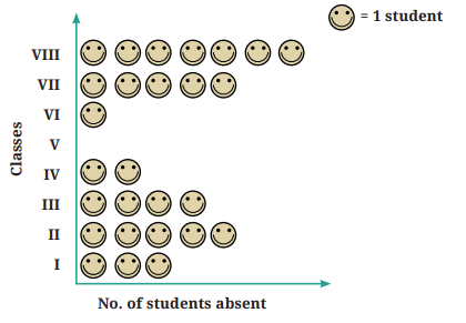
One day, Lakhanpal collected data on how many students were
absent in each class—
| Class | 1 | 2 | 3 | 4 | 5 | 6 | 7 | 8 |
| No. of students | 3 | 5 | 4 | 2 | 0 | 1 | 5 | 7 |
He created a pictograph to present this data and decided to show
1 student as in the pictograph—
Meanwhile, his friends Jarina and Sangita collected data on how
many students were present in each class—
| Class | 1 | 2 | 3 | 4 | 5 | 6 | 7 | 8 |
| No. of students | 30 | 35 | 20 | 25 | 30 | 25 | 30 | 20 |
If they want to show their data through a pictograph, where they
also use one symbol for each student, as Lakhanpal did, what are
the challenges they might face? Jarina made a plan to address this—since there were many
students, she decided to use to represent 5 students. She figured
that would save time and space too
to represent 5 students. She figured
that would save time and space too 
Sangita decided to use one to represent 10 students instead.
to represent 10 students instead. Since she used one to show 10 students, she had a problem in
showing 25 students and 35 students in the pictograph. Then, she
realised she could use  to show 5 students.
to show 10 students, she had a problem in
showing 25 students and 35 students in the pictograph. Then, she
realised she could use to show 5 students.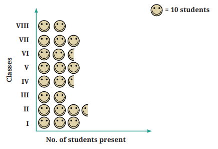 What could be the problems faced in preparing such a
pictograph, if the total number of students present in a class is
33 or 27?
What could be the problems faced in preparing such a
pictograph, if the total number of students present in a class is
33 or 27? - Pictographs are a nice visual and suggestive way to represent data. They represent data through pictures of objects.
- Pictographs can help answer questions and make inferences about data with just a quick glance (in the examplesabove— about favorite games, favorite colours, most common modes of conveyance, number of students absent etc.).
- By reading a pictograph, we can quickly understand the frequencies of the different categories (for example, cricket, hockey, etc.), and the comparisons of these frequencies. •
- In a pictograph, the categories can be arranged horizontlly or vertically. For each category, simple pictures and symbols are then drawn in the designated columns or rows according to the frequency of that category.
- A scale or key (for example, : 1 student or : 5 students)
is added to show what each symbol or picture represents. Each
symbol or picture can represent one unit or multiple units.
- It can be more challenging to prepare a pictograph when the amount of data is large or when the frequencies are not exact multiples of the scale or key.
Figure it Out 1. The following pictograph shows the number of books borrowed
by students, in a week, from the library of Middle School,
Ginnori—
| Day |
Number of Books Borrowed (  =1 Book ) =1 Book ) |
|---|---|
| Monday |
|
| Tuesday | |
| Wednesday | |
| Thursday | |
| Friday | |
| Saturday | |
a. On which day were the minimum number of books borrowed?
b. What was the total number of books borrowed during the
week?
c. On which day were the maximum number of books borrowed?
What may be the possible reason?
2. Magan Bhai sells kites at Jamnagar. Six shopkeepers from nearby
villages come to purchase kites from him. The number of kites he
sold to these six shopkeepers are given below—
| Shopkeeper |
Number of Kites sold |
|---|---|
| Chaman |
250 |
| Rani |
300 |
| Rukhsana |
100
|
| Jasmeet |
450 |
| Jetha Lal |
250 |
| Poonam Ben |
700 |
Prepare a pictograph using the symbol  to represent 100 kites.
Answer the following questions:
to represent 100 kites.
Answer the following questions:
to represent 100 kites.
Answer the following questions: a. How many symbols represent the kites that Rani purchased?
b. Who purchased the maximum number of kites?
c. Who purchased more kites, Jasmeet or Chaman?
d. Rukhsana says Poonam Ben purchased more than double the
number of kites that Rani purchased. Is she correct? Why?
4.3 Bar Graphs
Have you seen graphs
like this on TV or in a
newspaper?
Like pictographs, such
bar graphs can help us to
quickly understand and
interpret information,
such as the highest value,
the comparison of values
of different categories, etc.
However, when the amount
of data is large, presenting
it by a pictograph is not
only time consuming but
at times difficult too. Let us
see how data can be presented instead using a bar graph.
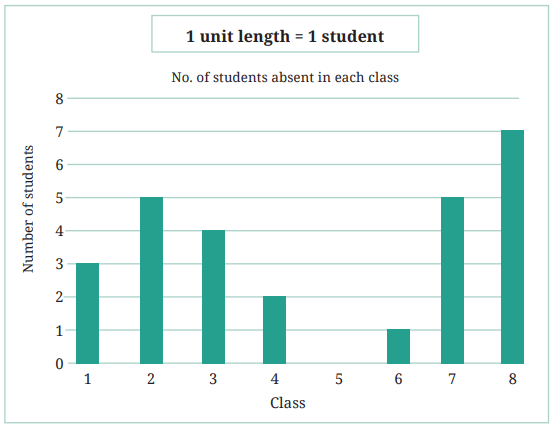
Let’s take the data collected by Lakhanpal earlier, regarding the
number of students absent on one day in each class—
| Class | 1 | 2 | 3 | 4 | 5 | 6 | 7 | 8 |
| No. of students | 3 | 5 | 4 | 2 | 0 | 1 | 5 | 7 |
He presented the same data using a bar graph—
Teacher’s Note
If the students have not noticed, please point out the equally spaced
horizontal lines. Explain that this means that each pair of consecutive
numbers on the left has the same gap. Answer the following questions using the bar graph: 1. In Class 2, ___________ students were absent that day.
2. In which class were the maximum number of students absent?
___________
3. Which class had full attendance that day? ___________
When making bar graphs, bars of uniform width can be drawn
horizontally or vertically with equal spacing between them; then the
length or height of each bar represents the given number. As we saw in
pictographs, we can use a scale or key when the frequencies are larger.
Let us look at an example of vehicular traffic at a busy road
crossing in Delhi, which was studied by the traffic police on a
particular day. The number of vehicles passing through the crossing
each hour from 6 am to 12:00 noon is shown in the bar graph. One
unit of length stands for 100 vehicles.
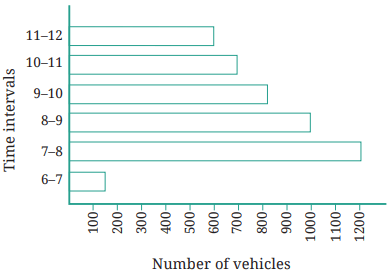
We can see that the maximum traffic at the crossing is shown
by the longest bar, i.e., for the time interval 7-8 a.m. The bar graph
shows that 1200 vehicles passed through the crossing at that time.
The second longest bar is for 8-9 a.m. During that time, 1000 vehicles
passed through the crossing. Similarly, the minimum traffic is shown
by the smallest bar, i.e., the bar for the time interval 6-7 a.m. During
that time, only about 150 vehicles passed through the crossing. The
second smallest bar is that for the time interval 11 a.m.-12 noon,
when about 600 vehicles passed through the crossing.
The total number of cars passing through the crossing during the
two-hour interval 8.00-10.00 am as shown by the bar graph is about
1000 + 800 = 1800 vehicles.
Figure it Out 1. How many total cars passed through the crossing between 6 am
and noon?
2. Why do you think so little traffic occurred during the hour of 6–7
am, as compared to the other hours from 7 am-noon?
3. Why do you think the traffic was the heaviest between 7 am and 8
am?
4. Why do you think the traffic was lesser and lesser each hour after
8am all the way until noon?
Example:
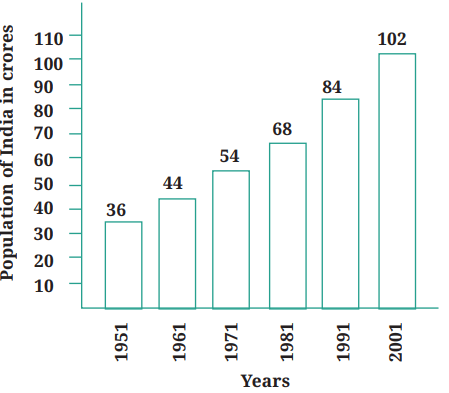
Population of India in crores
This bar graph shows the population of India in each decade over a
period of 50 years. The numbers are expressed in crores. If you were
to take 1 unit length to represent one person, drawing the bars will be difficult! Therefore, we choose the scale so that 1 unit represents
10 crores. The bar graph for this choice is shown in the figure. So a
bar of length 5 units represents 50 crores and of 8 units represents
80 crores.
- On the basis of this bar graph, what may be a few questions you may ask your friends?
- How much did the population of India increase over 50 years?
How much did the population increase in each decade?
4.4 Drawing a Bar Graph
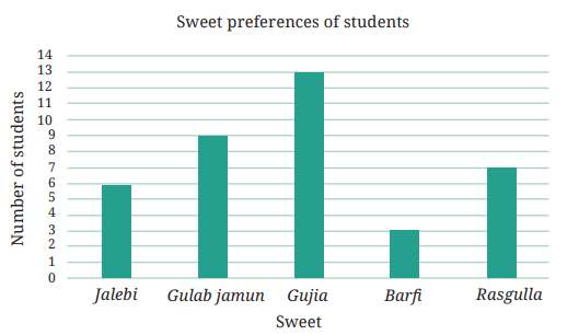
In a previous example, Shri Nilesh prepared a frequency table
representing the sweet preferences of the students in his class. Let`s
try to prepare a bar graph to present his data—
| Sweet | No. of Students |
|---|---|
| Jalebi | 6 |
| Gulab Jamun | 9 |
| Gujiya | 13 |
| Barf | 3 |
| Rasgulla | 7 |
1. First, we draw a horizontal
line and a vertical line. On
the horizontal line, we will
write the name of each of
the sweets, equally spaced,
from which the bars will
rise in accordance with
their frequencies; and on
the vertical line we will write the frequencies representing the
number of students.
2. We must choose a scale. That means we must decide how many
students will be represented by a unit length of a bar so that
it fits nicely on our paper. Here, we will take 1 unit length to
represent 1 student.
3. For Jalebi, we therefore need to draw a bar having a height of 6
units (which is the frequency of the sweet Jalebi), and similarly
for the other sweets we have to draw bars as high as their
frequencies.
4. We therefore get a bar graph as shown below—
When the frequencies are larger and we cannot use the scale of
1 unit length = 1 number (frequency), we need to choose a different
scale like we did in the case of pictographs.
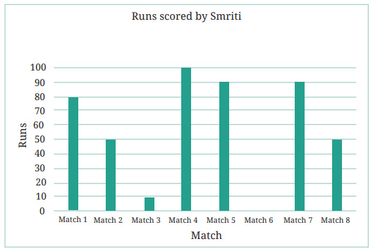
Example: The number of runs scored by Smriti in each of 8 matches
are given in the table below:
| Match | Match 1 | Match 2 | Match 3 | Match 4 | Match 5 | Match 6 | Match 7 | Match 8 |
|---|---|---|---|---|---|---|---|---|
| Run | 80 | 50 | 10 | 100 | 90 | 0 | 90 | 50 |
In this example, the minimum score is 0 and the maximum score
is 100. Using a scale of 1 unit length = l run would mean that we
have to go all the way from 0 to 100 runs in steps of l. This would
be unnecessarily tedious. Instead, let us use a scale where 1 unit
length = 10 runs. We mark this scale on the vertical line and draw
the bars according to the scores in each match. We get the following
bar graph representing the above data.
Example: The following table shows the monthly expenditure of
Imran’s family on various items:
| Items |
Expenditure ( in Rs.) |
|---|---|
| House rent |
3000 |
| Food | 3400 |
| Education |
800 |
| Electricity |
400 |
| Transport |
600 |
| Miscellaneous |
1200 |
To represent this data in the form of a bar graph, here are the steps—
- Draw two perpendicular lines, one horizontal and one vertical.
- Along the horizontal line, mark the ‘Items’ with equal spacing
between them, and along the vertical line, mark the corresponding
expenditures.
- Take bars of the same width, keeping a uniform gap between them.
- Choose a suitable scale along the vertical line. Let 1 unit length = 200Rs, and then mark and write the corresponding values ( 200Rs, 400Rs, etc.) representing each unit length.
Finally, calculate the heights of the bars for various items as
shown below—
| House rent |
3000 ÷ 200 |
15 units |
| Food | 3400 ÷ 200 |
17 units |
| Education |
800 ÷ 200 |
4 units |
| Electricity |
400 ÷ 200 |
2 units |
| Transport |
600 ÷ 200 |
3 units |
| Miscellaneous |
1200 ÷ 200 |
6 units |
Here is the bar graph that we obtain based on the above steps:
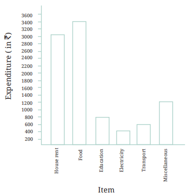
Use the bar graph to answer the following questions:
1. On which item does Imran’s family spend the most and the
second most?
2. Is the cost of electricity about one-half the cost of education?
3. Is the cost of education less than one-fourth the cost of food?
Figure it Out 1. Samantha visited a tea garden and collected data of the insects and
critters she saw there. Here is the data she collected—
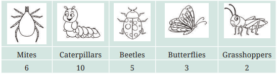
Help her prepare a bar graph representing this data.
2. Pooja collected data on the number of tickets sold at the Bhopal
railway station for a few different cities of Madhya Pradesh over a
2-hour period.
| City |
Vidisha | Jabalpur |
Seoni |
Indore |
Sagar |
|---|---|---|---|---|---|
| Number of
tickets |
24 | 20 |
16 | 28 | 16 |
She used this data and prepared a bar graph on the board to discuss
the data with her students, but someone erased a portion of the graph.
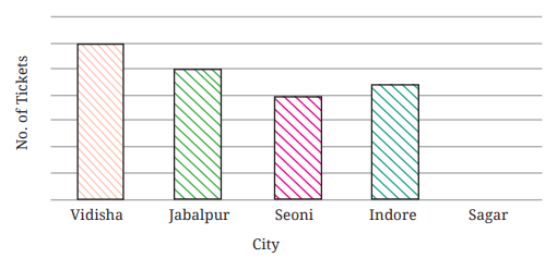
a. Write the number of tickets sold for Vidisha above the bar.
b. Write the number of tickets sold for Jabalpur above the bar.
c. The bar for Vidisha is 6 unit lengths and the bar for Jabalpur
is 5 unit lengths. What is the scale for this graph?
d. Draw the correct bar for Sagar.
e. Add the scale of the bar graph placing the correct numbers
on the vertical axis.
f. Are the bars for Seoni and Indore correct in this graph? If
not, draw the correct bar(s).
3. Chinu listed the various means of transport that passed across
the road in front of his house from 9 am to 10 am:
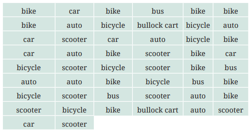
a. Prepare a frequency distribution table for the data.
b. Which means of transport was used the most?
c. If you were there to collect this data, how could you do it?
Write the steps or process.
4. Roll a die 30 times and record the number you obtain each time.
Prepare a frequency distribution table using tally marks. Find the
number that appeared:
a. The minimum number of times.
b. The maximum number of times.
c. Find numbers that appeared an equal number of times.
5. Faiz prepared a frequency distribution table of data on the number
of wickets taken by Jaspreet Bumrah in his last 30 matches:
| Wickets Taken | Number of Matches |
|---|---|
| 0 | 2 |
| 1 | 4 |
| 2 | 6 |
| 3 | 8 |
| 4 | 3 |
| 5 | 5 |
| 6 | 1 |
| 7 | 1 |
a. What information is this table giving?
b. What may be the title of this table?
c. What caught your attention in this table?
d. In how many matches has Bumrah taken 4 wickets?
e. Mayank says “If we want to know the total number of
wickets he has taken in his last 30 matches, we have to add
the numbers 0, 1, 2, 3 …, up to 7.” Can Mayank get the total
number of wickets taken in this way? Why?
f. How would you correctly figure out the total number of
wickets taken by Bumrah in his last 30 matches, using this
table?
6. The following pictograph shows the number of tractors in five
different villages.
| Villages |
Number of Tractors (  = 1 Tractor ) = 1 Tractor ) |
|---|---|
| Villages A |
|
| Villages B |
|
| Villages C |
|
| Villages D |
|
| Villages E |
|
Observe the pictograph and answer the following questions—
a. Which village has the smallest number of tractors?
b. Which village has the most tractors?
c. How many more tractors does Village C have than Village B?
d. Komal says, “Village D has half the number of tractors as
Village E.” Is she right?
7. The number of girl students in each class of a school is depicted
by a pictograph:
4.5 Artistic and Aesthetic Considerations
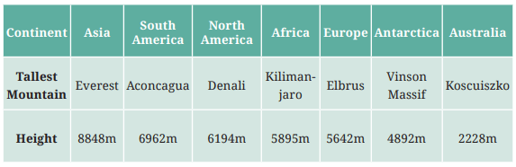
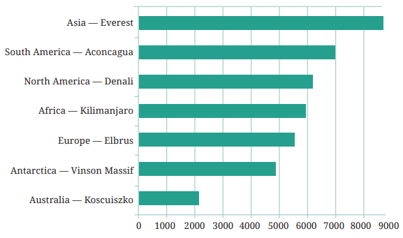
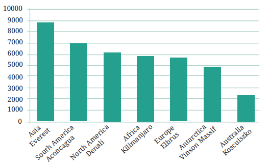
Figure it Out
Summary
| Classes |
Number of Girl Students (  = 4 Girls ) = 4 Girls ) |
|---|---|
| 1 |
|
| 2 |
 |
| 3 |
|
| 4 |
|
| 5 |
|
| 6 |
|
| 7 |
|
| 8 |
|
Observe this pictograph and answer the following questions:
a. Which class has the least number of girl students?
b. What is the difference between the number of girls in Classs
5 and 6?
c. If 2 more girls were admitted in Class 2, how would the graph
change?
d. How many girls are there in Class 7?
8. Mudhol Hounds (a type of breed of Indian dogs) are largely found
in North Karnataka’s Bagalkote and Vijaypura districts. The
government took an initiative to protect this breed by providing
support to those who adopted these dogs. Due to this initiative, the
number of these dogs increased. The number of Mudhol dogs in six
villages of Karnataka are as follows—
Village A : 18, Village B : 36, Village C : 12, Village D : 48, Village E : 18,
Village F : 24
Prepare a pictograph and answer the following questions:
a. What will be a useful scale or key to draw this pictograph?
a. What will be a useful scale or key to draw this pictograph?
b. How many symbols will you use to represent the dogs in
Village B?
c. Kamini said that the number of dogs in Village B and Village D
together will be more than the number of dogs in the other
4 villages. Is she right? Give reasons for your response.
9. A survey of 120 school students was conducted to find out which
activity they preferred to do in their free time.
| Preferred Activity |
Number of Students |
|---|---|
| Playing |
45 |
| Reading story books |
20 |
| Watching TV |
30 |
| Listening to music |
10 |
| Painting |
15 |
Draw a bar graph to illustrate the above data taking the scale of
1 unit length = 5 students. Which activity is preferred by most
students other than playing?
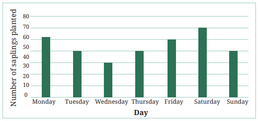
10. Students and teachers of a primary school decided to plant tree
saplings in the school campus and in the surrounding village
during the first week of July. Details of the saplings they planted
are as follows—
a. The total number of saplings planted on Wednesday and
Thursday is ___________.
b. The total number of saplings planted during the whole week
is ___________.
c. The greatest number of saplings were planted on ___________,
and the least number of saplings were planted on ___________.
Why do you think that is the case? Why were more saplings
planted on certain days of the week and less on others? Can
you think of possible explanations or reasons? How could you
try and figure out whether your explanations are correct?
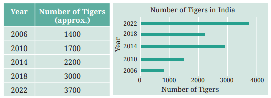
11. The number of tigers in India went down drastically between 1900
and 1970. Project Tiger was launched in 1973 to track and protect
tigers in India. Starting in 2006, the exact number of tigers in India
was tracked. Shagufta and Divya looked up information about the
number of tigers in India between 2006 and 2022 in 4-year intervals.
They prepared a frequency table for this data and a bar graph to
present this data, but there are a few mistakes in the graph. Can
you find those mistakes and fix them?
- Like pictographs, bar graphs give a nice visual way to represent data. They represent data through equally-spaced bars, each of equal width, where the lengths or heights give frequencies of the different categories.
- Each category is represented by a bar where the length or height depicts the corresponding frequency (for example, cost) or quantity (for example, runs).
- The bars have uniform spaces between them to indicate that they are free standing and represent equal categories.
- The bars help in interpreting data much faster than a frequency table. By reading a bar graph, we can compare frequencies of different categories at a glance.
- We must decide the scale (for example, 1 unit length = 1 student
or 1 unit length = ` 200) for a bar graph on the basis of the data,
including the minimum and maximum frequencies, so that the
resulting bar graph fits nicely and looks visually appealing on the
paper or poster we are preparing. The markings of the unit lengths
as per the scale must start from zero.
Teacher’s Note
The main focus of this chapter is to learn how to handle data to find
answers to specific questions or inquiries, to test hypotheses or to
take specific decisions. This should be kept in mind when providing
practice opportunities to collect, organise, and analyse data.4.5 Artistic and Aesthetic Considerations
In addition to the steps described in previous sections, there are
also some other more artistic and aesthetic aspects one can consider
when preparing visual presentations of data to make them more
interesting and effective. First, when making a visual presentation of
data, such as a pictograph or bar graph, it is important to make it fit in
the intended space; this can be controlled, e.g., by choosing the scale
appropriately, as we have seen earlier. It is also desirable to make
the data presentation visually appealing and easy-to-understand,
so that the intended audience appreciates the information being
conveyed.
Let us consider an example. Here is a table naming the tallest
mountain on each continent, along with the height of each mountain
in meters.
How much taller is Mount Everest than Mount Koscuiszko? Are
Mount Denali and Mount Kilimanjaro very different in height? This
is not so easy to quickly discern from a large table of numbers.
As we have seen earlier, we can convert the table of numbers
into a bar graph, as shown on the right. Here, each value is drawn
as a horizontal box. These are longer or shorter depending on the
number they represent. This makes it easier to compare the heights
of all these mountains at a glance.
However, since the boxes represent heights, it is better and more
visually appealing to rotate the picture, so that the boxes grow
upward vertically from the ground like mountains. A bar graph with
vertical bars is also called a column graph. Columns are the pillars
you find in a building that hold up the roof.
Below is a column graph for our table of tallest mountains. From
this column graph, it becomes easier to compare and visualize the
heights of the mountains.
In general, it is more intuitive, suggestive, and visually appealing
to represent heights, that are measured upwards from the ground,
using bar graphs that have vertical bars or columns. Similarly,
lengths that are parallel to the ground (e.g., distances between
location on Earth) are usually best represented using bar graphs
with horizontal ars.
Figure it Out1. If you wanted to visually represent the data of the heights of the
tallest persons in each class in your school, would you use a graph
with vertical bars or horizontal bars? Why?
2. If you were making a table of the longest rivers on each continent
and their lengths, would you prefer to use a bar graph with
vertical bars or with horizontal bars? Why? Try finding out this
information, and then make the corresponding table and bar
graph! Which continents have the longest rivers?
Infographics
When data visualisations such as bar graphs are further beautified
with more extensive artistic and visual imagery, they are called
information graphics, or infographics for short. The aim of
infographics is to make use of attention-attracting and engaging
visuals to communicate information even more clearly and quickly,
in a visually pleasing way.
As an example of how infographics can be used to communicate
data even more suggestively, let us go back to the table above listing
the tallest mountain on each continent. We drew a bar graph with
vertical bars (columns), rather than horizontal bars, to be more
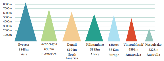
indicative of mountains. But instead of rectangles, we could instead
use triangles, which look a bit more like mountains. And we can add
a splash of colour as well. Here is the result.
While this infographic might look more appealing and suggestive
at first glance, it does have some issues. The goal of our bar graph
earlier was to represent the heights of various mountains - using bars
of the appropriate heights but the same widths. The purpose of using
the same widths was to make it clear that we are only comparing
heights. However, in this infographic, the taller triangles are also
wider! Are taller mountains always wider? The infographic is
implying additional information that may be misleading and may or
may not be correct. Sometimes going for more appealing pictures can
also accidentally mislead.
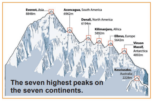
Taking this idea further, and to make the picture even more visually
stimulating and suggestive, we can further change the shapes of the
mountains to make them look even more like mountains, and add
other details, while attempting to preserve the heights. For example,
we can create an imaginary mountain range that contains all these
mountains.
Is the infographic below better than the column graph with
rectangular columns of equal width? The mountains look more
realistic, but is the picture accurate?
For example, Everest appears to be twice as tall as Elbrus.
What is 5642 × 2?
While preparing visually-appealing presentations of data, we
also need to be careful that the pictures we draw do not mislead us
about the facts. In general, it is important to be careful when making
or reading infographics, so that we do not mislead our intended
audiences and so that we, ourselves, are not misled.
Summary
- Facts, numbers, measures, observations, and other descriptions of
things that convey information about those things is called data.
- Data can be organised in a tabular form using tally marks for easy
analysis and interpretation.
- Frequencies are the counts of the occurrences of values, measures, or observations.