Chapter-5
TALES BY DOTS
AND LINES
5.1 The Balancing Act
Last year, we learnt about the mean and median. Recall that the mean of some data is the sum of all the values divided by the number of values in the data. The median is the middle value when the data is sorted.
We shall try to understand the mean and median from a different perspective and see how the mean behaves with changing data.
? Consider any 2 numbers. Find their average/arithmetic mean. Repeat this by taking other pairs. What do you observe?
For example, let the two numbers be 3 and 7. Their average is 3 + 7/2 = 5. Taking another pair of numbers, say 8 and 9, their average is 8 + 9/2 = 8.5. Visualising these as dot plots we get

Notice that the mean is exactly halfway between the two numbers.
We have learnt earlier that the arithmetic mean is a measure of central tendency and represents the ‘centre’ of the data. Let us see how the mean represents the ‘centre’ in the case of 3 numbers.
? Calculate and mark the mean of each collection of data below.
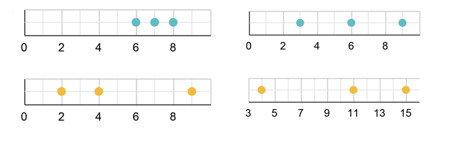
? Can you explain how the mean is the centre of each collection?
? Mark the mean for the collections below.
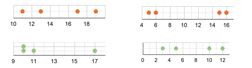
? Can you explain how the mean is the centre of each collection?
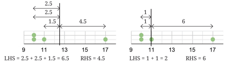
Is the mean the midpoint of the two endpoints/extremes of the data? It is not always so. Instead, the total distances are equal on both the sides of the mean. This is illustrated through the following dot plots.
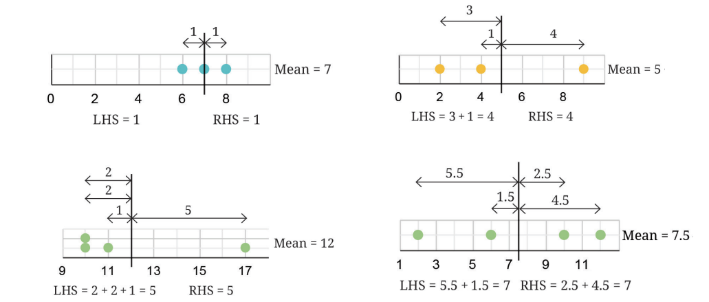
? Verify that this holds for all the collections of data shown earlier.
? Can there be more than one such 'centre'? In other words, is there any other value such that the sum of the distances to the values lower than it and the values higher than it will still be equal?
? In the case of the collection 10, 10, 11, and 17 whose mean is 12, suppose there is a different centre larger than 12.
Clearly, all the distances on the LHS will increase and the distances on the RHS will decrease. Thus, it is no longer the 'centre'. Similarly, for any value smaller than 12, the distances on the LHS will decrease while those on the RHS will increase.
Both these cases are illustrated in the following diagram. Therefore, there is only one centre.
? Will including a new value in the data increase or decrease the mean?
When a new value greater than the mean is included, the mean increases to maintain the balance between the sum of distances on the LHS and RHS, as illustrated below.
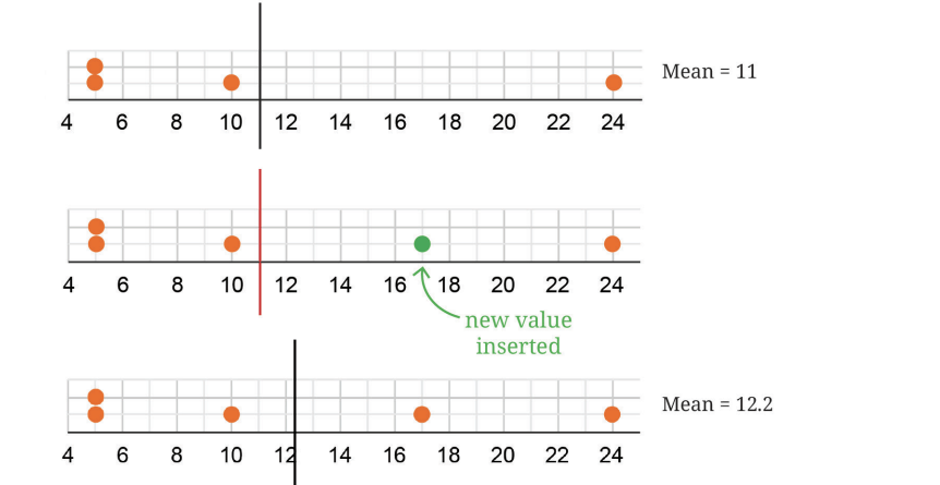
Similarly, if a value smaller than the mean is included, then the new mean will be less than before.
? What happens to the mean when an existing value is removed? When will the mean increase, decrease, or stay the same?
? What happens to the mean if a value equal to the mean is included or removed?
Try to explain this using the fair-share interpretation of mean that we studied last year.
Unchanging Mean!
We saw earlier how the mean varies when a value is included or removed.
? Explore if it is possible to include or remove 2 values such that the mean is unchanged.
You may use the following data to experiment with.

? How about including or removing 3 values without changing the mean? Is it possible?
? Can we include 2 values less than the mean and 1 value greater than the mean, so that the mean remains the same?
One of the possibilities is shown here.
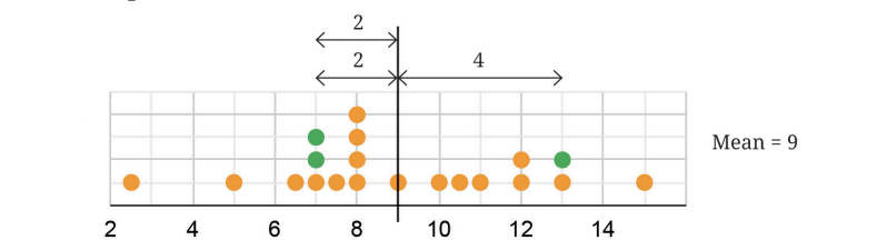
? Try to include 2 values greater than the mean and 1 value less than the mean, so that the mean stays the same.
Relatively Unchanged!
? We saw what happens to the mean when values are included or removed from the collection. What happens to the mean if every value in the collection increases by some fixed number?
? Consider the data: 8, 3, 10, 13, 4, 6, 7, 7, 8, 8, 5. Calculate its mean.
? Now, consider this data with every value increased by 10: 18, 13, 20, 23, 14, 16, 17, 17, 18, 18, 15. What is its mean? Is there a quicker way to find out? [Hint: Observe the following dot plots corresponding to the two data collections.]
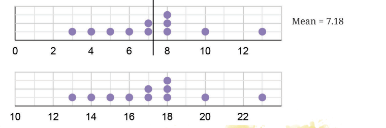
The mean of the new collection also increases by 10. Notice that the relative position of the mean stays the same.
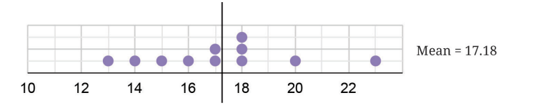
We get the following dot plot if we reduce every value by 1.

This can be explained using algebra —
Suppose there are n values in the collection. Let these values be represented by x1, x2, x3, … xn. Their average is given by —
x1, x2, x3,+ … xn/n=a
When a fixed number, for example, 3 is added to every value in the collection, the new average becomes —
(x1 + 3) + (x2 + 3) + (x3 + 3) + … + (xn + 3)/ n
= (x1 + x2+ x3 + … + xn + 3n)/ n
= (x1 + x2 + x3 + … + xn)/ n + 3n/n
= a + 3.
That is, the new average is 3 more than the previous average.
? Try to explain, using algebra, what the average is when a fixed number, e.g., 2 is subtracted from every value in the collection.
? Try to explain this using the fair-share interpretation of average that you learnt last year.
? What happens to the average if every value in the collection is doubled?
You may have guessed that the average also doubles. The following is an example with the data we saw earlier -
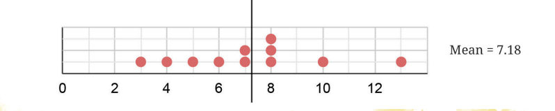
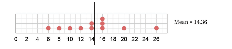
We can see that the average has doubled.
Let us prove it using algebra.
Suppose there are n values in the collection. Let these values be represented by x1, x2, x3, … xn. Their average is —
(x1 + x2 + x3 + … + xn)/ n = a.
When a fixed number, for example, 5 is multiplied to every value in the collection, the new average becomes —
[(5x1 ) + (5x2) + (5x3) + … + (5xn)]/ n
= [(x1 + x2 + x3 + … + xn) × 5.]/ n (using the distributive property)
= [(x1 + x2 + x3 + … + xn)/n] × 5.= 5a.
That is, the new average is 5 times more than the previous average.
Tinkering with Median
We know that the median is the middle value in the sorted data - there are an equal number of values less than it and greater than it.
? Will including a new value to the data increase or decrease the median?
Let us consider the following data. The median of this data is 8.
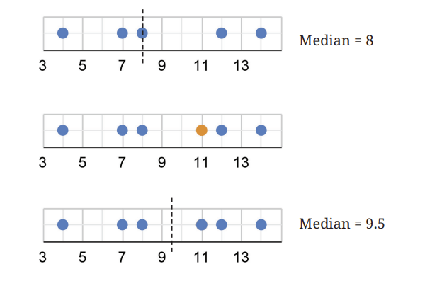
Suppose we include a value 11. The new value included is greater than the (earlier) median — the median can no longer be 8 as there are more values greater than it. Therefore, the median will also increase. The median, now, will be the average of the two middle values 8 and 11, which is 9.5.
We can similarly argue that when a value less than the median is included, the median will decrease.
Finding the Unknown
? Coach Balwan noted down the weights of the kushti players (wrestlers) and the mean as shown. But one value that was written down got smudged. Can you find out the missing value?
Average weight of the players = (Sum of weight of all players) /(Number of players)
Let the unknown weight be w kg.
=(42 + 40 + 39 + 33 + 48 + 38 + 42 + 35 + 32 + w)/10 = 39.2 .
Simplifying this we get,
349 + w = 392
Simplifying this we get, ==(42 + 40 + 39 + 33 + 48 + 38 + 42 + 35 + 32 + w)/10 = 39.2 .
4240
39
33
48
38
42
35
32
Avg/39.2
Simplifying this we get,
349 + w = 392
,w = 392 – 349 = 43.
The missing value is 43 kg.

? Venkayya keeps track of the coconut harvest in his farm. He calculates the average harvest per tree as 25.6. His son verifies the counts and finds that one tree's harvest count is incorrectly noted as 3 more than the actual number. Can you find the correct average if the number of trees is 15?
The average harvest per tree =(Total number of coconuts harvested)/( Number of trees)
The data of harvest per tree is not given.
? Can we still find out the number of coconuts harvested?
Let the initial number of coconuts harvested be z. Based on what is given
25.6 = z/15
Simplifying,
z = 25.6 * 15 = 384
The initial count of coconuts harvested is 384.
We know that one tree's count is 3 more than the actual. Therefore the actual total harvest count is 384-3 = 381.
The correct average harvest is 381 /15 = 25.4.
Mean and Median with Frequencies
? What is the average family size of students in your class? How would you find this out?
We can collect the data of how many family members each student has, add them up, and divide it by the number of students. The family size data of students in a class is shown in the table here.
| Number | Frequency |
| 3 | 3 |
| 4 | 11 |
| 5 | 9 |
| 6 | 7 |
| 7 | 3 |
| 8 | 1 |
| 9 | 1 |
| 10 | 1 |
? What is the average family size of this class?
Some of you may have thought, “Easy! It will be
(3 + 4 + 5 + 6 + 7 + 8 + 9 + 10)/8 = 52/8 = 6.5.”
Remember that finding the average involves adding all the values in the data. The number 3 occurs three times, the number 4 occurs eleven times, and so on. Do these reflect in your calculation?
We know that the average = (Sum of all the values in the data)/ (Number of value in the data)
Accounting for the frequencies of each value, the average will be
= [(3 × 3) + (4 × 11) + (5 × 9) + (6 × 7) + (7 × 3) + (8 × 1) + (9 × 1) + (10 × 1)] /3 + 11 + 9 + 7 + 3 + 1 + 1 + 1
= (9 + 44 + 45 + 42 + 21 + 8 + 9 + 10)/36
= 188/ 36 = 5.22.
The average family size of this class is 5.22.
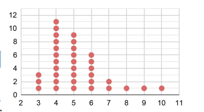
? What is the median family size of this class? We know that there are 36 values in the data. The median would be the average of the 18th and 19th value in the sequence when the data is ordered.
? Do we need to write all the 36 numbers in order? Is there a quicker way to find out?
We can make use of the table where the frequencies are listed. We successively add the frequencies starting from the smallest value until we reach 18 and 19.
| Number | 3 | 4 | 5 | 6 | 7 | 8 | 9 | 10 |
| Frequency | 3 | 11 | 9 | 7 | 3 | 1 | 1 | 1 |
Adding the frequencies of 3 and 4, we get 3 + 11 = 14. This means the value in the 14th position when the data is sorted is 4. Adding the frequencies of 3, 4, and 5, we get 3 + 11 + 9 = 23. This means the value in the 23rd position when the data is sorted is 5. We can see that all the values from positions 15 to 23 are 5. Therefore, the median of this data is 5.
Spreadsheets
Sudhakar has collected the mid-term exam marks obtained by his Grade 8 students in the following table:
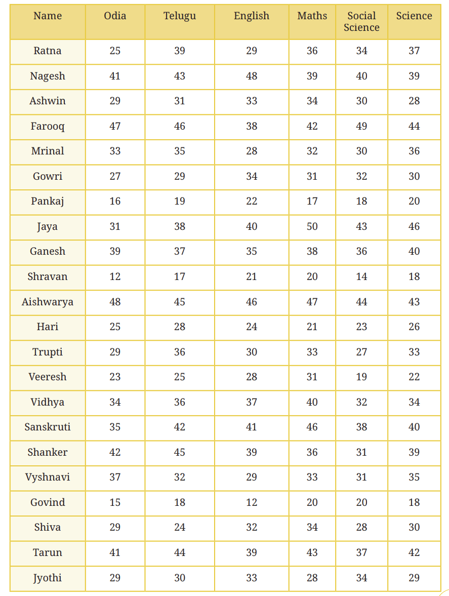
Sudhakar has to calculate the total marks scored by each student. He is also interested in knowing the average marks scored in each subject. But there are so many numbers! He will have to spend too much time and effort to complete this task. Of course, he can use a calculator to speed up the task.
Is there any way to further quicken this process?
One way is to use a computer. Computers have different applications/ tools that can be used to perform tasks. One such application is a spreadsheet — it is like a digital notebook with rows and columns of small boxes called cells. In each cell, we can type text or numbers. The picture below shows a snapshot of a spreadsheet where Sudhakar has entered the marks data of his class. Try to get access to a computer before proceeding.
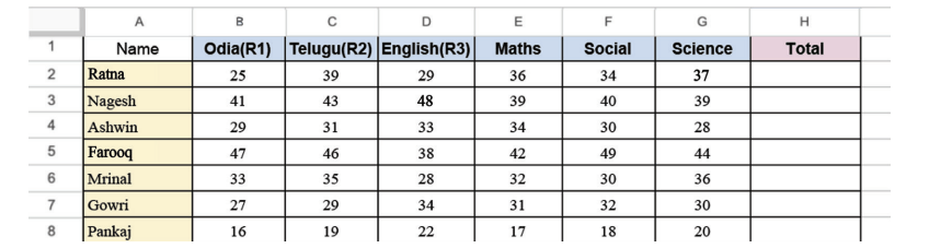
Before learning how to calculate the average marks per subject and the total marks scored by each student, let us first understand the structure of spreadsheets and how to read them.
? Can you tell which cell has the marks obtained by Farooq in Mathematics? Cells are named and referred to using the column headers labelled A, B, C, … , and row headers labelled 1, 2, 3, … Farooq’s score in Mathematics is in cell E5
? Can you tell what data is in column B7?
How can we use spreadsheets to quickly calculate totals and averages? In addition to text and numbers, we can also enter formulae in a cell. We can write a formula that computes the sum or average of a row,or column of cells.
We can describe a row of cells by an expression of the form Start:End, indicating the first and last cell in the row. For instance, Nagesh’s marks are described by the expression B3:G3, while Gowri’s marks in Odiya, Telugu and English are described by the expression B7:D7. We can use similar expressions to describe columns. For instance, D2:D6 describes the marks in English for the first five students.
We can then write a formula to compute the sum or the average of a row or column. For instance =SUM(B3:G3) calculates the total marks for Nagesh across all subjects, while =AVERAGE(B7:D7) calculates Gowri’s average marks across Odia, Telugu and English.
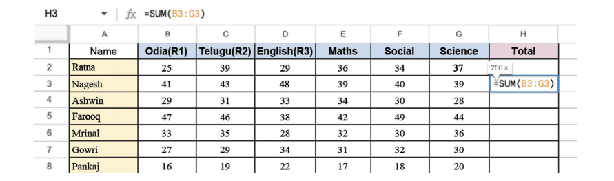
? What formula would you type to find out the class average marks in Science?
? Find out if the class average marks in Odia is greater than the class average marks in Telugu.
? Show the average marks in other subjects after the last row by typing the appropriate formulae.
Try these out on a computer. You can download the tabular data from this QR code.

? Get the total scores of each student by typing the appropriate formulae.
? Figure it Out
1. Find the mean of the following data and share your observations:
(i) The first 50 natural numbers.
(ii) The first 50 odd numbers.
(iii) The first 50 multiples of 4.
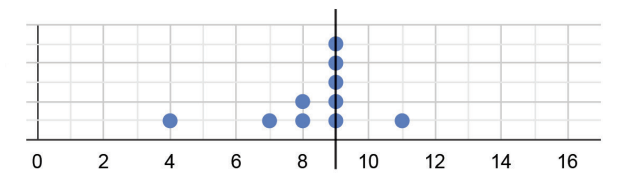
2. The dot plot below shows a collection of data and its average; but one dot is missing. Mark the missing value so that the mean is 9 (as shown below).
3. Sudhakar, the class teacher, asks Shreyas to measure the heights of all 24 students in his class and calculate the average height. Shreyas informs the teacher that the average height is 150.2 cm. Sudhakar discovers that the students were wearing uniform shoes when the measurements were taken and the shoes add 1 cm to the height.
(i) Should the teacher get all the heights measured again without the shoes to find the correct average height? Or is there a simpler way?
(ii) What is the correct average height of the class?
(a) 174.2 cm (b) 126.2 cm (c) 150.2 cm (d) 149.2 cm (e) 151.2 cm (f) None of the above (g) Insufficient information
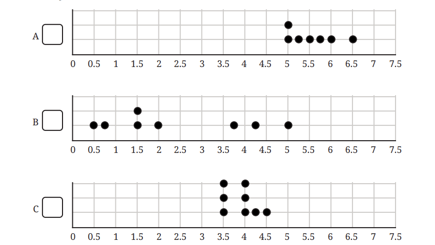
4. The three dot plots below show the lengths, in minutes, of songs of different albums. Which of these has a mean of 5.57 minutes? Explain how you arrived at the answer.
5. Find the median of 8, 10, 19, 23, 26, 34, 40, 41, 41, 48, 51, 55, 70, 84, 91, 92.
(i) If we include one value to the data (in the given list) without affecting the median, what could that value be?
(ii) If we include two values to the data without affecting the median what could the two values be?
(iii) If we remove one value from the data without affecting the median what could the value be?
6. Examine the statements below and justify if the statement is always true, sometimes true, or never true.
(i) Removing a value less than the median will decrease the median.
(ii) Including a value less than the mean will decrease the mean.
(iii) Including any 4 values will not affect the median.
(iv) Including 4 values less than the median will increase the median.
7. The mean of the numbers 8, 13, 10, 4, 5, 20, y, 10 is 10.375. Find the value of y.
8. The mean of a set of data with 15 values is 134. Find the sum of the data.
9. Consider the data: 12, 47, 8, 73, 18, 35, 39, 8, 29, 25, p. Which of the following number(s) could be p if the median of this data is 29?
(i) 10 (ii) 25 (iii) 40 (iv) 100 (v) 29 (vi) 47 (vii) 30
10. The number of times students rode their cycles in a week is shown in the dot plot below. Four students rode their cycles twice in that week.
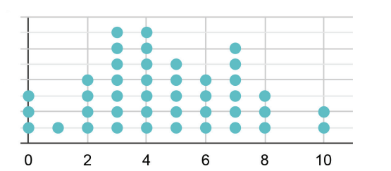
(i) Find the average number of times students rode their cycles.
(ii) Find the median number of times students rode their cycles.
(iii) Which of the following statements are valid? Why?
(a) Everyone used their cycle at least once.
(b) Almost everyone used their cycle a few times.
(c) There are some students who cycled more than once on some days.
(d) Exactly 5 students have used their cycles more than once on some days.
(e) The following week, if all of them cycled 1 more time than they did the previous week, what would be the average and median of the next week’s data?
11. A dart-throwing competition was organised in a school. The number of throws participants took to hit the bull’s eye (the centre circle) is given in the table below. Describe the data using its minimum, maximum, mean and median.

| No. of trials | 1 | 2 | 3 | 4 | 5 | 6 | 7 | 8 | 9 | 10 |
| No. of students | 1 | 0 | 0 | 1 | 4 | 9 | 12 | 15 | 10 | 10 |
5.2 Visualising and Interpreting Data
So far we have learnt how to read and make pictographs, bar graphs, clustered-bar graphs, and dot plots. We now examine some more ways of visualising data.
Line Graphs
TemperatureThe following figure is a clustered-column graph that shows the monthly maximum temperature in Kerala and Punjab in 2023.
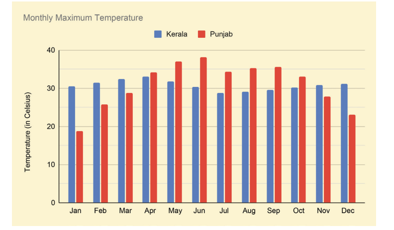
? Now, observe the following graph. Do both these graphs represent the same information?
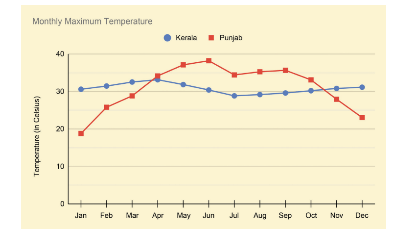
We call such a graph made up of lines a line graph. Line graphs are generally used to visualise data across time.
? How do we get the maximum temperature over a month in a state?
There could be a few weather stations across the state that regularly track the local temperature. We can get the monthly maximum temperature by looking at the maximum value among all the values recorded across the state.
 When we try to understand how the data is collected or produced,
we gain a clearer idea of its scope and can interpret it more
meaningfully. It also helps us identify any limitations, such as bias
or missing information, and decide how confidently we can draw
conclusions from the data.
When we try to understand how the data is collected or produced,
we gain a clearer idea of its scope and can interpret it more
meaningfully. It also helps us identify any limitations, such as bias
or missing information, and decide how confidently we can draw
conclusions from the data.
To identify and interpret the information presented, let us follow a two-step process.
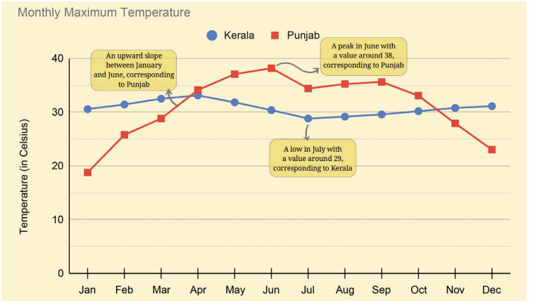
Step 1: Identify what is given? Notice how the graph is organised, what scale is used, and what patterns the data shows.
•The data for each month for a city is marked and connected by lines to show the change over time. Kerala's data is shown using blue circle marks connected by blue lines and Punjab's data is shown in red.
• The horizontal line shows the months of the year. The vertical line shows the temperature in oC.
Step 2: Infer and interpret from what is given
? Analyse and interpret each of the observations you made. Share appropriate summary/conclusion statements.
• In Punjab, the monthly maximum temperature increases from January to June, reaching a high of 38°c. Then, it reduces to just under 35°c in July, stays mostly flat till September, and then falls continuously till December, reaching about 23°c. January has the lowest among the monthly maximum temperature of about 19°c.
• Kerala’s trend is different — it stays mostly flat throughout the year. The peak is around 33°c in April and the lowest point is around 29°C in July. Notice that the monthly maximum temperatures in Kerala are similar both in summer and winter!
• In short, the temperature in Punjab varies more, reaching colder and warmer temperatures than in Kerala.
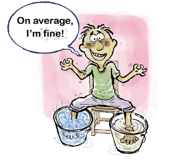
This can trigger questions in different directions, some of which can be answered using data. Here are some directions to think about —
• Why are the trends so distinct in these two states? What factors determine a region’s temperature?
• You might be curious to look at the trends of a few other states. Are there other types of trends that states exhibit?
• Which states show trends similar to Punjab’s? Is there anything common between these states?
• What would a plot of the monthly minimum temperatures for these states look like?
? What thoughts or questions occur to you?
Space Jam: A Traffic Problem in the Future?
Take a look at the line graph below showing the annual number of objects launched into space.
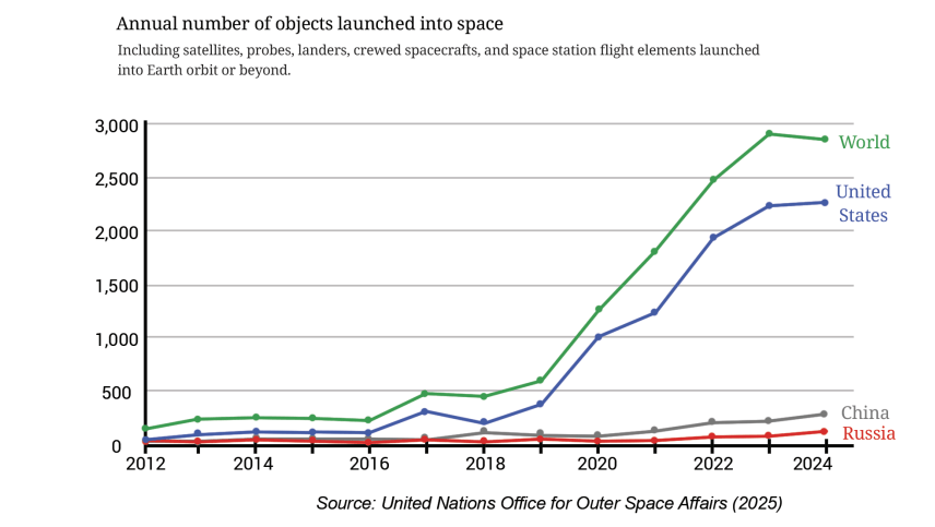
? What could be the possible method used to derive this data? Discuss.
Step 1: Identify what is given? Notice how the graph is organised, what scale is used, and what patterns the data shows.
Step 2: Infer from and interpret what is given? Analyse and interpret each of the observations you made. Once all interpretations are made, summarising/concluding statements can be made.
• In 2024, the worldwide count is around 2800, whereas in 2023, it was around 2900. We can say that 2023 saw the highest number of objects launched into space worldwide (assuming the trend before 2012 was decreasing).
• The counts of the three countries don't add up to the worldwide count. Therefore, we can infer that the counts of other countries are not shown in this visualisation.
• For the USA, the increase from 2022 to 2023 is more than from 2023 to 2024. We can say this by looking at how steep the line segments are — the steeper the line is, the greater the increase.? Which of the following statements are valid inferences?
• From 2012 till 2024, the worldwide count of space object launches increased every year.
• USA is a major contributor in the years 2022 – 24, launching about 3/4th of the worldwide count.
• Nepal did not launch any object in the period 2012 – 24.
• The combined count of object launches by China and Russia in 2024 is about 400.
? Identify two consecutive years where the worldwide count increased by 2 times or more.
Imagine the same data being shown as a clustered column graph. There would be 13 clusters — one for each year — and within each cluster, 4 columns, making a total of 52 bars! Such a graph would look crowded and difficult to read, making it hard to interpret the trends clearly.
A line graph, on the other hand, is better suited for illustrating changes over time. By connecting data points with line segments, it provides a clear visual representation of trends and variations, allowing the reader to easily track how a parameter evolves across different years.
Catch the (Pattern in) Rain
The following graphs show monthly average rainfall data of a few cities.
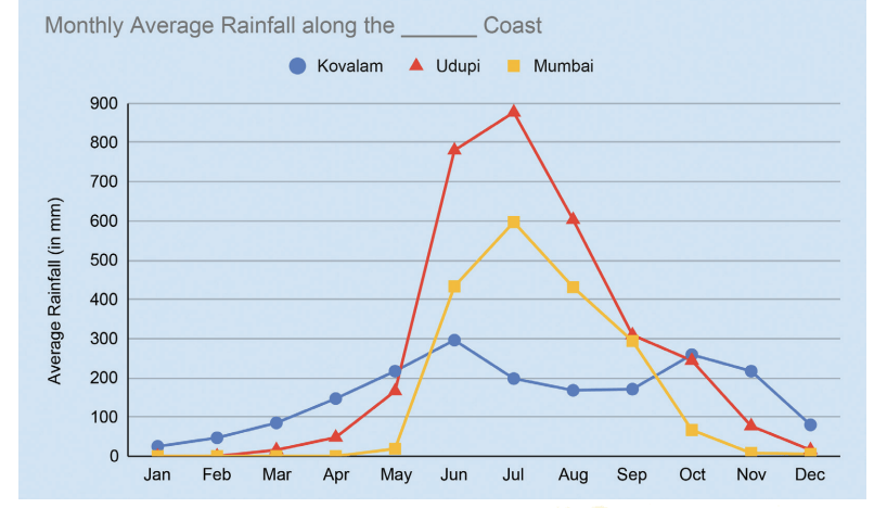
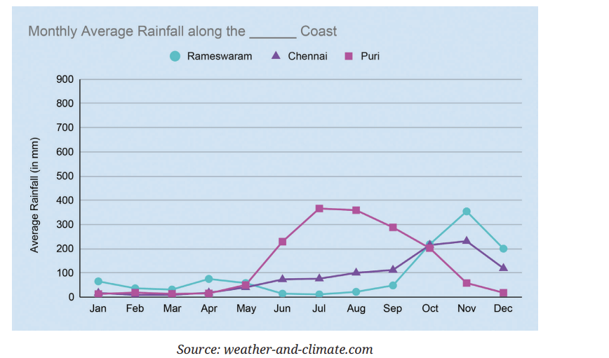
? What could be the possible method to compile this data?
This data shows the monthly average rainfall in 6 cities. This means rainfall data is collected over a few years in every city. The total rainfall in a month, say June, across years is averaged to get the monthly average rainfall in June in a city.
? Mark these cities on a map of India. What is common to how they are grouped in the graphs? Share your observations and inferences about the graphs.
Kovalam, Udupi, and Mumbai are along the west coast. Rameswaram, Chennai, and Puri are along the east coast. It appears that regions along the west coast receive more rain.
? Identify the peak months and low months of rainfall for each city.
Udupi, Mumbai, and Kovalam have peak rainfall during June - August. Rameswaram gets most of its rain during October-December. Chennai starts getting rain from June onwards, which peaks in November, and continues till December. Puri, although on the east coast, gets its peak rainfall during July-September. January-March are dry months, with low rainfall, for all the cities. Rameswaram receives very little rain from January-September.
? Read about the south-west monsoon and north-east monsoon and which regions come under the influence of these and when.
? Figure it Out
1. The average number of customers visiting a shop and the average number of customers actually purchasing items over different days of the week is shown in the table below. Visualise this data on a line graph.

2. The average number of days of rainfall in each month for a few cities is shown in the table below:
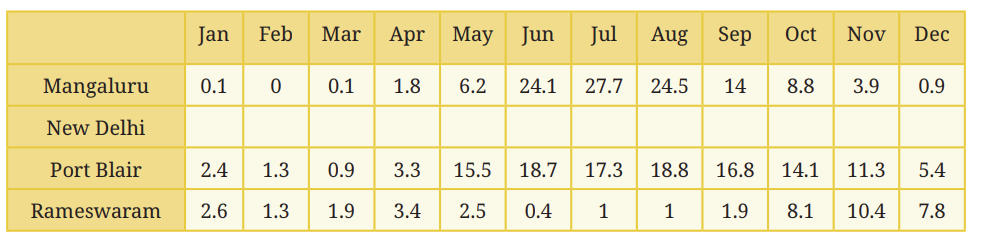
(i) What could be the possible method to compile this data?
(ii) Mark the data for Mangaluru, Port Blair, and Rameswaram in the line graph shown below. You can round off the values to the nearest integer.
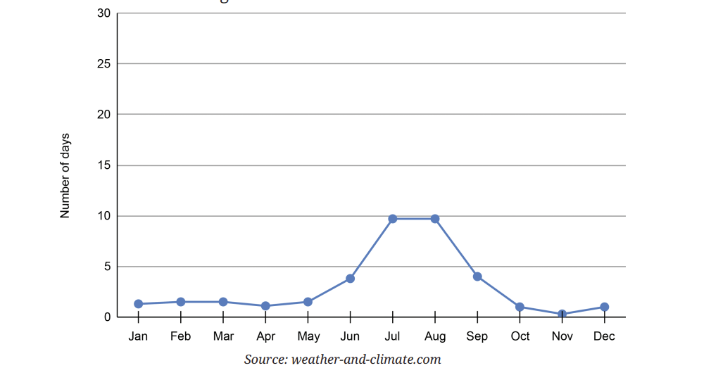
(iii) Based on the line for New Delhi in the graph fill the data in the table.
(iv) Which city among these receives the most number of days of rainfall per year? Which city gets the least number of days of rainfall per year?
(v) Looking at the table, when is the rainy season in New Delhi and Rameswaram?
2. The following line graph shows the number of births in every month in India over a time period:
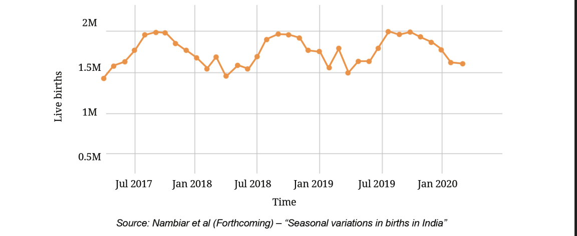
(i) What are your observations?
(ii) What was the approximate number of births in July 2017?
(iii) What time period does the graph capture?
(iv) Compare the number of births in the month of January in the years 2018, 2019, and 2020.
(v) Estimate the number of births in the year 2019.
Infographics
In Grade 6, we saw an example of how infographics can be used to communicate information and insights more clearly and quickly in a visually appealing way. Take a look at the following infographic. Are you able to understand the information presented here?
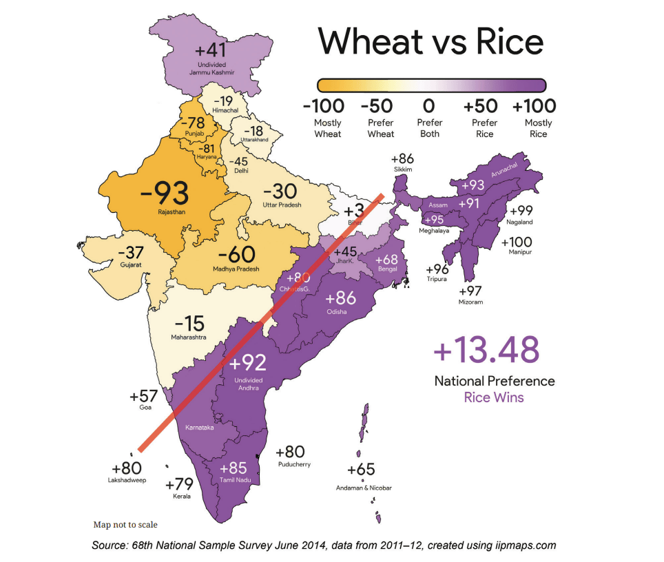
This infographic compares the preference between rice and wheat in different states. The colour scale at the top right indicates how to interpret the different shades in terms of preferences.
The difference between the per capita consumption of rice and wheat is mapped to values between – 100 and + 100. A value of + 100 doesn’t mean that the state doesn’t consume wheat at all. It means that this state prefers mostly rice and the difference between per capita rice and wheat consumption is the highest. Isn’t it interesting how there is a clear geographical split in preferences of rice vs. wheat shown by the red line?
? Share your observations. Based on this infographic, answer the following:
(i) The value of Karnataka is hidden. Can you guess what it could be?
(ii) Which are the top 5 states where rice is the most popular?
(iii) Which are the top 5 states where wheat is the most popular?
(iv) List a few states where the preference between rice and wheat is more or less balanced.
What can a Strip Say?
Manoj has an interesting hobby. He makes note of what he does throughout the day. He records his activities by colouring a strip of paper with 48 boxes, marking time in 30 minute intervals from midnight to midnight.
He has recorded five types of activities for three different days of the week on three coloured strips, shown to the right.

(i) Sleeping
(ii) Eating
(iii) Meeting friends, hobbies, media, time with family
(iv) Attending classes, studying and homework
(v) Showering and getting dressed, yoga or exercise
(vi) Travelling
? Look at the three coloured strips carefully.
(i) What activity does each colour stand for?
(ii) The three strips correspond to the days Friday – Sunday in some order. Which day do you think each strip represents?
(iii) On one of these days, he went out with friends to watch a long movie. When do you think this happened?
(iv) At what time does his school break for lunch?
(v) What more can the strips tell us?
? What would your strip for a weekday look like? How similar or different is it to Manoj's?
? What would a strip of your typical day during your vacation look like? How similar/different would it look?
? What would a strip for any of the adults in your family look like? Make a strip of a day for any adult at home. Compare your strip with theirs. What do you find interesting?
Data Story: Sleepy-Deepy
Do you remember the sleep time pie chart from the Proportionality chapter?
Isn't it amusing that there are animals that sleep as little as 2 hours per day and animals that sleep as much as 20 hours per day? How about insects - have you seen any insect sleep/rest? Humans typically sleep for about 7-9 hours a day. The sleep duration can vary greatly among people. The amount of sleep people need depends on age, living conditions, lifestyle (food they consume, the activities they engage in, etc.) among other factors. You may have observed that babies sleep longer than adults.
The line graphs below show typical sleep durations of Indians across ages 6 to 75. The second picture is a zoomed-in version of the first picture.
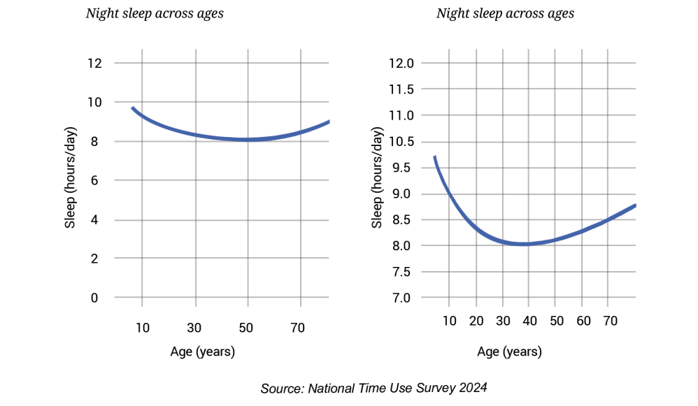
? Share your observations on this graph. What do you find interesting?
Unlike the earlier graphs that were made up of a few connected line segments, this line graph looks like a smooth curve because it contains 80 data points that are placed very close to each other. Representing the same data using a column graph would require 70 columns, making the graph look cluttered and heavy. A line graph is a better choice here. It is light and captures the pattern well.
From the graph we can see that the average sleep time for 6-year olds is about 9.5 hours per day. The daily sleep time decreases as we grow through teenage years and step into adulthood, touching about 8 hours a day between ages 30 and 50. After 50, the daily sleep time increases, reaching about 8.5 hours.
You might wonder-why do newborns and infants sleep for so long? Do people in different countries sleep differently? Do animals also exhibit such patterns in sleep durations across age?
? Figure it Out
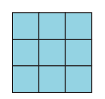
1. Mean Grids:
(i) Fill the grid with 9 distinct numbers such that the average along each row, column, and diagonal is 10.
(ii) Can we fill the grid by changing a few numbers and still get 10 as the average in all directions?
2. Give two examples of data that satisfy each of the following conditions:
(i) 3 numbers whose mean is 8.
(ii) 4 numbers whose median is 15.5.
(iii) 5 numbers whose mean is 13.6.
(iv) 6 numbers whose mean = median.
(v) 6 numbers whose mean > median.
3. Fill in the blanks such that the median of the collection is 13: 5, 21, 14, ....,....,....How many possibilities exist if only counting numbers are allowed?
4. Fill in the blanks such that the mean of the collection is 6.5: 3, 11, _, _15, 6. How many possibilities exist if only counting numbers are allowed?
5. Check whether each of the statements below is true. Justify your reasoning. Use algebra, if necessary, to justify.
(i) The average of two even numbers is even.
(ii) The average of any two multiples of 5 will be a multiple of 5.
(iii) The average of any 5 multiples of 5 will also be a multiple of 5.
6. There were 2 new admissions to Sudhakar’s class just a couple of days after the class average height was found to be 150.2 cm.
(i) Which of the following statements are correct? Why?
(a) The average height of the class will increase as there are 2 new values.
(b) The average height of the class will remain the same.
(c) The heights of the new students have to be measured to find out the new average height.
(d) The heights of everyone in the class has to be measured again to calculate the new average height.
(ii) The heights of the two new joinees are 149 cm and 152 cm. Which of the following statements about the class’ average height are correct? Why?
(a) The average will remain the same.
(b) The average will increase.
(c) The average will decrease.
(d) The information is not sufficient to make a claim about the average.
(iii) Which of the following statements about the new class average height are correct? Why?
- (a) The median will remain the same.
- (b) The median will increase.
- (c) The median will decrease.
- (d) The information is not sufficient to make a claim about median.
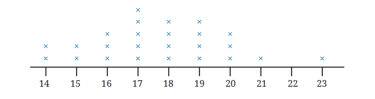
7. Is 17 the average of the data shown in the dot plot below? Share the method you used to answer this question.
8. The weights of people in a group were measured every month. The average weight for the previous month was 65.3 kg and the median weight was 67 kg. The data for this month showed that one person has lost 2 kg and two have gained 1 kg. What can we say about the change in mean weight and median weight this month?
9. The following table shows the retail price (in ₹) of iodised salt in the month of January in a few states over 10 years. For your calculations and plotting you may round off values to the nearest counting number.
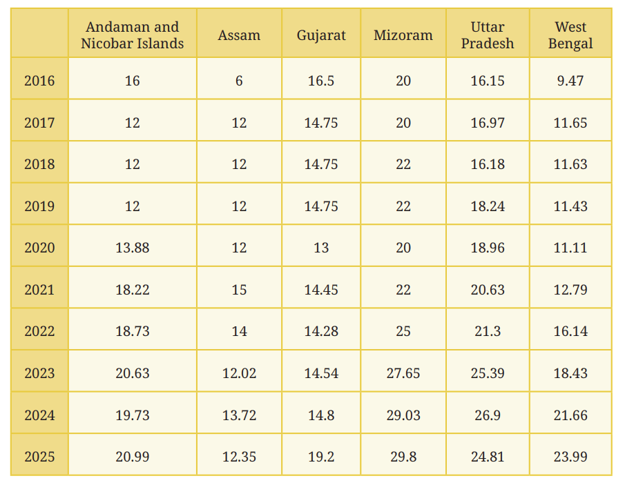
- (i) Choose data from any 3 states you find interesting and present it through a line graph using an appropriate scale.
- (ii) What do you find interesting in this data? Share your observations.
- (iii) Compare the price variation in Gujarat and Uttar Pradesh.
- (iv) In which state has the price increased the most from 2016 to 2025?
- (v) What are you curious to explore further?
10. Referring to the graph below, which of the following statements are valid? Why?
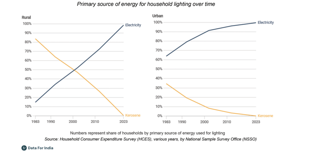
- (i) In 1983, the majority in rural areas used kerosene as a primary lighting source while the majority in urban areas used electricity.
- (ii) The use of kerosene as a primary lighting source has decreased over time in both rural and urban areas.
- (ii) The use of kerosene as a primary lighting source has decreased over time in both rural and urban areas.
- (iii) In the year 2000, 10% of the urban households used electricity as a primary lighting source.
- (iv) In 2023, there were no power cuts.
- (i) How long do children aged 10 in urban areas spend each day on hobbies and games?
- (ii) At what age is the average time spent daily on hobbies and games by rural kids 1.5 hours?
(a) 8 years
(b) 10 years
(c) 12 years
(d) 14 years
(e) 18 years
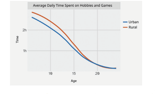
(iii) Are the following statements correct?
- (a) The average time spent daily on hobbies and games by kids
- aged 15 is twice that of kids aged 10.
- (b) All rural kids aged 15 spend
- at least 1 hour on hobbies and
- games everyday
12. Individual project: Make your own activity strip for different days of the week.

- (i) Do you eat and sleep at regular times every day? Typically how long do you spend outdoors?
- (ii) Calculate the average time spent per activity. Represent this average day using a strip.
- (iii) Similarly, track the activities of any adult at home. Compare your data with theirs.
13. Small group project: Make a group of 3 – 4 members. Do at least one of the following:
- (i) Track daily sleep time of all your family members for a week. Daily sleep time includes night sleep, naps, and any sleep during the day.
- (a) Represent this on strips.
- (b) Put together the data of all your group members. Calculate the average and median sleep time of children, adults, elderly.
- (c) Share your findings and observations.
- (ii) When do schools start and end? On a weekday, Manoj’s school starts at 9:30 am and ends at 4:30 pm, i.e., 7 hours which include class time and breaks. Collect information on the daily timings of different schools for Grade 8, including class time and break time (the schools can be anywhere in the country. You can ask your neighbours, relatives, parents and friends to find out). Analyse and present the data collected.
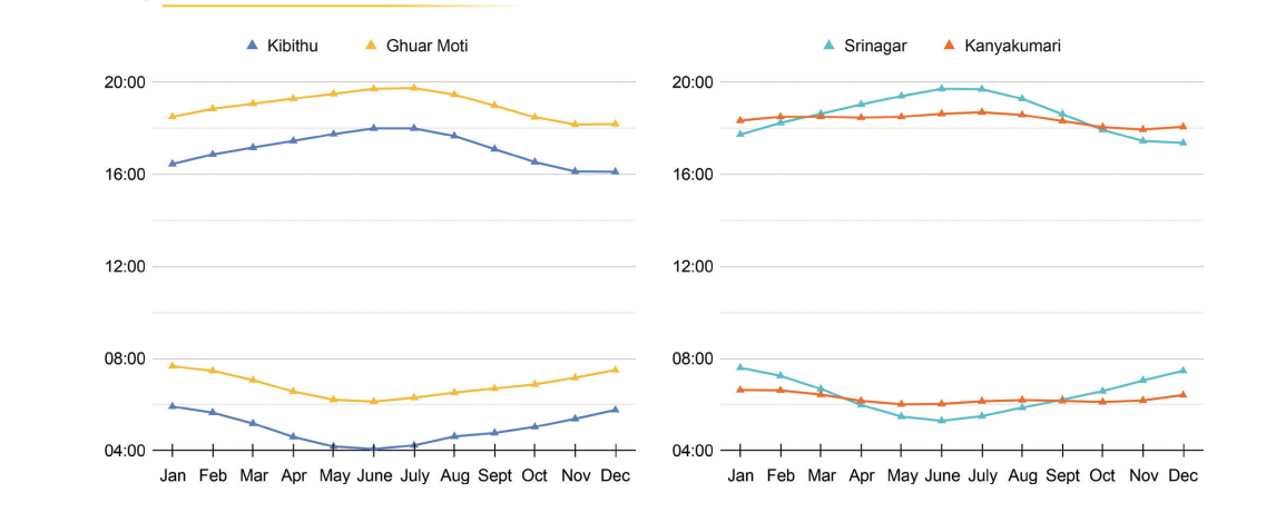
14. The following graphs show the sunrise and sunset times across the year at 4 locations in India. Observe how the graphs are organised. Are you able to identify which lines indicate the sunrise and which indicate the sunset?
Answer the following questions based on the graphs:
- (i) At which place does the sun rise the earliest in January? What is the approximate day length at this place in January?
- (ii) Which place has the longest day length over the year?
- (iii) Share your observations — what do you find interesting? What are you curious to find out?
15. We all know the typical sunrise and sunset timings. Do you know when the moon rises and sets? Does it follow a regular pattern like the sun? Let’s find out. The following graph shows the moonrise and moonset time over a month:
- (i) Find out on what dates amavasya (new moon) and purnima (full moon) were in this month.
- (ii) What do you notice? What do you wonder?

SUMMARY
• Last year we looked at mean as a fair-share. Here, we learnt how the sum of the distances of the values to its left and right are the same.
• We saw that when values greater than the mean are inserted, the mean increases. When values less than the mean are inserted, the mean decreases. Similar phenomena can be observed with the median.
• Line graphs can be used to visualise change over time.
• We saw that examining data can lead to new questions and directions to probe further.
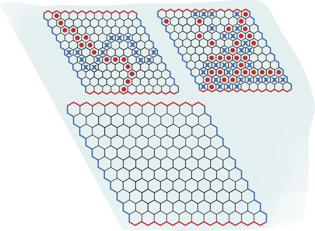
IT'S PUZZLE TIME! Game of Hex
Hex is a two-player strategy game played on a rhombus-shaped board made of hexagonal cells, usually of size 11 × 11. Each player is assigned a colour and two opposite sides of the board. Players take turns placing a piece of their colour on any empty cell. Once placed, pieces can not be moved or removed. The objective is to create an unbroken chain of one’s own pieces connecting the two assigned sides. The first player to complete such a connection wins the game. The pictures below show two possible gameplays where blue wins in the first and red wins in the second board.
Here is an empty board. You can use pencils to play each round and erase the marks to play a fresh round.