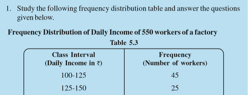
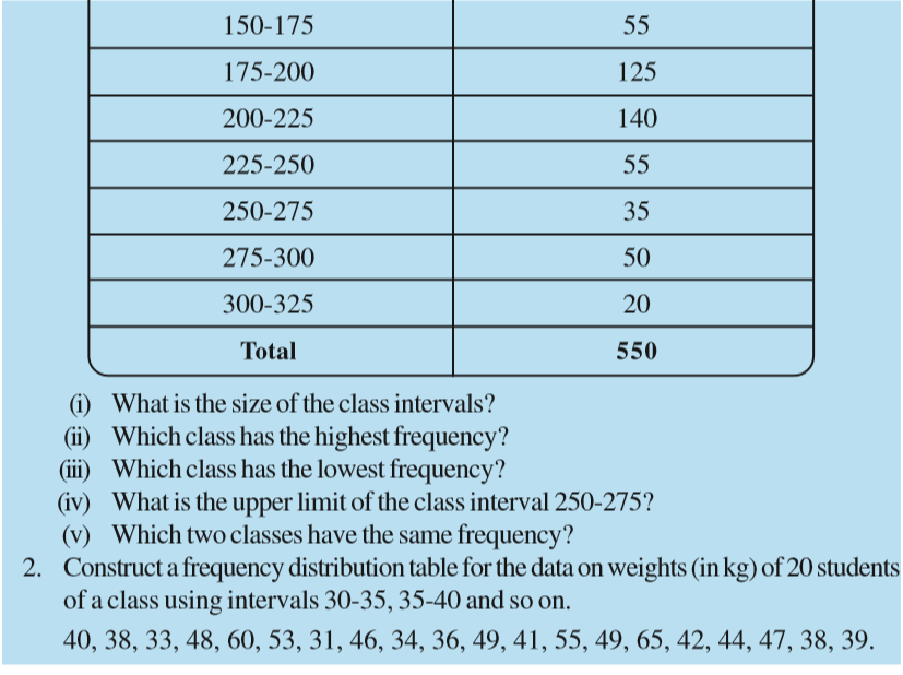
Table of Contents

Chapter 5
Data Handling
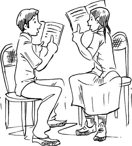
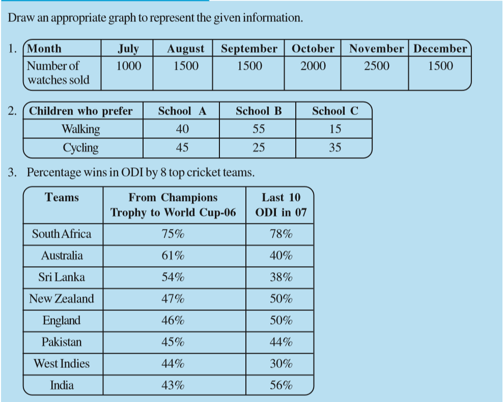
5.1 Looking for Information
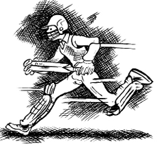
(a) Runs made by a batsman in the last 10 test matches.
(b) Number of wickets taken by a bowler in the last 10 ODIs.
(c) Marks scored by the students of your class in the Mathematics unit test.
(d) Number of story books read by each of your friends etc.
The information collected in all such cases is called data. Data is usually collected in the context of a situation that we want to study. For example, a teacher may like to know the average height of students in her class. To find this, she will write the heights of all the students in her class, organise the data in a systematic manner and then interpret it accordingly.
Sometimes, data is represented graphically to give a clear idea of what it represents. Do you remember the different types of graphs which we have learnt in earlier classes?
1. A Pictograph: Pictorial representation of data using symbols.
 = 100 cars ← One symbol stands for 100 cars = 100 cars ← One symbol stands for 100 cars | |
| July |  = 250 denotes = 250 denotes  of 100 of 100 |
| August | = 300 |
| September | = ? |
(i) How many cars were produced in the month of July?
(ii) In which month were maximum number of cars produced?
2. A bar graph: A display of information using bars of uniform width, their heights being proportional to the respective values.
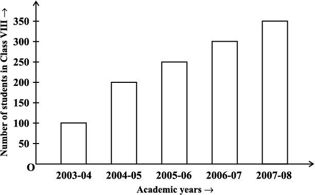
Bar heights give the quantity for each category.
(i) What is the information given by the bar graph?
(ii) In which year is the increase in the number of students maximum?
(iii) In which year is the number of students maximum?
(iv) State whether true or false:
‘The number of students during 2005-06 is twice that of 2003-04.’
3. Double Bar Graph: A bar graph showing two sets of data simultaneously. It is useful for the comparison of the data.
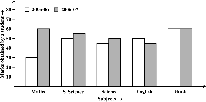
(i) What is the information given by the double bar graph?
(ii) In which subject has the performance improved the most?
(iii) In which subject has the performance deteriorated?
(iv) In which subject is the performance at par?
THINK, DISCUSS AND WRITE
Try These
5.2 Organising Data
Usually, data available to us is in an unorganised form called raw data. To draw meaningful inferences, we need to organise the data systematically. For example, a group of students was asked for their favourite subject. The results were as listed below:
Art, Mathematics, Science, English, Mathematics, Art, English, Mathematics, English, Art, Science, Art, Science, Science, Mathematics, Art, English, Art, Science, Mathematics, Science, Art.
Which is the most liked subject and the one least liked?
It is not easy to answer the question looking at the choices written haphazardly. We arrange the data in Table 5.1 using tally marks.
Table 5.1
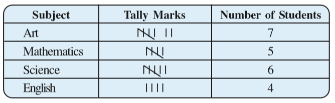
The number of tallies before each subject gives the number of students who like that particular subject.
This is known as the frequency of that subject.
Frequency gives the number of times that a particular entry occurs.
From Table 5.1, Frequency of students who like English is 4
Frequency of students who like Mathematics is 5
The table made is known as frequency distribution table as it gives the number of times an entry occurs.
Try These
1. A group of students were asked to say which animal they would like most to have as a pet. The results are given below:
dog, cat, cat, fish, cat, rabbit, dog, cat, rabbit, dog, cat, dog, dog, dog, cat, cow, fish, rabbit, dog, cat, dog, cat, cat, dog, rabbit, cat, fish, dog.
Make a frequency distribution table for the same.
5.3 Grouping Data
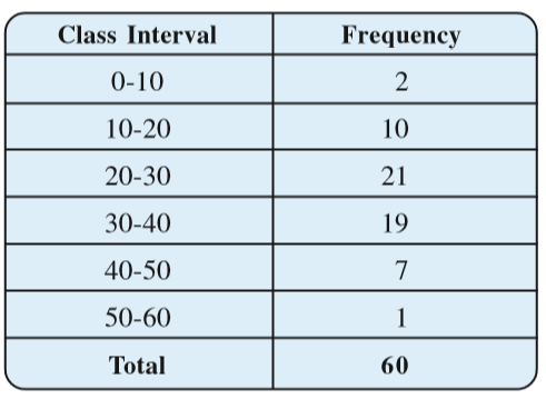
The data regarding choice of subjects showed the occurrence of each of the entries several times. For example, Art is liked by 7 students, Mathematics is liked by 5 students and so on (Table 5.1). This information can be displayed graphically using a pictograph or a bargraph. Sometimes, however, we have to deal with a large data. For example, consider the following marks (out of 50) obtained in Mathematics by 60 students of Class VIII:
21, 10, 30, 22, 33, 5, 37, 12, 25, 42, 15, 39, 26, 32, 18, 27, 28, 19, 29, 35, 31, 24, 36, 18, 20, 38, 22, 44, 16, 24, 10, 27, 39, 28, 49, 29, 32, 23, 31, 21, 34, 22, 23, 36, 24, 36, 33, 47, 48, 50, 39, 20, 7, 16, 36, 45, 47, 30, 22, 17.
If we make a frequency distribution table for each observation, then the table would be too long, so, for convenience, we make groups of observations say, 0-10, 10-20 and so on, and obtain a frequency distribution of the number of observations falling in each group. Thus, the frequency distribution table for the above data can be.
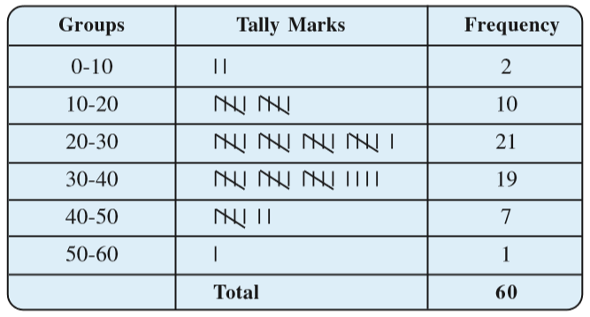
Data presented in this manner is said to be grouped and the distribution obtained is called grouped frequency distribution. It helps us to draw meaningful inferences like –
(1) Most of the students have scored between 20 and 40.
(2) Eight students have scored more than 40 marks out of 50 and so on.
Each of the groups 0-10, 10-20, 20-30, etc., is called a Class Interval (or briefly a class).
Observe that 10 occurs in both the classes, i.e., 0-10 as well as 10-20. Similarly, 20 occurs in classes 10-20 and 20-30. But it is not possible that an observation (say 10 or 20) can belong simultaneously to two classes. To avoid this, we adopt the convention that the common observation will belong to the higher class, i.e., 10 belongs to the class interval 10-20 (and not to 0-10). Similarly, 20 belongs to 20-30 (and not to 10-20). In the class interval, 10-20, 10 is called the lower class limit and 20 is called the upper class limit. Similarly, in the class interval 20-30, 20 is the lower class limit and 30 is the upper class limit. Observe that the difference between the upper class limit and lower class limit for each of the class intervals 0-10, 10-20, 20-30 etc., is equal, (10 in this case). This difference between the upper class limit and lower class limit is called the width or size of the class interval.

Try These
5.3.1 Bars with a difference
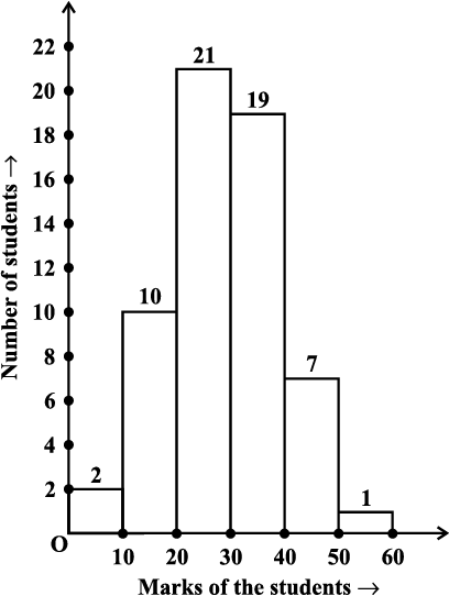
Fig 5.1
This is displayed graphically as in the adjoining graph (Fig 5.1).
Table 5.4
Is this graph in any way different from the bar graphs which you have drawn in Class VII? Observe that, here we have represented the groups of observations (i.e., class intervals) on the horizontal axis. The height of the bars show the frequency of the class-interval. Also, there is no gap between the bars as there is no gap between the class-intervals.
The graphical representation of data in this manner is called a histogram.
The following graph is another histogram (Fig 5.2).
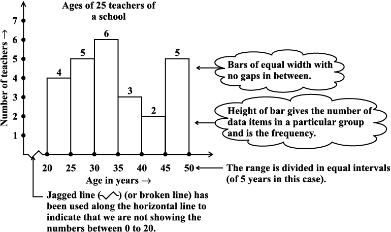
Fig 5.2
From the bars of this histogram, we can answer the following questions:
(i) How many teachers are of age 45 years or more but less than 50 years?
(ii) How many teachers are of age less than 35 years?

Try These
1. Observe the histogram (Fig 5.3) and answer the questions given below.
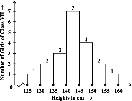
Fig 5.3
(i) What information is being given by the histogram?
(ii) Which group contains maximum girls?
(iii) How many girls have a height of 145 cms and more?
(iv) If we divide the girls into the following three categories, how many would there be in each?
150 cm and more — Group A
140 cm to less than 150 cm — Group B
Less than 140 cm — Group C
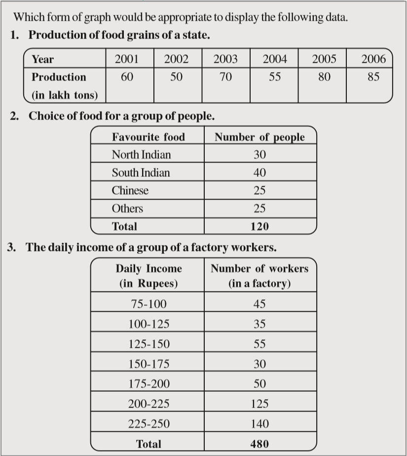
Exercise 5.1
1. For which of these would you use a histogram to show the data?
(a) The number of letters for different areas in a postman’s bag.
(b) The height of competitors in an athletics meet.
(c) The number of cassettes produced by 5 companies.
(d) The number of passengers boarding trains from 7:00 a.m. to 7:00 p.m. at a station.
Give reasons for each.
2. The shoppers who come to a departmental store are marked as: man (M), woman (W), boy (B) or girl (G). The following list gives the shoppers who came during the first hour in the morning:
W W W G B W W M G G M M W W W W G B M W B G G M W W M M W W W M W B W G M W W W W G W M M W W M W G W M G W M M B G G W
Make a frequency distribution table using tally marks. Draw a bar graph to illustrate it.
3. The weekly wages (in `) of 30 workers in a factory are.
830, 835, 890, 810, 835, 836, 869, 845, 898, 890, 820, 860, 832, 833, 855, 845, 804, 808, 812, 840, 885, 835, 835, 836, 878, 840, 868, 890, 806, 840
Using tally marks make a frequency table with intervals as 800–810, 810–820 and so on.
4. Draw a histogram for the frequency table made for the data in Question 3, and answer the following questions.
(i) Which group has the maximum number of workers?
(ii) How many workers earn ` 850 and more?
(iii) How many workers earn less than ` 850?
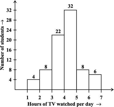
5. The number of hours for which students of a particular class watched television during holidays is shown through the given graph.
Answer the following.
(i) For how many hours did the maximum number of students watch TV?
(ii) How many students watched TV for less than 4 hours?
(iii) How many students spent more than 5 hours in watching TV?
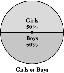
5.4 Circle Graph or Pie Chart
Have you ever come across data represented in circular form as shown (Fig 5.4)?
The time spent by a child during a day Age groups of people in a town
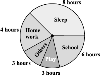
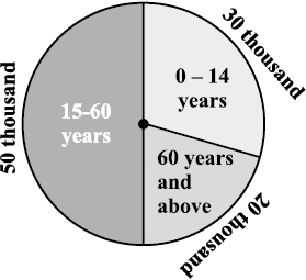
(i) Fig 5.4 (ii)
For example, in the above graph, the proportion of the sector for hours spent in sleeping
= 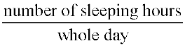 =
= 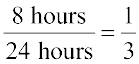
So, this sector is drawn as  part of the circle. Similarly, the proportion of the sector for hours spent in school =
 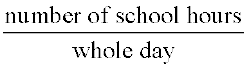 =
= 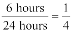
So this sector is drawn  of the circle. Similarly, the size of other sectors can be found. Add up the fractions for all the activities. Do you get the total as one?
A circle graph is also called a pie chart.
TRY THESE
1. Each of the following pie charts (Fig 5.5) gives you a different piece of information about your class. Find the fraction of the circle representing each of these information.
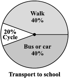
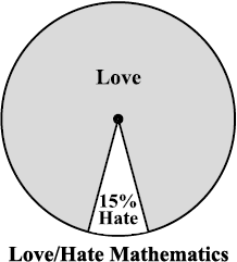
(i) (ii) (iii)
Fig 5.5
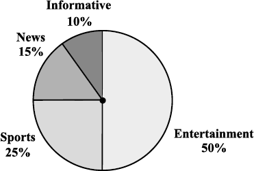
Fig 5.6
(i) Which type of programmes are viewed the most?
(ii) Which two types of programmes have number of viewers equal to those watching sports channels?
5.4.1 Drawing pie charts
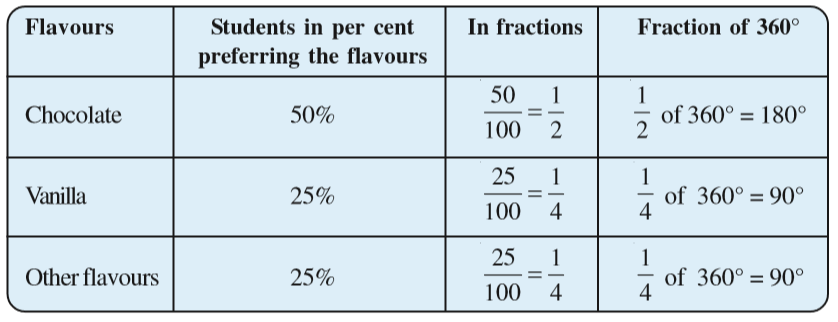
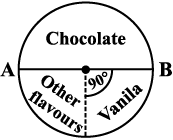
The favourite flavours of ice-creams for students of a school is given in percentages as follows.
| Flavours | Percentage of students Preferring the flavours |
| Chocolate | 50% |
| Vanilla | 25% |
| Other flavours | 25% |
Let us represent this data in a pie chart.
The total angle at the centre of a circle is 360°. The central angle of the sectors will be a fraction of 360°. We make a table to find the central angle of the sectors (Table 5.5).
Table 5.5
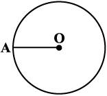
1. Draw a circle with any convenient radius.
Mark its centre (O) and a radius (OA).
Example 1: Adjoining pie chart (Fig 5.7) gives the expenditure (in percentage) on various items and savings of a family during a month.
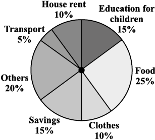
Fig 5.7
(i) On which item, the expenditure was maximum?
(ii) Expenditure on which item is equal to the total savings of the family?
(iii) If the monthly savings of the family is ` 3000, what is the monthly expenditure on clothes?
Solution:
(i) Expenditure is maximum on food.
(ii) Expenditure on Education of children is the same (i.e., 15%) as the savings of the family.
(iii) 15% represents ` 3000
Therefore, 10% represents ` 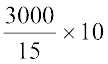 = ` 2000
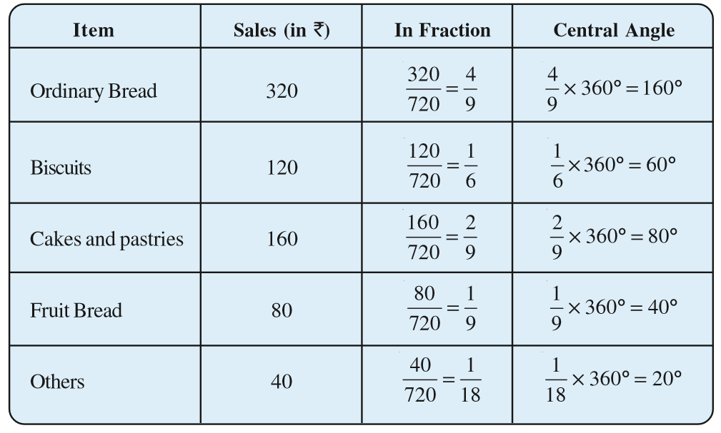
Example 2: On a particular day, the sales (in rupees) of different items of a baker’s shop are given below.
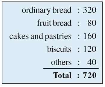 Draw a pie chart for this data.
Solution: We find the central angle of each sector. Here the total sale = ` 720. We thus have this table.
Now, we make the pie chart (Fig 5.8):
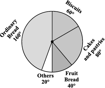
Fig 5.8
Try These
Draw a pie chart of the data given below.
The time spent by a child during a day.
Sleep — 8 hours
School — 6 hours
Home work — 4 hours
Play — 4 hours
Others — 2 hours
Think, Discuss and Write
Exercise 5.2
(i) If 20 people liked classical music, how many young people were surveyed?
(ii) Which type of music is liked by the maximum number of people?
(iii) If a cassette company were to make 1000 CD’s, how many of each type would they make?
2. A group of 360 people were asked to vote for their favourite season from the three seasons rainy, winter and summer.
(i) Which season got the most votes?
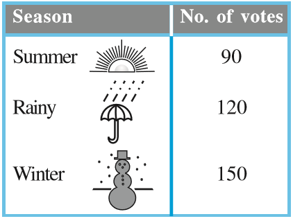
(ii) Find the central angle of each sector.
(iii) Draw a pie chart to show this information.
3. Draw a pie chart showing the following information. The table shows the colours preferred by a group of people.
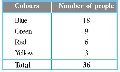
Find the proportion of each sector. For example,
Blue is  ; Green is
  and so on. Use this to find the corresponding angles.

4. The adjoining pie chart gives the marks scored in an examination by a student in Hindi, English, Mathematics, Social Science and Science. If the total marks obtained by the students were 540, answer the following questions.
(i) In which subject did the student score 105 marks?
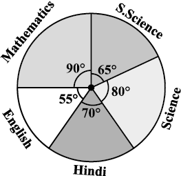
(Hint: for 540 marks, the central angle = 360°. So, for 105 marks, what is the central angle?)
(ii) How many more marks were obtained by the student in Mathematics than in Hindi?
(iii) Examine whether the sum of the marks obtained in Social Science and Mathematics is more than that in Science and Hindi.
(Hint: Just study the central angles).
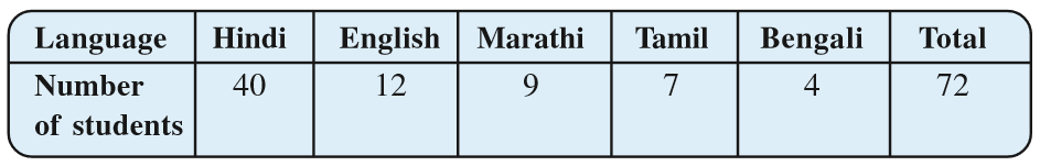
5. The number of students in a hostel, speaking different languages is given below. Display the data in a pie chart.
5.5 Chance and Probability
Sometimes it so happens that a student prepares 4 chapters out of 5, very well for a test. But a major question is asked from the chapter that she left unprepared.
Everyone knows that a particular train runs in time but the day you reach well in time it is late!
You face a lot of situations such as these where you take a chance and it does not go the way you want it to. Can you give some more examples? These are examples where the chances of a certain thing happening or not happening are not equal. The chances of the train being in time or being late are not the same. When you buy a ticket which is wait listed, you do take a chance. You hope that it might get confirmed by the time you travel.
We however, consider here certain experiments whose results have an equal chance of occurring.
5.5.1 Getting a result
You might have seen that before a cricket match starts, captains of the two teams go out to toss a coin to decide which team will bat first.
What are the possible results you get when a coin is tossed? Of course, Head or Tail.
Imagine that you are the captain of one team and your friend is the captain of the other team. You toss a coin and ask your friend to make the call. Can you control the result of the toss? Can you get a head if you want one? Or a tail if you want that? No, that is not possible. Such an experiment is called a random experiment. Head or Tail are the two outcomes of this experiment.
Try These
1. If you try to start a scooter, what are the possible outcomes?
2. When a die is thrown, what are the six possible outcomes?
3. When you spin the wheel shown, what are the possible outcomes? (Fig 5.9)
List them.
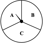
Fig 5.9
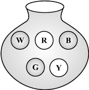
Fig 5.10
4. You have a bag with five identical balls of different colours and you are to pull out (draw) a ball without looking at it; list the outcomes you would get (Fig 5.10).
THINK, DISCUSS AND WRITE
In throwing a die:
• Does the first player have a greater chance of getting a six?
• Would the player who played after him have a lesser chance of getting a six?
• Suppose the second player got a six. Does it mean that the third player would not have a chance of getting a six?
5.5.2 Equally likely outcomes:
A coin is tossed several times and the number of times we get head or tail is noted. Let us look at the result sheet where we keep on increasing the tosses:
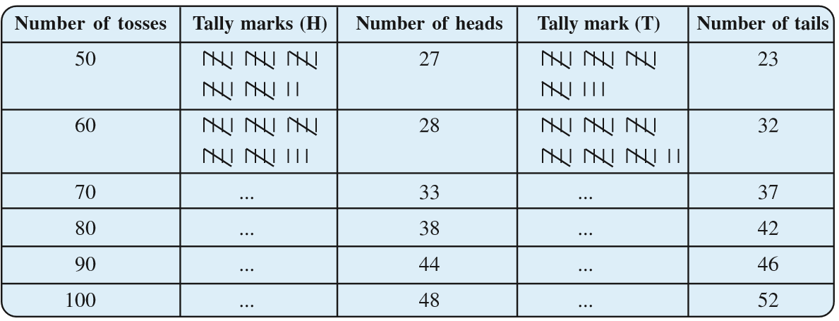
Observe that as you increase the number of tosses more and more, the number of heads and the number of tails come closer and closer to each other.
This could also be done with a die, when tossed a large number of times. Number of each of the six outcomes become almost equal to each other.
In such cases, we may say that the different outcomes of the experiment are equally likely. This means that each of the outcomes has the same chance of occurring.
5.5.3 Linking chances to probability
Consider the experiment of tossing a coin once. What are the outcomes? There are only two outcomes – Head or Tail. Both the outcomes are equally likely. Likelihood of getting a head is one out of two outcomes, i.e., . In other words, we say that the probability of getting a head = . What is the probability of getting a tail?
Now take the example of throwing a die marked with 1, 2, 3, 4, 5, 6 on its faces (one number on one face). If you throw it once, what are the outcomes?
The outcomes are: 1, 2, 3, 4, 5, 6. Thus, there are six equally likely outcomes.
What is the probability of getting the outcome ‘2’?
It is  ← Number of outcomes giving 2
← Number of equally likely outcomes.
What is the probability of getting the number 5? What is the probability of getting the number 7? What is the probability of getting a number 1 through 6?
5.5.4 Outcomes as events
Each outcome of an experiment or a collection of outcomes make an event.
For example in the experiment of tossing a coin, getting a Head is an event and getting a Tail is also an event.
In case of throwing a die, getting each of the outcomes 1, 2, 3, 4, 5 or 6 is an event.
Is getting an even number an event? Since an even number could be 2, 4 or 6, getting an even number is also an event. What will be the probability of getting an even number?
It is  ← Number of outcomes that make the event
← Total number of outcomes of the experiment.
Example 3: A bag has 4 red balls and 2 yellow balls. (The balls are identical in all respects other than colour). A ball is drawn from the bag without looking into the bag. What is probability of getting a red ball? Is it more or less than getting a yellow ball?
Solution: There are in all (4 + 2 =) 6 outcomes of the event. Getting a red ball consists of 4 outcomes. (Why?)
Therefore, the probability of getting a red ball is = . In the same way the probability of getting a yellow ball = (Why?). Therefore, the probability of getting a red ball is more than that of getting a yellow ball.
Try These
Suppose you spin the wheel
1. (i) List the number of outcomes of getting a green sector and not getting a green sector on this wheel (Fig 5.11).
(ii) Find the probability of getting a green sector.
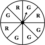
(iii) Find the probability of not getting a green sector.
5.5.5 Chance and probability related to real life
What could you say about the chance in terms of probability? Could it be one in 10 days during a rainy season? The probability that it rains is then  . The probability that it does not rain =
  . (Assuming raining or not raining on a day are equally likely)
The use of probability is made in various cases in real life.
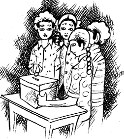
1. To find characteristics of a large group by using a small part of the group.
For example, during elections ‘an exit poll’ is taken. This involves asking the people whom they have voted for, when they come out after voting at the centres which are chosen off hand and distributed over the whole area. This gives an idea of chance of winning of each candidate and predictions are made based on it accordingly.
2. Metrological Department predicts weather by observing trends from the data over many years in the past.
Exercise 5.3
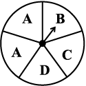
1. List the outcomes you can see in these experiments.
(a) Spinning a wheel (b) Tossing two coins together
2. When a die is thrown, list the outcomes of an event of getting
(ii) (a) a number greater than 5 (b) a number not greater than 5.
3. Find the.
(a) Probability of the pointer stopping on D in (Question 1-(a))?
(b) Probability of getting an ace from a well shuffled deck of 52 playing cards?
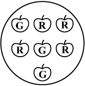
(c) Probability of getting a red apple. (See figure below)
4. Numbers 1 to 10 are written on ten separate slips (one number on one slip), kept in a box and mixed well. One slip is chosen from the box without looking into it. What is the probability of .
(i) getting a number 6?
(ii) getting a number less than 6?
What have we Discussed?
(iii) getting a number greater than 6?
(iv) getting a 1-digit number?
5. If you have a spinning wheel with 3 green sectors, 1 blue sector and 1 red sector, what is the probability of getting a green sector? What is the probability of getting a non blue sector?
6. Find the probabilities of the events given in Question 2.
WHAT HAVE WE DISCUSSED
1. Data mostly available to us in an unorganised form is called raw data.
2. In order to draw meaningful inferences from any data, we need to organise the data systematically.
3. Frequency gives the number of times that a particular entry occurs.
4. Raw data can be ‘grouped’ and presented systematically through ‘grouped frequency distribution’.
5. Grouped data can be presented using histogram. Histogram is a type of bar diagram, where the class intervals are shown on the horizontal axis and the heights of the bars show the frequency of the class interval. Also, there is no gap between the bars as there is no gap between the class intervals.
6. Data can also presented using circle graph or pie chart. A circle graph shows the relationship between a whole and its part.
7. There are certain experiments whose outcomes have an equal chance of occurring.
8. A random experiment is one whose outcome cannot be predicted exactly in advance.
9. Outcomes of an experiment are equally likely if each has the same chance of occurring.
10. Probability of an event = 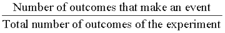 , when the outcomes are equally likely.
11. One or more outcomes of an experiment make an event.
12. Chances and probability are related to real life.