Table of Contents

Chapter 14
Statistics
14.1 Introduction
Everyday we come across a lot of information in the form of facts, numerical figures, tables, graphs, etc. These are provided by newspapers, televisions, magazines and other means of communication. These may relate to cricket batting or bowling averages, profits of a company, temperatures of cities, expenditures in various sectors of a five year plan, polling results, and so on. These facts or figures, which are numerical or otherwise, collected with a definite purpose are called data. Data is the plural form of the Latin word datum. Of course, the word ‘data’ is not new for you. You have studied about data and data handling in earlier classes.
Our world is becoming more and more information oriented. Every part of our lives utilises data in one form or the other. So, it becomes essential for us to know how to extract meaningful information from such data. This extraction of meaningful information is studied in a branch of mathematics called Statistics.
The word ‘statistics’ appears to have been derived from the Latin word ‘status’ meaning ‘a (political) state’. In its origin, statistics was simply the collection of data on different aspects of the life of people, useful to the State. Over the period of time, however, its scope broadened and statistics began to concern itself not only with the collection and presentation of data but also with the interpretation and drawing of inferences from the data. Statistics deals with collection, organisation, analysis and interpretation of data. The word ‘statistics’ has different meanings in different contexts. Let us observe the following sentences:
1. May I have the latest copy of ‘Educational Statistics of India’.
2. I like to study ‘Statistics’ because it is used in day-to-day life.
In the first sentence, statistics is used in a plural sense, meaning numerical data. These may include a number of educational institutions of India, literacy rates of various states, etc. In the second sentence, the word ‘statistics’ is used as a singular noun, meaning the subject which deals with the collection, presentation, analysis of data as well as drawing of meaningful conclusions from the data.
In this chapter, we shall briefly discuss all these aspects regarding data.
14.2 Collection of Data
Let us begin with an exercise on gathering data by performing the following activity.
Activity 1 : Divide the students of your class into four groups. Allot each group the work of collecting one of the following kinds of data:
(i) Heights of 20 students of your class.
(ii) Number of absentees in each day in your class for a month.
(iii) Number of members in the families of your classmates.
(iv) Heights of 15 plants in or around your school.
Let us move to the results students have gathered. How did they collect their data in each group?
(i) Did they collect the information from each and every student, house or person concerned for obtaining the information?
(ii) Did they get the information from some source like available school records?
In the first case, when the information was collected by the investigator herself or himself with a definite objective in her or his mind, the data obtained is called primary data.
In the second case, when the information was gathered from a source which already had the information stored, the data obtained is called secondary data. Such data, which has been collected by someone else in another context, needs to be used with great care ensuring that the source is reliable.
By now, you must have understood how to collect data and distinguish between primary and secondary data.
Exercise 14.1
1. Give five examples of data that you can collect from your day-to-day life.
2. Classify the data in Q.1 above as primary or secondary data.
14.3 Presentation of Data
As soon as the work related to collection of data is over, the investigator has to find out ways to present them in a form which is meaningful, easily understood and gives its main features at a glance. Let us now recall the various ways of presenting the data through some examples.
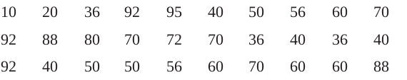
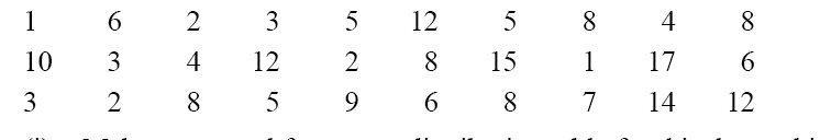
Example 1 : Consider the marks obtained by 10 students in a mathematics test as given below:

The data in this form is called raw data.
By looking at it in this form, can you find the highest and the lowest marks?
Did it take you some time to search for the maximum and minimum scores? Wouldn’t it be less time consuming if these scores were arranged in ascending or descending order? So let us arrange the marks in ascending order as

Now, we can clearly see that the lowest marks are 25 and the highest marks are 95.
The difference of the highest and the lowest values in the data is called the range of the data. So, the range in this case is 95 – 25 = 70.
Presentation of data in ascending or descending order can be quite time consuming, particularly when the number of observations in an experiment is large, as in the case of the next example.
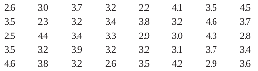
Example 2 : Consider the marks obtained (out of 100 marks) by 30 students of Class IX of a school:
Recall that the number of students who have obtained a certain number of marks is called the frequency of those marks. For instance, 4 students got 70 marks. So the frequency of 70 marks is 4. To make the data more easily understandable, we write it in a table, as given below:
Table 14.1
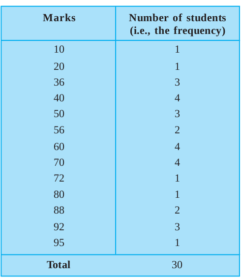
Table 14.1 is called an ungrouped frequency distribution table, or simply a frequency distribution table. Note that you can use also tally marks in preparing these tables, as in the next example.
Example 3 : 100 plants each were planted in 100 schools during Van Mahotsava. After one month, the number of plants that survived were recorded as :
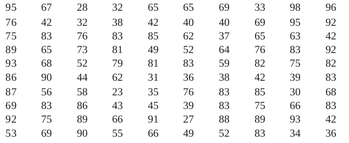
To present such a large amount of data so that a reader can make sense of it easily, we condense it into groups like 20-29, 30-39, . . ., 90-99 (since our data is from 23 to 98). These groupings are called ‘classes’ or ‘class-intervals’, and their size is called the class-size or class width, which is 10 in this case. In each of these classes, the least number is called the lower class limit and the greatest number is called the upper class limit, e.g., in 20-29, 20 is the ‘lower class limit’ and 29 is the ‘upper class limit’.
Also, recall that using tally marks, the data above can be condensed in tabular form as follows:
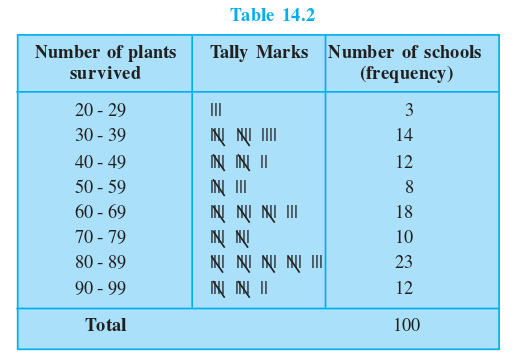
Presenting data in this form simplifies and condenses data and enables us to observe certain important features at a glance. This is called a grouped frequency distribution table. Here we can easily observe that 50% or more plants survived in 8 + 18 + 10 + 23 + 12 = 71 schools.
We observe that the classes in the table above are non-overlapping. Note that we could have made more classes of shorter size, or fewer classes of larger size also. For instance, the intervals could have been 22-26, 27-31, and so on. So, there is no hard and fast rule about this except that the classes should not overlap.
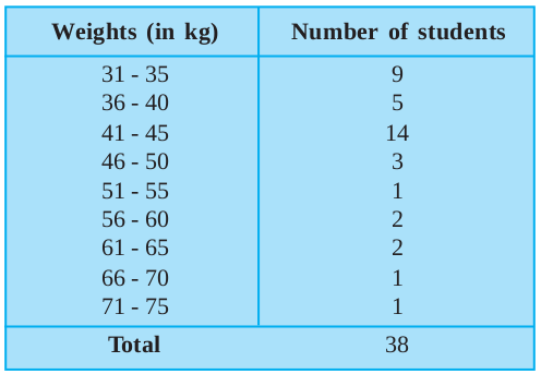
Example 4 : Let us now consider the following frequency distribution table which gives the weights of 38 students of a class:
Table 14.3
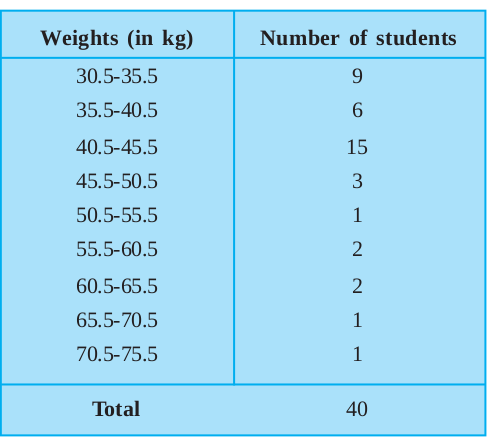
Now, if two new students of weights 35.5 kg and 40.5 kg are admitted in this class, then in which interval will we include them? We cannot add them in the ones ending with 35 or 40, nor to the following ones. This is because there are gaps in between the upper and lower limits of two consecutive classes. So, we need to divide the intervals so that the upper and lower limits of consecutive intervals are the same. For this, we find the difference between the upper limit of a class and the lower limit of its succeeding class. We then add half of this difference to each of the upper limits and subtract the same from each of the lower limits.
For example, consider the classes 31 - 35 and 36 - 40.
The lower limit of 36 - 40 = 36
The upper limit of 31 - 35 = 35
The difference = 36 – 35 = 1
So, half the difference = = 0.5
= 0.5
So the new class interval formed from 31 - 35 is (31 – 0.5) - (35 + 0.5), i.e., 30.5 - 35.5.
Similarly, the new class formed from the class 36 - 40 is (36 – 0.5) - (40 + 0.5), i.e., 35.5 - 40.5.
Continuing in the same manner, the continuous classes formed are:
30.5-35.5, 35.5-40.5, 40.5-45.5, 45.5-50.5, 50.5-55.5, 55.5-60.5, 60.5 - 65.5, 65.5 - 70.5, 70.5 - 75.5.
Now it is possible for us to include the weights of the new students in these classes. But, another problem crops up because 35.5 appears in both the classes 30.5 - 35.5 and 35.5 - 40.5. In which class do you think this weight should be considered?
If it is considered in both classes, it will be counted twice.
By convention, we consider 35.5 in the class 35.5 - 40.5 and not in 30.5 - 35.5. Similarly, 40.5 is considered in 40.5 - 45.5 and not in 35.5 - 40.5.
So, the new weights 35.5 kg and 40.5 kg would be included in 35.5 - 40.5 and 40.5 - 45.5, respectively. Now, with these assumptions, the new frequency distribution table will be as shown below:
Table 14.4
Now, let us move to the data collected by you in Activity 1. This time we ask you to present these as frequency distribution tables.
Activity 2 : Continuing with the same four groups, change your data to frequency distribution tables.Choose convenient classes with suitable class-sizes, keeping in mind the range of the data and the type of data.
Exercise 14.2
1. The blood groups of 30 students of Class VIII are recorded as follows:
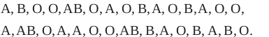
Represent this data in the form of a frequency distribution table. Which is the most common, and which is the rarest, blood group among these students?
2. The distance (in km) of 40 engineers from their residence to their place of work were found as follows:
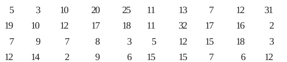
Construct a grouped frequency distribution table with class size 5 for the data given above taking the first interval as 0-5 (5 not included). What main features do you observe from this tabular representation?
3. The relative humidity (in %) of a certain city for a month of 30 days was as follows:
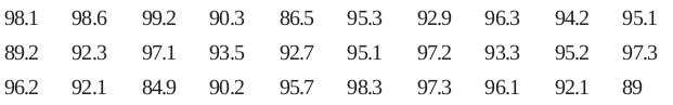
(i) Construct a grouped frequency distribution table with classes 84 - 86, 86 - 88, etc.
(ii) Which month or season do you think this data is about?
(iii) What is the range of this data?
4. The heights of 50 students, measured to the nearest centimetres, have been found to be as follows:
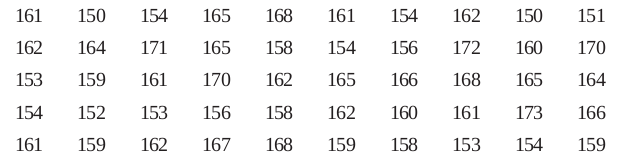
(i) Represent the data given above by a grouped frequency distribution table, taking the class intervals as 160 - 165, 165 - 170, etc.
(ii) What can you conclude about their heights from the table?
5. A study was conducted to find out the concentration of sulphur dioxide in the air in parts per million (ppm) of a certain city. The data obtained for 30 days is as follows:
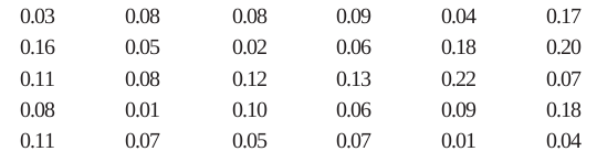
(i) Make a grouped frequency distribution table for this data with class intervals as 0.00 - 0.04, 0.04 - 0.08, and so on.
(ii) For how many days, was the concentration of sulphur dioxide more than 0.11 parts per million?
6. Three coins were tossed 30 times simultaneously. Each time the number of heads occurring was noted down as follows:
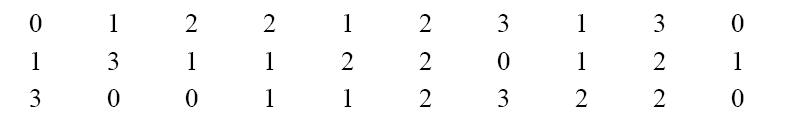
Prepare a frequency distribution table for the data given above.
7. The value of π upto 50 decimal places is given below:
3.14159265358979323846264338327950288419716939937510
(i) Make a frequency distribution of the digits from 0 to 9 after the decimal point.
(ii) What are the most and the least frequently occurring digits?
8. Thirty children were asked about the number of hours they watched TV programmes in the previous week. The results were found as follows:
(i) Make a grouped frequency distribution table for this data, taking class width 5 and one of the class intervals as 5 - 10.
(ii) How many children watched television for 15 or more hours a week?
9. A company manufactures car batteries of a particular type. The lives (in years) of 40 such batteries were recorded as follows:
Construct a grouped frequency distribution table for this data, using class intervals of size 0.5 starting from the interval 2 - 2.5.
14.4 Graphical Representation of Data
The representation of data by tables has already been discussed. Now let us turn our attention to another representation of data, i.e., the graphical representation. It is well said that one picture is better than a thousand words. Usually comparisons among the individual items are best shown by means of graphs. The representation then becomes easier to understand than the actual data. We shall study the following graphical representations in this section.
(A) Bar graphs
(B) Histograms of uniform width, and of varying widths
(C) Frequency polygons
(A) Bar Graphs
In earlier classes, you have already studied and constructed bar graphs. Here we shall discuss them through a more formal approach. Recall that a bar graph is a pictorial representation of data in which usually bars of uniform width are drawn with equal spacing between them on one axis(say, the x-axis), depicting the variable. The values of the variable are shown on the other axis(say, the y-axis) and the heights of the bars depend on the values of the variable.
Example 5 : In a particular section of Class IX, 40 students were asked about the months of their birth and the following graph was prepared for the data so obtained
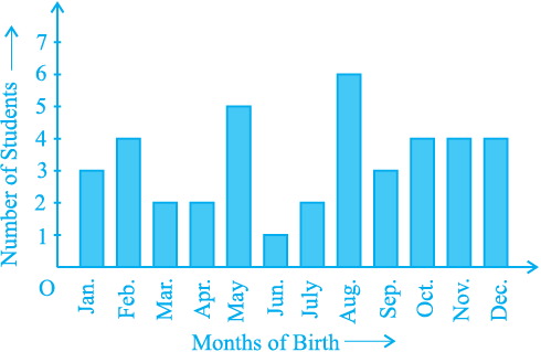
Fig. 14.1
Observe the bar graph given above and answer the following questions:
(i) How many students were born in the month of November?
(ii) In which month were the maximum number of students born?
Solution : Note that the variable here is the ‘month of birth’, and the value of the variable is the ‘Number of students born’.
(i) 4 students were born in the month of November.
(ii) The Maximum number of students were born in the month of August.
Let us now recall how a bar graph is constructed by considering the following example.
Example 6 : A family with a monthly income of Rs 20,000 had planned the following expenditures per month under various heads:
Table 14.5
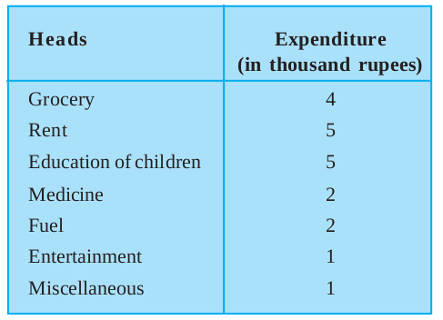
Draw a bar graph for the data above.
Solution : We draw the bar graph of this data in the following steps. Note that the unit in the second column is thousand rupees. So, ‘4’ against ‘grocery’ means Rs 4000.
1. We represent the Heads (variable) on the horizontal axischoosing any scale, since the width of the bar is not important. But for clarity, we take equal widths for all bars and maintain equal gaps in between. Let one Head be represented by one unit.
2. We represent the expenditure (value) on the vertical axis. Since the maximum expenditure is Rs 5000, we can choose the scale as 1 unit = Rs 1000.
3. To represent our first Head, i.e., grocery, we draw a rectangular bar with width 1 unit and height 4 units.
4. Similarly, other Heads are represented leaving a gap of 1 unit in between two consecutive bars.
The bar graph is drawn in Fig. 14.2.
Here, you can easily visualise the relative characteristics of the data at a glance, e.g., the expenditure on education is more than double that of medical expenses. Therefore, in some ways it serves as a better representation of data than the tabular form.
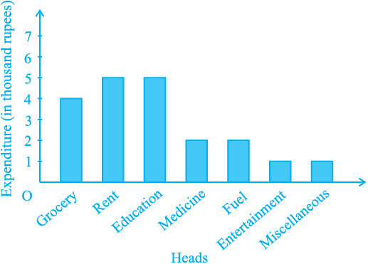
Fig. 14.2
Activity 3 : Continuing with the same four groups of Activity 1, represent the data by suitable bar graphs.
Let us now see how a frequency distribution table for continuous class intervals can be represented graphically.
(B) Histogram
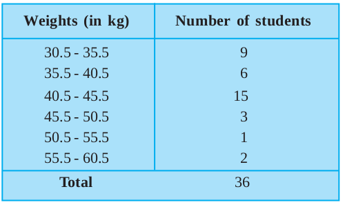
This is a form of representation like the bar graph, but it is used for continuous class intervals. For instance, consider the frequency distribution Table 14.6, representing the weights of 36 students of a class:
Table 14.6
Let us represent the data given above graphically as follows:
(i) We represent the weights on the horizontal axison a suitable scale. We can choose the scale as 1 cm = 5 kg. Also, since the first class interval is starting from 30.5 and not zero, we show it on the graph by marking a kink or a break on the axis.
(ii) We represent the number of students (frequency) on the vertical axison a suitable scale. Since the maximum frequency is 15, we need to choose the scale to accomodate this maximum frequency.
(iii) We now draw rectangles (or rectangular bars) of width equal to the class-size and lengths according to the frequencies of the corresponding class intervals. For example, the rectangle for the class interval 30.5 - 35.5 will be of width 1 cm and length 4.5 cm.
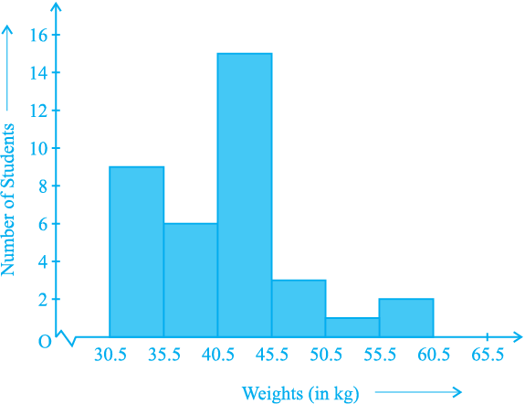
Fig. 14.3
(iv) In this way, we obtain the graph as shown in Fig. 14.3:
Observe that since there are no gaps in between consecutive rectangles, the resultant graph appears like a solid figure. This is called a histogram, which is a graphical representation of a grouped frequency distribution with continuous classes. Also, unlike a bar graph, the width of the bar plays a significant role in its construction.
Here, in fact, areas of the rectangles erected are proportional to the corresponding frequencies. However, since the widths of the rectangles are all equal, the lengths of the rectangles are proportional to the frequencies. That is why, we draw the lengths according to (iii) above.
Now, consider a situation different from the one above.
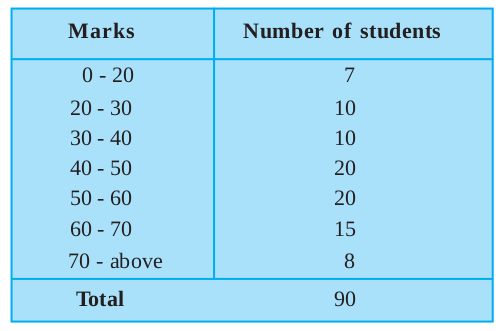
Example 7 : A teacher wanted to analyse the performance of two sections of students in a mathematics test of 100 marks. Looking at their performances, she found that a few students got under 20 marks and a few got 70 marks or above. So she decided to group them into intervals of varying sizes as follows: 0 - 20, 20 - 30, . . ., 60 - 70,
70 - 100. Then she formed the following table:
Table 14.7
A histogram for this table was prepared by a student as shown in Fig. 14.4.
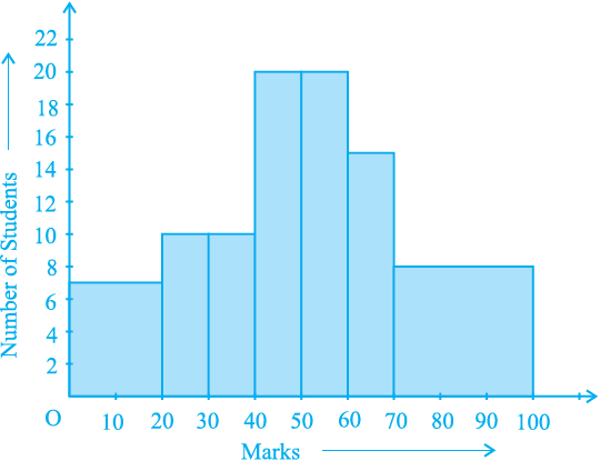
Fig. 14.4
Carefully examine this graphical representation. Do you think that it correctly represents the data? No, the graph is giving us a misleading picture. As we have mentioned earlier, the areas of the rectangles are proportional to the frequencies in a histogram. Earlier this problem did not arise, because the widths of all the rectangles were equal. But here, since the widths of the rectangles are varying, the histogram above does not give a correct picture. For example, it shows a greater frequency in the interval
70 - 100, than in 60 - 70, which is not the case.
So, we need to make certain modifications in the lengths of the rectangles so that the areas are again proportional to the frequencies.
The steps to be followed are as given below:
1. Select a class interval with the minimum class size. In the example above, the minimum class-size is 10.
2. The lengths of the rectangles are then modified to be proportionate to the class-size 10.
For instance, when the class-size is 20, the length of the rectangle is 7. So when the class-size is 10, the length of the rectangle will be
× 10 = 3.5.
Similarly, proceeding in this manner, we get the following table:
Table 14.8
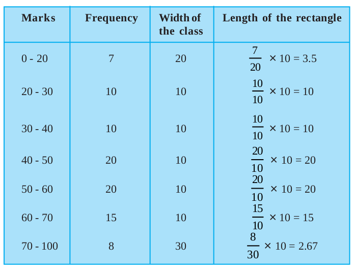
Since we have calculated these lengths for an interval of 10 marks in each case, we may call these lengths as “proportion of students per 10 marks interval”.
So, the correct histogram with varying width is given in Fig. 14.5.
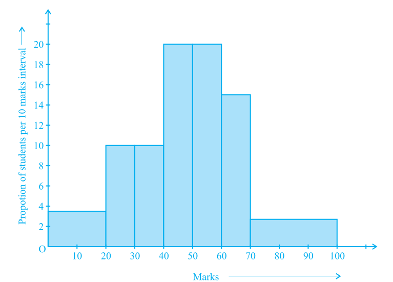
Fig. 14.5
(C) Frequency Polygon
There is yet another visual way of representing quantitative data and its frequencies. This is a polygon. To see what we mean, consider the histogram represented by
Fig. 14.3. Let us join the mid-points of the upper sides of the adjacent rectangles of this histogram by means of line segments. Let us call these mid-points B, C, D, E, F and G. When joined by line segments, we obtain the figure BCDEFG (see Fig. 14.6). To complete the polygon, we assume that there is a class interval with frequency zero before 30.5 - 35.5, and one after 55.5 - 60.5, and their mid-points are A and H, respectively. ABCDEFGH is the frequency polygon corresponding to the data shown in Fig. 14.3. We have shown this in Fig. 14.6.
Although, there exists no class preceding the lowest class and no class succeeding the highest class, addition of the two cslass intervals with zero frequency enables us to make the area of the frequency polygon the same as the area of the histogram. Why is this so? (Hint : Use the properties of congruent triangles.)
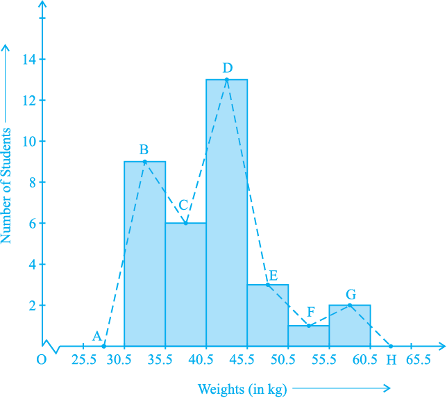
Fig. 14.6
Now, the question arises: how do we complete the polygon when there is no class preceding the first class? Let us consider such a situation.
Example 8 : Consider the marks, out of 100, obtained by 51 students of a class in a test, given in Table 14.9.
Table 14.9
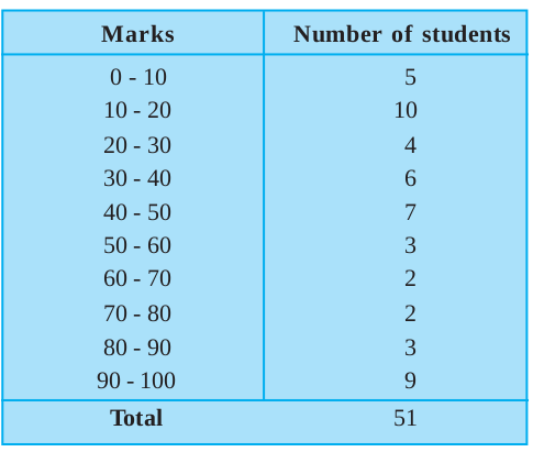
Draw a frequency polygon corresponding to this frequency distribution table.
Solution : Let us first draw a histogram for this data and mark the mid-points of the tops of the rectangles as B, C, D, E, F, G, H, I, J, K, respectively. Here, the first class is 0-10. So, to find the class preceeding 0-10, we extend the horizontal axisin the negative direction and find the mid-point of the imaginary class-interval (–10) - 0. The first end point, i.e., B is joined to this mid-point with zero frequency on the negative direction of the horizontal axis. The point where this line segment meets the vertical axisis marked as A. Let L be the mid-point of the class succeeding the last class of the given data. Then OABCDEFGHIJKL is the frequency polygon, which is shown in Fig. 14.7
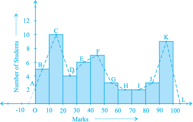
Fig. 14.7
Frequency polygons can also be drawn independently without drawing histograms. For this, we require the mid-points of the class-intervals used in the data. These mid-points of the class-intervals are called class-marks.
To find the class-mark of a class interval, we find the sum of the upper limit and lower limit of a class and divide it by 2. Thus,
Class-mark = 
Let us consider an example.
Example 9 : In a city, the weekly observations made in a study on the cost of living index are given in the following table:
Table 14.10
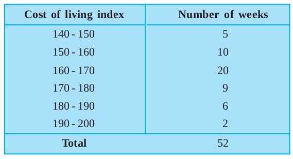
Draw a frequency polygon for the data above (without constructing a histogram).
Solution : Since we want to draw a frequency polygon without a histogram, let us find the class-marks of the classes given above, that is of 140 - 150, 150 - 160,....
For 140 - 150, the upper limit = 150, and the lower limit = 140
So, the class-mark = 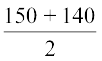 =
=  = 145.
Continuing in the same manner, we find the class-marks of the other classes as well. So, the new table obtained is as shown in the following table:
Table 14.11
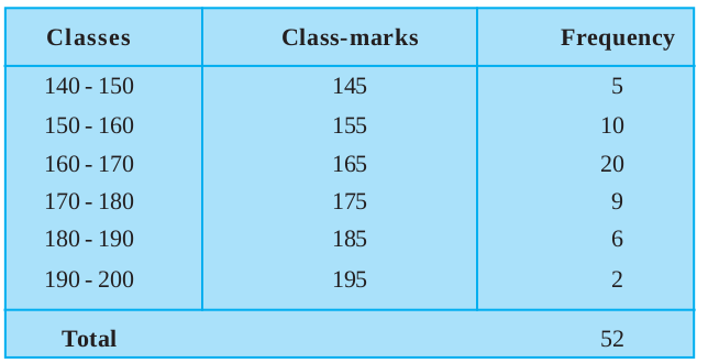
We can now draw a frequency polygon by plotting the class-marks along the horizontal axis, the frequencies along the vertical-axis, and then plotting and joining the points B(145, 5), C(155, 10), D(165, 20), E(175, 9), F(185, 6) and G(195, 2) by line segments. We should not forget to plot the point corresponding to the class-mark of the class
130 - 140 (just before the lowest class 140 - 150) with zero frequency, that is,
A(135, 0), and the point H (205, 0) occurs immediately after G(195, 2). So, the resultant frequency polygon will be ABCDEFGH (see Fig. 14.8).
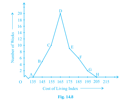
Frequency polygons are used when the data is continuous and very large. It is very useful for comparing two different sets of data of the same nature, for example, comparing the performance of two different sections of the same class.
Exercise 14.3
1. A survey conducted by an organisation for the cause of illness and death among the women between the ages 15 - 44 (in years) worldwide, found the following figures (in %):
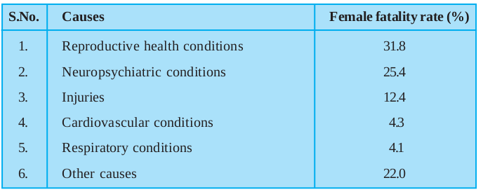
(i) Represent the information given above graphically.
(ii) Which condition is the major cause of women’s ill health and death worldwide?
(iii) Try to find out, with the help of your teacher, any two factors which play a major role in the cause in (ii) above being the major cause.
2. The following data on the number of girls (to the nearest ten) per thousand boys in different sections of Indian society is given below.
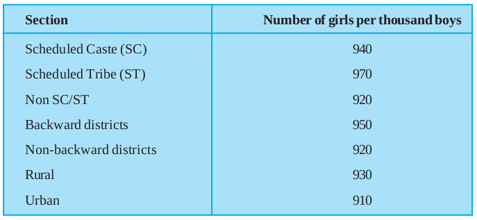
(i) Represent the information above by a bar graph.
(ii) In the classroom discuss what conclusions can be arrived at from the graph.
3. Given below are the seats won by different political parties in the polling outcome of a state assembly elections:
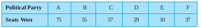
(i) Draw a bar graph to represent the polling results.
(ii) Which political party won the maximum number of seats?
4. The length of 40 leaves of a plant are measured correct to one millimetre, and the obtained data is represented in the following table:
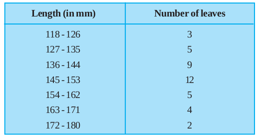
(i) Draw a histogram to represent the given data. [Hint: First make the class intervals continuous]
(ii) Is there any other suitable graphical representation for the same data?
(iii) Is it correct to conclude that the maximum number of leaves are 153 mm long? Why?
5. The following table gives the life times of 400 neon lamps:
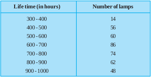
(i) Represent the given information with the help of a histogram.
(ii) How many lamps have a life time of more than 700 hours?
6. The following table gives the distribution of students of two sections according to the marks obtained by them:
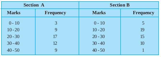
Represent the marks of the students of both the sections on the same graph by two frequency polygons. From the two polygons compare the performance of the two sections.
7. The runs scored by two teams A and B on the first 60 balls in a cricket match are given below:
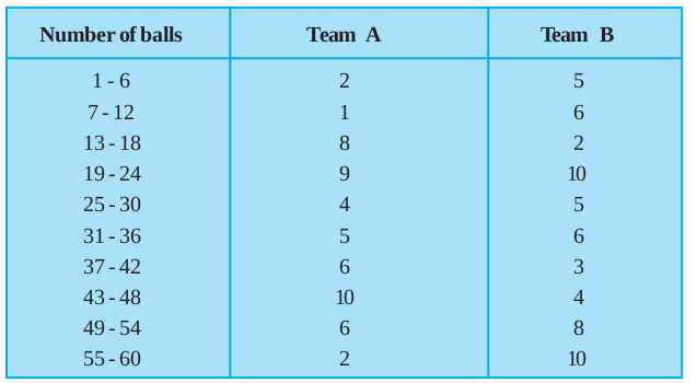
Represent the data of both the teams on the same graph by frequency polygons.
[Hint : First make the class intervals continuous.]
8. A random survey of the number of children of various age groups playing in a park was found as follows:
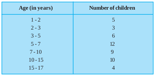
Draw a histogram to represent the data above.
9. 100 surnames were randomly picked up from a local telephone directory and a frequency distribution of the number of letters in the English alphabet in the surnames was found as follows:
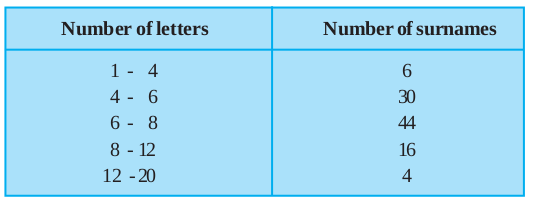
(i) Draw a histogram to depict the given information.
(ii) Write the class interval in which the maximum number of surnames lie.
14.5 Measures of Central Tendency
Earlier in this chapter, we represented the data in various forms through frequency distribution tables, bar graphs, histograms and frequency polygons. Now, the question arises if we always need to study all the data to ‘make sense’ of it, or if we can make out some important features of it by considering only certain representatives of the data. This is possible, by using measures of central tendency or averages.
Consider a situation when two students Mary and Hari received their test copies. The test had five questions, each carrying ten marks. Their scores were as follows:
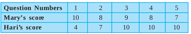
Upon getting the test copies, both of them found their average scores as follows:
Mary’s average score =  = 8.4
= 8.4
Hari’s average score 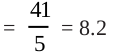
Since Mary’s average score was more than Hari’s, Mary claimed to have performed better than Hari, but Hari did not agree. He arranged both their scores in ascending order and found out the middle score as given below:
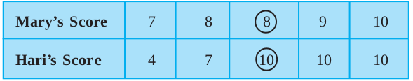
Hari said that since his middle-most score was 10, which was higher than Mary’s middle-most score, that is 8, his performance should be rated better.
But Mary was not convinced. To convince Mary, Hari tried out another strategy. He said he had scored 10 marks more often (3 times) as compared to Mary who scored 10 marks only once. So, his performance was better.
Now, to settle the dispute between Hari and Mary, let us see the three measures they adopted to make their point.
The average score that Mary found in the first case is the mean. The ‘middle’ score that Hari was using for his argument is the median. The most often scored mark that Hari used in his second strategy is the mode.
Now, let us first look at the mean in detail.
The mean (or average) of a number of observations is the sum of the values of all the observations divided by the total number of observations.
It is denoted by the symbol  , read as ‘x bar’.
Let us consider an example.
Example 10 : 5 people were asked about the time in a week they spend in doing social work in their community. They said 10, 7, 13, 20 and 15 hours, respectively.
Find the mean (or average) time in a week devoted by them for social work.
Solution : We have already studied in our earlier classes that the mean of a certain number of observations is equal to  . To simplify our working of finding the mean, let us use a variable xi to denote the ith observation. In this case, i can take the values from 1 to 5. So our first observation is x1, second observation is x2, and so on till x5.
Also x1 = 10 means that the value of the first observation, denoted by x1, is 10. Similarly, x2 = 7, x3 = 13, x4 = 20 and x5 = 15.
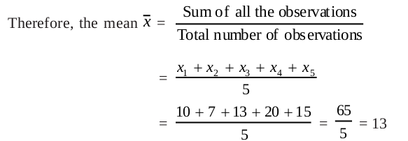
So, the mean time spent by these 5 people in doing social work is 13 hours in a week.
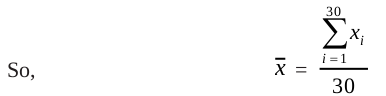
Now, in case we are finding the mean time spent by 30 people in doing social work, writing x1 + x2 + x3 + . . . + x30 would be a tedious job.We use the Greek symbol Σ (for the letter Sigma) for summation. Instead of writing x1 + x2 + x3 + . . . + x30, we write  , which is read as ‘the sum of xi as i varies from 1 to 30’.
Example 11 : Find the mean of the marks obtained by 30 students of Class IX of a school, given in Example 2.
Solution :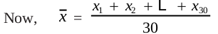
 = 10 + 20 + 36 + 92 + 95 + 40 + 50 + 56 + 60 + 70 + 92 + 88
80 + 70 + 72 + 70 + 36 + 40 + 36 + 40 + 92 + 40 + 50 + 50
56 + 60 + 70 + 60 + 60 + 88 = 1779
So, =  = 59.3
Is the process not time consuming? Can we simplify it? Note that we have formed a frequency table for this data (see Table 14.1).
The table shows that 1 student obtained 10 marks, 1 student obtained 20 marks, 3 students obtained 36 marks, 4 students obtained 40 marks, 3 students obtained 50 marks, 2 students obtained 56 marks, 4 students obtained 60 marks, 4 students obtained 70 marks, 1 student obtained 72 marks, 1 student obtained 80 marks, 2 students obtained 88 marks, 3 students obtained 92 marks and 1 student obtained 95 marks.
So, the total marks obtained = (1 × 10) + (1 × 20) + (3 × 36) + (4 × 40) + (3 × 50)
+ (2 × 56) + (4 × 60) + (4 × 70) + (1 × 72) + (1 × 80)
+ (2 × 88) + (3 × 92) + (1 × 95)
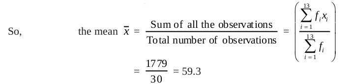
= f1x1 + . . . + f13x13, where fi is the frequency of the ith entry inTable 14.1.
In brief, we write this as  .
.
So, the total marks obtained =
= 10 + 20 + 108 + 160 + 150 + 112 + 240 + 280 + 72 + 80 + 176 + 276 + 95
= 1779
Now, the total number of observations
= 
= f1+ f2+ . . . + f13
= 1 + 1 + 3 + 4 + 3 + 2 + 4 + 4 + 1 + 1 + 2 + 3 + 1
= 30
This process can be displayed in the following table, which is a modified form of Table 14.1.
Table 14.12
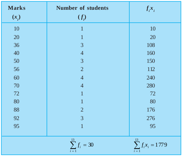
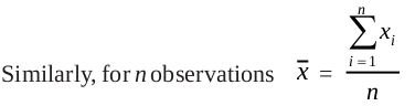
Thus, in the case of an ungrouped frequency distribution, you can use the formula
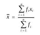
for calculating the mean.
Let us now move back to the situation of the argument between Hari and Mary, and consider the second case where Hari found his performance better by finding the middle-most score. As already stated, this measure of central tendency is called the median.
The median is that value of the given number of observations, which divides it into exactly two parts. So, when the data is arranged in ascending (or descending) order the median of ungrouped data is calculated as follows:
(i) When the number of observations (n) is odd, the median is the value of the  observation. For example, if n = 13, the value of the
  th, i.e., the 7th observation will be the median [see Fig. 14.9 (i)].
(ii) When the number of observations (n) is even, the median is the mean of the  th and the
  th observations. For example, if n = 16, the mean of the values of the
  th and the
  observations, i.e., the mean of the values of the 8th and 9th observations will be the median [see Fig. 14.9 (ii)].
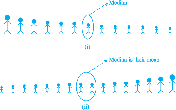
Fig. 14.9
Let us illustrate this with the help of some examples.
Example 12 : The heights (in cm) of 9 students of a class are as follows:

Find the median of this data.
Solution : First of all we arrange the data in ascending order, as follows:

Since the number of students is 9, an odd number, we find out the median by finding the height of the 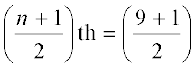 th = the 5th student, which is 149 cm.
So, the median, i.e., the medial height is 149 cm.
Example 13 : The points scored by a Kabaddi team in a series of matches are as follows:

Find the median of the points scored by the team.
Solution : Arranging the points scored by the team in ascending order, we get

There are 16 terms. So there are two middle terms, i.e. the  and
and  th, i.e., the 8th and 9th terms.
So, the median is the mean of the values of the 8th and 9th terms.
i.e, the median =  = 12
= 12
So, the medial point scored by the Kabaddi team is 12.
Let us again go back to the unsorted dispute of Hari and Mary.
The third measure used by Hari to find the average was the mode.
The mode is that value of the observation which occurs most frequently, i.e., an observation with the maximum frequency is called the mode.
The ready made garment and shoe industries make great use of this measure of central tendency. Using the knowledge of mode, these industries decide which size of the product should be produced in large numbers.
Let us illustrate this with the help of an example.
Example 14 : Find the mode of the following marks (out of 10) obtained by 20 students:

Solution : We arrange this data in the following form :

Here 9 occurs most frequently, i.e., four times. So, the mode is 9.
Example 15 : Consider a small unit of a factory where there are 5 employees : a supervisor and four labourers. The labourers draw a salary of Rs 5,000 per month each while the supervisor gets Rs 15,000 per month. Calculate the mean, median and mode of the salaries of this unit of the factory.
Solution : 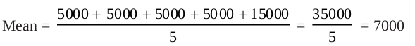
So, the mean salary is Rs 7000 per month.
To obtain the median, we arrange the salaries in ascending order:
5000, 5000, 5000, 5000, 15000
Since the number of employees in the factory is 5, the median is given by the 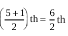 = 3rd observation. Therefore, the median is Rs 5000 per month.
To find the mode of the salaries, i.e., the modal salary, we see that 5000 occurs the maximum number of times in the data 5000, 5000, 5000, 5000, 15000. So, the modal salary is Rs 5000 per month.
Now compare the three measures of central tendency for the given data in the example above. You can see that the mean salary of Rs 7000 does not give even an approximate estimate of any one of their wages, while the medial and modal salaries of Rs 5000 represents the data more effectively.
Extreme values in the data affect the mean. This is one of the weaknesses of the mean. So, if the data has a few points which are very far from most of the other points, (like 1,7,8,9,9) then the mean is not a good representative of this data. Since the median and mode are not affected by extreme values present in the data, they give a better estimate of the average in such a situation.
Again let us go back to the situation of Hari and Mary, and compare the three measures of central tendency.
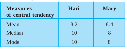
This comparison helps us in stating that these measures of central tendency are not sufficient for concluding which student is better. We require some more information to conclude this, which you will study about in the higher classes.
Exercise 14.4
1. The following number of goals were scored by a team in a series of 10 matches:

Find the mean, median and mode of these scores.
2. In a mathematics test given to 15 students, the following marks (out of 100) are recorded:

Find the mean, median and mode of this data.
3. The following observations have been arranged in ascending order. If the median of the data is 63, find the value of x.

4. Find the mode of 14, 25, 14, 28, 18, 17, 18, 14, 23, 22, 14, 18.
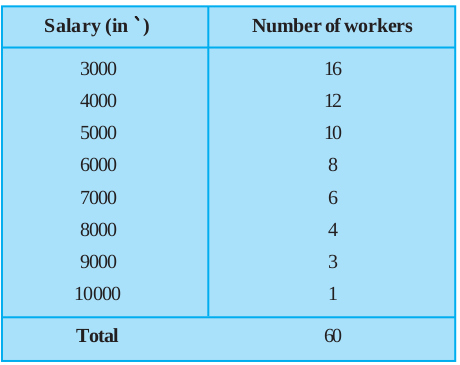
5. Find the mean salary of 60 workers of a factory from the following table:
6. Give one example of a situation in which
(i) the mean is an appropriate measure of central tendency.
(ii) the mean is not an appropriate measure of central tendency but the median is an appropriate measure of central tendency.
14.6 Summary
In this chapter, you have studied the following points:
1. Facts or figures, collected with a definite purpose, are called data.
2. Statistics is the area of study dealing with the presentation, analysis and interpretation of data.
3. How data can be presented graphically in the form of bar graphs, histograms and frequency polygons.
4. The three measures of central tendency for ungrouped data are:
(i) Mean : It is found by adding all the values of the observations and dividing it by the total number of observations. It is denoted by  .
.
So, 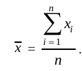 For an ungrouped frequency distribution, it is
 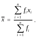 .
.
(ii) Median : It is the value of the middle-most observation (s).
If n is an odd number, the median = value of the  th observation.
If n is an even number, median = Mean of the values of the 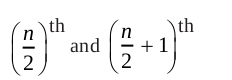 observations.
(iii) Mode : The mode is the most frequently occurring observation.