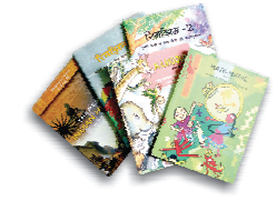
Table of Contents
UNIT I
FOUNDATIONS OF GRAPHIC DESIGN
The term graphic design refers to a number of artistic and professional disciplines which focus on visual communication and presentation. Various methods are used by combinedsymbols, images and words to create a visual representation of ideas and messages. A graphic design uses typography, visuals and layout techniques in varying degrees toproduce the final result. It often refers to both the process (designing) by which the communication is created and the products (designs) which are generated.
A work might include a logo or other artwork, organisedtext and pure design principles and elements such as shapes, colour, balance, harmony which unify the piece. Composition is one of the most important features of graphicdesignespecially when utilising pre-existing material or using diverse elements.
Chapter 1
INTRODUCTION TO GRAPHIC DESIGN
When we look around we find that we are surrounded by a number of pictures, photos and images. These visuals are various forms of graphic design. Graphic design is part of our dailylife from simple things such as postal stamps to huge hoardings and advertisements on clothes, etc. Graphic design makes it easier to interact and communicate, stimulate mind,attract attention and provide information to the user in an aesthetically elegant manner. Graphic design is a major component of visual communication and it comprises a variety ofcommunication medium and strategies in order to convey a visual message to the target audience. These visuals are representations of thoughts, emotions, ideas and reality.
Whilecommunicating, if a person communicates using a language, then it is termed as 'verbal communication'. Radiobroadcast and loudspeaker announcements are very goodexamplesof verbal communication. But if someone does not use a language and uses some other medium to communicate then it is called 'non-verbal communication'. Non-verbalcommunication takes place through visual images, logos, newspaper advertisements as well as other media such as music, dance, body gestures or acting. Films, television,theatre, animation, multimedia and the internet are some of the examples where verbal as well as non-verbal mediums of communication are successfully combined.
Amongnon-verbal medium of communication, visual media is the most widely used media. Graphic design deals mainly with visual communication. Contemporary graphic designpracticehas been engaged in digital technology also. Today most graphic designers are working in new areas, viz. new media, interaction design, information architecture and graphical user interface (GUI) design. Therefore, a contemporary graphic designer requires a range of technical skills, aesthetic sense, an imaginative mind and creativity. You might,however, still be wondering what graphic design really is?
Graphic design is everywhere
The sun rises…
The birds chirp…
… Eyes open…
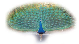
Figure 1.1 A peacock having beautiful patterned design on its feath
You get up on the bed and see newspaper headlines (typography- graphic design!)
You have breakfast and you see a 'logo' on the milk pack (once again graphic design!)
You drive a bike and see the 'traffic signs on the road! (Graphic design)
You open your computer and click on the 'icon' (graphic design again)
... And it goes on...
Figure 1.2 A digital clock
Graphic design has merged with our lifestyle in a big way.
From the moment we get up in the morning till the time we go to sleep in the night, we are surrounded by graphic designs.
Graphic design makes things intelligible
We wake up in the morning and see the time in the clock. Readability of numbers, colour of the dial, everything has an impact on us. Then we want information and read a newspaper.News flows through all the pages of a newspaper with appropriate attention to text, type sizes and layout.
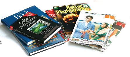
Figure 1.3 Books, magazines and newspaper have text and visuals
Can you imagine a newspaper with text scattered everywhere without any columns or layouts? Graphic design makes understanding simpler, organised and better. Graphic design has always contributed and impacted society in a constructive way by helping people to create a clear and imaginative visual communication. It helps to relate tendencies of people amongst each other, with culture, economics and social lives and thus creating awareness about environment and society. Can you imagine if an instruction booklet is not provided how will you operate a new device?
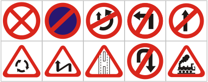
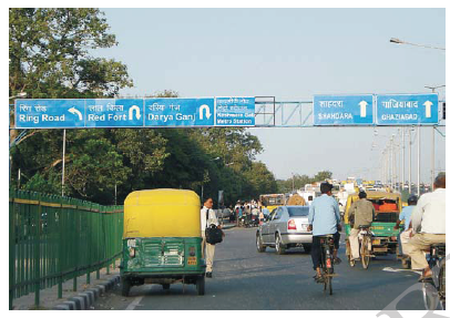
Figure 1.4 Traffic symbols should also have their meanings. Road signs provide information to follow
Graphic design provides safety
You step out of your house and see so many graphic images around you—a poster on the nearby wall, bill board and neon signs on the nearby shop, and many other signages and symbols. Do you know how many accidents will take place if the road signage does not exist?
The earliest road signs were milestones, showing distance or directions; for example, the Romans erected stone columns throughout their empire showing the distance to Rome. In the Middle Ages, multi-directional signs at intersections of roads became common. The basic patterns of most traffic signs were set at International Road Congress conference in 1908 in Rome. Since then there have been considerable changes in their design to make them more user friendly and meaningful.
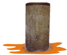
Figure 1.5 Roman Milestone
Now it is very common in countries to install signage, known as traffic signs or road signs, at the side of the roads to give information to commuters. As different people speak,vread and write different languages which can create barriers in understanding the written words and therefore uniform and similar looking international signs using symbols in place of words have been developed and adopted in most countries.
From road signs to technical r e p o r t s , from i n t e r - o f f i c e memorandums to reference manuals, graphic design enhances transfer ofinformation. Readability is enhanced by improving the visual presentation of text. Graphic design makes life convenient as it makesinformation more accessible and understandable. How many people will be lost if directional signage does not exist?
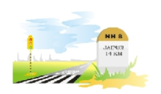
Figure 1.6 Signals of different colours give different instructions. Zebra crossing is used by pedestrians to cross the road safely.
Milestones or the indicators of distance on Indian highways have white background with a yellow or green top. The names of cities anddistances are painted in black. The names of nearest towns and cities are written along with distance in kilometres. On undividedhighways, both sides of the milestones are used, the distance to the nearest cities in both directions. The head of the milestonehas the highway number written on it. The side of the milestone has a number that indicates the distance covered by thecommuterand the remaining distance. With changing times, new generations of traffic signage with an intelligent information systemsrebeing developed. indicating Today, the signages are designed using various types of materials suitable even for night vision and low-light visibility.
Graphic design and identity
It is evident that human beings have been relating to forms and symbols from primitive times and it helped them build upassociation and identity. From earlier times people are using flags to exhibit their identity. A flag is a piece of cloth, oftenflown from a pole or mast, generally used as a symbolic tool for signalling or identification. This was especially usedwhere communication was difficult otherwise and still are used for signalling by railways, ships, even on airport runways including project, institution and national identity.
Flags were invented and first used by ancient Indians. The usage of flags spread from India and China to neighbouring Burma, Thailand and south-eastern Asia. Flags are also adopted by socio-cultural institutions or groups to represent religion, associations, sports and so on and so forth. Institutions and organisations represent their ideologies through flags. In fact, every institution is formed on certainstrong thoughts and principles that need to be communicated to gain trust of people and establish their identity through flags.
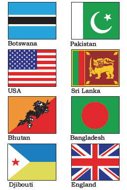
Figure 1.7 Flags of different countries
National flags are patriotic symbols and have colours with varied wide-ranging interpretations. Many national flags and other flags havesymbolic designs, reference or patterns. Flags are usually rectangular in shape (often in the ratio of 3:2 or 5:3), and of any shape orsize that is suitable for flying, including square, triangular, or swallow tailed and usually in sets of different colours.
Logos are another formof identity. We find ourselves surrounded by different logos, symbols and brands. Graphic designs have a unique ability to sell aproductor idea through effective visual communications. It is widely used in designing company identity using logos, text and colour.Branding has increasingly become important in the corporate sector and industry. When you go to market, you have various choices
available for buying a product but there will be a few which will attract your attention, because of its attractive design and packaging.Packaging design is a part of graphic design which also has an important role in identification.

Figure 1.8 National Flag of India
The Indian National Flag is the symbol of the land and people of India. Our National Flag is a tricolour panel made up of three rectangular panels or sub-panels of equal widths. The colour of the top panel is India saffron and that of the bottom is India green. The middlepanel is white, bearing at its centre the design of the Ashoka Chakra in navy blue colour with 24 equally spaced spokes. The Ashoka Chakra is visible on both sides of the Flag in the centre of the white panel. The Flag is rectangular in shape with the ratio of thelength to the heigh (width) being 3: 2.
Dr S. Radhakrishnan explained about the National Flag in the Constituent Assembly which adopted it, '' or the colour denotes renunciation or disinterestedness. The white in the centre is light, the path of truth to guide ourconduct. The green shows our relation to the soil, our relation to the plant life here on which all other life depends. The Ashoka Wheel isthe wheel of the law of . Truth or , or virtue ought to be the controlling principles of those who work under this flag. Again, the wheel denotesmotion. There is life in movement. India must move and go forward.''
'Logo' is a symbolic visual/textual representation of the ideology and principles of an organisation. Logotype is a logo designed by using letterforms or typefaces.
Figure 1.9 Logos of different international organisations
Graphic design expresses and informs
Every signage on the road side calls you and tries to capture your attention. In fact, literate as well as illiterate people are equally benefited by visual information or graphics. You step into a bus or a train and you will see lots of information surrounding you. Providing information about everything from shops, malls and doctors to festivals and cultural programmes in the city or town is done through graphics. Graphics are useful in providing information during natural calamities, earthquakes, disasters and even during a war.

Figure 1.10 AIDS (Acquired Immune Deficiency Syndrome)
Graphics are used in textbooks of all subjects and particularly in geography, science, language, history and mathematics to illustrate theories and concepts. Common examples of graphics in books are maps and diagrams. Graphic design is also used in designing of educational materials to make the instructional material more accessible, interesting and more easily understandable.
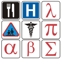
Figure 1.11 Institutional and mathematical signs
Graphic design combined with visual communication with user interaction makes information seeking a fascinating experience through aesthetically designed interactive websites. Websites create both the look and feel and enhance online experience to a web user. Every page of a website is full of icons. You click an icon in search of information and a whole world of information opens up in front of you. The further you search the more information you get. It has become important to understand the intricacies of the digital medium with translation of graphic ideas into experiential ideas.
Figure 1.12 Textual material with graphics
Design is not just about creating beautiful images, it generates new thoughts, provokes mind, creates or changes mindset and ultimatelychanges people and society.
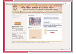
Figure 1.13 Home page of the website of NCERT with interactive icons and visuals
The primary requirement for graphic designing is a creative mind. Observation, critical thinking and analytical thinking enhance graphic design capabilities. Traditional tools such as pencil, pen and brush are absolutely important. Apart from that, contemporary graphic design requires understanding of digital tools and technology. Selection of appropriate tools to address communication solution at hand is also a key skill in graphic design, and surely a defining factor for aesthetically appealing design.
Exercises
1. Explain the difference between verbal communication and non-verbal communication giving some examples.
2. How do you think graphic design helps in providing safety?
3. Graphic design contributes to design identities. Discuss.
Practicals
Collect images of at least twenty logos. Select five symbols that you like the most and analyse their graphic features.

