Table of Contents
Chapter 3
ELEMENTS AND PRINCIPLES OF GRAPHIC DESIGN
Graphic design is about representation of ideas and conceptsfor communication or expression. It requires a visual medium of representation. A graphic design communicates through the visual language of dots, lines, shapes and colours. When we write something on a paper with black ink we 'read' it because we see it first and then understand the meaning. Reading is nothing but first and foremost, a visual perception. Similarly, when we see a beautiful painting, it is a visual perception. Visual perception has two basic components. Firstly, there should be some material medium such as the white surface of a paper, or black ink, colours that result into dots, lines, shapes and so on. This material is called 'medium' in graphic design. Material medium is a vehicle of visual perception. Secondly, visual perception happens through the eyes and, therefore, visual sensitivity is very important. Material medium and visual sensitivity, both play an important role in graphic design.
Any random scribbling of ink on paper is not called writing. Similarly, any random splash of colour on paper is not called a beautiful picture. Therefore, a disciplined or proper visual arrangement is required. Dots, lines, shapes, forms, colours are the basic elements of graphic design without which graphic design is not possible. Similarly, there are time-tested rules or laws of arrangement of these elements so that they will look beautiful and will be effective. These rules are called principles of visual composition. A graphic designer needs to learn and understand the role of basic elements and principles of composition in design. They are the core of graphic design. These elements and principles are discussed in detail here.
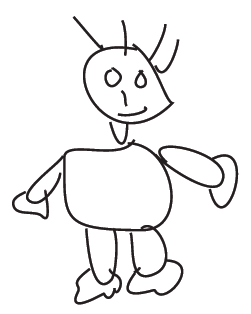
Figure 3.1 Scribbling drawing
Let us first discuss the elements of graphic design followed by principles of composition.
ELEMENTS OF GRAPHIC DESIGN
There are three major categories of these elements.
Basic elements
Relational elements
Intentional elements
BASIC ELEMENTS
Basic elements of composition are abstract concepts. They do not actually exist but seems to be present in a picture or in any visual representation.
Points
In geometry, a point is defined as an entity without length and breadth or an entity without any dimension. In graphic design a point is represented in the form of a dot indicates a position. It is the end or the beginning of a line. Dot has a physical dimension which is a visual representation of an abstract concept also known as 'point'. For example, we feel that there is a point at the angle of a triangle or wherever two lines meet. This point is a basic element of design.
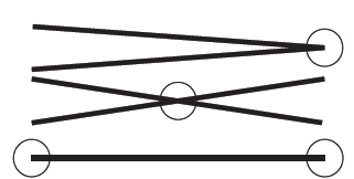
Figure 3.2 Points
There is another interesting notion related to a 'dot'. Assume that there is a bird sitting on a tree or near your window. You can see the bird in detail. When it starts flying and goes away from you, all the details get blurred and you just see a shape of a flying bird. As it goes further and further then even the shape also gets blurred and finally you see a 'dot'. This dot need not be round in shape. It can have the shape of a
flying bird reduced to its limits of recognition. It appears as a 'dot'. Therefore, a 'dot' can have any desired shape.

Figure 3.3 Dots of various thickness
Line
A line is defined as a one-dimensional entity having length but no breadth. In graphic design, it is metaphorically defined as 'a line is a dot gone for a walk', that is, a line is a point in motion. However, in graphic design a line is depicted where it has length as well as breadth. A line can be thin or thick. It can have many variations in thinness and thickness.
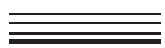
Horizontal straight lines of varying thickness
Thinness or thickness of line creates a visual impact. A thick line appears heavy and a thin line appears lighter in a visual composition. Lines can be of various types. They can be straight, curved, zigzag, decorative, ornamental, vertical, horizontal, inclined, random or showing free movement. Each type of line will create a visual impact. If lines are grouped together then they will create even more visual impact.

Figure 3.4 Lines of different characteristics
Straight horizontal lines create a feeling of calmness. Horizontal lines are stable. Vertical lines appear dynamic and may also suggest upward mobility. Inclined lines are unstable but may suggest growth or decay depending on the context of use. Curved lines create various types of rhythmic movements while zigzag lines create a feeling of harshness. Decorative and ornamental lines create an impact of Indian tradition. In all the above cases, thickness and thinness of lines will either increase the visual impact or reduce the impact.
Activity 1
Collect images or photographs of lines from news papers. Briefly describe the character and impact of lines in the collected images.
Therefore, depiction of line in graphic design is not just a representation of an abstract concept of a line but it is a representation of emotions, expression as well as a visual impact.
Plane
A plane is defined as an entity with length and breadth but no depth. It is a two-dimensional flat or level surface.

Figure 3.5 Visual plane of three - dimensional object
Space
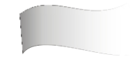
Figure 3.6 Visual effect of three-dimensional space by tonal variation
Space is defined as an infinite expansion. It is also defined as a collection of points in three dimensions. However, in graphic design space is defined in terms of its visual representation in a composition. Using the other elements of design such as lines, colours and forms, it is possible to create an illusion of three-dimensional spaces or volume on two-dimensional surfaces. Similarly, a physical space as well as conceptual (or mental) space can be represented in a composition.

Figure 3.7 Visual effect of three-dimensional space by variation in size of trees, their reflection, tonal variation and also
colour variation
Shape
A shape is a contour or well-defined outline of a two-dimensional form. In the case of a three-dimensional form, a shape will be the skeleton of a form. In the figurative drawings of humans, natural things or man-made objects initially shape, i.e., contours or outlines are depicted.

Figure 3.8 Two and three - dimensional basic forms
Form
Any shape, outline or structure of anything like the body of a person, animal, tree, leaf or object is defined as 'form'. Form is defined in two ways. In graphic design, form is understood as one of the basic elements of visual composition as well as the whole visual composition is also considered as having a form . As a basic element of composition form is defined as a 'meaningful'. A shape is just an outline, but when
it is filled with some colour, texture or gradation it becomes 'meaningful' as well as it creates an illusion of three dimensions. In such cases a shape becomes a 'form'. Form also becomes 'meaningful' due to its position in the visual composition or its placement in the composition. Similarly, a form becomes 'meaningful' due to its relationship with otherbasic elements, viz. dots, lines, color and other forms in the composition.
Figure 3.9 Three-dimensional form
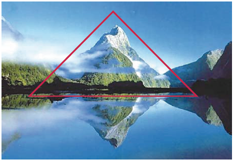
Figure 3.10 Form as composition, t he whole composition is treated as a form as well as the mountain inside the red triangle is also treated as an individual form
Whole composition is considered as a 'form', when the overall visual impact of a composition is 'meaningful'. In this case, the overall impact is the cumulative result of all the basic elements and their arrangement in a composition. Also, it is the result of the overall relationship of each part of the composition to the whole. In both cases, form as a basic element as well as a whole, a 'form' becomes 'meaningful' since, it generates a psychological impact in creating mood, emotions and feelings in the minds of the audience. Apart from this a form creates an impact if it has some unique features. In such cases the audience recognise the form easily and remember it for a longer duration.
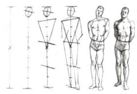
Figure 3.11 Basic form is also understood as a basic structure as indicated with lines in above figures
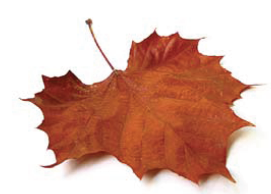
Figure 3.12 An irregular form of a leaf
In graphic design written text that is made up of typefaces is also treated as form. Each word and sentence has a meaning in a particular language but apart from that, the word or sentence itself is treated as a visual form in a visual composition. You can achieve maximum impact from a word or sentence if its linguistic meaning and their visual treatment in a composition are complementary to each other.
Colour
Colour is the basic and core attribute of visual perception and therefore it is the most effective element of graphic design. Can you imagine a world made up of only black, white and grey shades? Colour is studied in physics, psychology, cultural studies and many other disciplines of knowledge. In fine arts and graphic design, colour is studied to understand its visual properties such as hue, luminosity (intensity) and value.
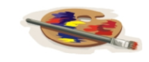
Figure 3.13 A palate is used to mix colours with brush to get appropriate combination, tint, tone or shade of colours
Grey scale
Grey scale is an ordered arrangement of white, black and various tones generated by mixing of white and black in different proportions. When black and white are mixed in equal proportions then the resultant tone is called 'grey' or 'medium grey'. If there is more amount of white and less black then the resultant tone is called 'tint' or 'light grey'. If there is less white and more amount of black, then the resultant tone is called a 'shade' or 'dark grey'.

Figure 3.14 Grey scale
Hue

Figure 3.15 Colour hue
Hue is a unique quality of colour by which a particular colour is identified. Due to this quality, eyes can differentiate one colour from the other. The colour 'red' is called red because eyes recognise the quality called 'redness' of the colour. The same applies to other colours also.
Value

Figure 3.16 Colour Value
Value is a relative darkness or lightness of a colour hue in relation to a grey scale. Blue colour with light value comparable with light grey values on the grey scale as shown in the image.
Luminosity

Figure 3.17 Colour luminosity
Luminosity is the brightness or freshness of a colour hue. When a colour hue is pure, it is brightest. When a colour hue is mixed with other colour hue or black or white, it loses its purity and brightness. Graphic designers always try to preserve the luminosity of the colour hue. If you go on mixing again and again with different colour hues then finally the resultant colour will be dull. Green colour with maximum luminosity on the left side of the rectangle decreases luminosity as it is mixed with blue colour towards right side of the rectangle as shown
in the image.
Texture

Figure 3.18 Various types of texture
A visual texture is the characteristic of a surface that creates an experience or the feeling of touch in a visual composition. Many a time designers create an illusion of a tactile experience. This is termed as simulated texture or implied texture. Designers work with simulated texture as well as real texture or both. When we run our fingers over a stone or a bark of a tree, we experience the tactile feeling. The tactile experience could be smooth or rough and most of the time it is very difficult to express it in words. Designers create such tactile experience through their designs by using colours and any available material on a particular surface. Designers also try to generate the same effect or an illusion of the same tactile feel by using colours alone. People appreciate designer's skill in creating such an experience or creating illusion. Texture also helps in creating and enhancing subtle feeling and mood.
RELATIONAL ELEMENTS
This group of elements governs the placement and interrelationship of the basic elements such as dot, line and form in a visual composition to enhance the visual impact of the composition.

Figure 3.19 Relational elements
Activity 2
On a white paper take impressions of interesting textures from your surroundings. For this, first select a surface in your surroundings, then cover it with the white paper and with a colour pencil, gently scratch over the paper and try to capture the impression of the surface texture. Now collect at least twenty such interesting impressions and make a composition out of it. Each impression should be at least 3 cm by 3 cm in size. Size of the composition should be 10 cm by 15 cm.
Activity 3
Collect different materials having different texture surfaces and then make a composition out of them. Size of the composition should be 10 cm by 15 cm.
Alignment
When a group of elements in a composition are arranged in a vertical or horizontal manner in such a way that they fall in line, then this arrangement is called alignment. The elements can be arranged in a diagonal manner also.

Figure 3.20 Aligned figure
Direction
It is an arrangement of basic elements of graphic design that helps in organising various elements in the composition. It can be parallel or angular arrangement. Direction is perceived always with reference to the observer, with reference to the frame that contains it or with reference to the other major forms in the context.
Visual Thrust
It is an arrangement of graphic elements that helps or guides the audience's eyes to move in a desired way in the composition. It literally forces viewers to move in the expected direction. Above mentioned directional elements contribute to generate visual thrust. It is also termed as visual momentum.
Figure and Ground
Visual elements in a composition occupy space. The space occupied by the majority of visual elements is called positive space and rest of the space in the composition is negative space.
Figure 3.21 Negative and positive space. Here figures constitute the positive space while white background is treated as a
negative space
Visual Gravity

Figure 3.22 Visual gravity created by varied thickness of lines
All of us experience earth's gravity and associate heaviness or lightness with it. Thus, the notion of gravity is established in our mind. In the context of visual composition we tend to attribute the notion of gravity in terms of visual heaviness or lightness, stability or instability to individual elements or group of elements in the composition. Therefore, big shapes in the lower part of the composition appear heavier and small shapes in the upper part appear lighter in the composition. Visual gravity is also termed as visual weight.
INTENTIONAL ELEMENTS
All designs have some purpose or an intention. Graphic works make an impact on the target audience. For example, an advertisement in a newspaper not only communicates the information but because of appropriate graphics makes an impact. This is possible due to the proper use of intentional elements. There are three types of intentional elements: Aesthetic, Content and Function.

Figure 3.23 Form as a meaningful element in a composition
Aesthetic
When a concept or an idea derived from nature is expressed using dots, line colour, texture, shapes, etc. it is called representation. The representation of a concept or natural forms is called realistic if it is depicted as it is. It is called stylised if the representation is decorative and ornamental. If the representation eliminates unnecessary details and representation is minimal then it is called abstract. All the styles produce distinctive visual and thematic impact.

Figure 3.24 The Scream, Edvard Munch 1893, National Gallery, Oslo. The figures in the composition are aligned following
direction by the railing and the whole painting create a visual thrust. Also all the lines create a visual thrust to support
the emotions expressed in the painting.
Activity 4
Collect images or photographs from magazines and newspapers and classify them according to various aesthetic styles.
Content
A message or a theme of the design is called the content. The theme can be historical, socio-cultural, eco-friendly, or scientific and so on.
Activity 5
Collect images or photographs from magazines and newspapers and classify them according to the categories of content.
Function

Figure 3.25 Science kit is designed to keep the tools and other material used in conducting experiments in class
It is the purpose or application of the design to deliver results. Design can be informative, for instance, it can create awareness about something or provide information about something. Design can be expressive, i.e., it can be used to express thoughts or emotions. In that case the function of the design will be termed as expressive function. Sometimes graphic design is used for giving instructions to operate an instrument or machine or a kit, viz., science kit. Graphic design is used to design a textbook, instructional manual, educational CD-ROM, or it can be used as a teaching tool. In all such cases the function of graphic design is instructive function. In advertisements, many a time graphic design is used to create an impact. It does not have any specific function as discussed above; creating impact itself is the utilitarian function of graphic design in such advertisements.
PRINCIPLES OF GRAPHIC DESIGN
There are several principles of design that have evolved over a period of time. Understanding and practical application of these principles is varied and diverse depending on the designer's attitude and overall approach. These principles are used in various fields, viz., graphic design, industrial design, fine arts, and architecture. They are understood and interpreted according to the need of the profession. However, there is a certain consensus among practising designers across all the disciplines about their nature and utility. Some of the definitions of these principles are accepted and shared across all the disciplines. By and large it is agreed that they are generic principles related to design sensitivity and designers use them to arrange or organise the basic elements of design so that overall composition looks appealing. These principles govern the relationship among various components and basic elements of design. These are the principles of aesthetic arrangement of components of design. They also govern the relationship of parts of design to the overall design. Successful application of these principles helps a designer to achieve the purpose of graphic composition and visual goals.

Visual Balance
In any work of art or design the consideration of form, i.e., overall structure and its relationship with individual components, fitness and unity has become a great source of beauty. Every work of art or design supposes unity of graphical basic elements, depicted by the artist or designers in the composition. The beauty or elegance of design is considered as the expression of design emerging out of principles of design such as balance, unity, consistency along with careful implementation of variety with rhythm.
Balance
Humans always experience balance in everyday life, for example, riding a bicycle. It is used for controlling gravity. Graphic designers apply same principle to control the visual gravity or visual weight of various components in a composition or design. The principle of balance provides a visual stability to design. There are three types of balance: radial balance, symmetrical or formal balance and asymmetrical or informal balance.
Figure 3.26 A plane is a balanced form
Radial Balance
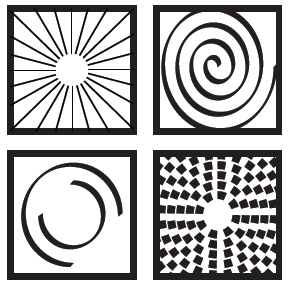
Figure 3.27 Different forms showing radial balance
In radial balance, there can be multiple visual axes and all should converge to one single point. It is interesting to try out the possibility of having radial symmetry where the convergence point needs not be in the centre of the composition. The centre point can be anywhere in the composition. With little bit more practice you can achieve this. Radial balance generates radiating visual effect. Most of the flowers have radial symmetry.
Activity 6
Study the radial symmetry of different flowers and analyse it.
Symmetrical or Formal Balance

Figure 3.2 Formal/Symmetrical balance
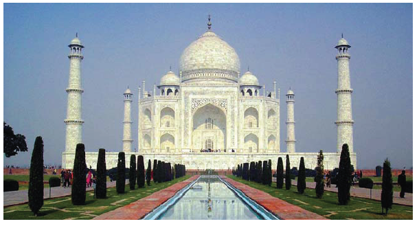
Figure 3.29 Taj Mahal in Agra is a perfect architectural example of symmetrical balanced design
It is the most common balance and all of us are familiar with it. Designers achieve this by placing graphic elements in one part of the composition and then mirror it in the remaining part of the composition. You can divide the composition vertically, horizontally or diagonally. The line of division is called visual axis. In symmetrical balance preferably there should be only one axis. The main difference between the radial balance and symmetrical balance is that symmetrical balance needs one visual axis, while radial balance requires multiple axes and there should be a convergence point. Radial balance is the advanced and complex type of symmetrical balance. Symmetrical balance and radial balance are visually appealing and widely used widespread across all civilisations. However, beyond a point they become predictable and visually uninteresting. Many people do not favour them. Therefore, designers use them with caution.
Asymmetrical or Informal Balance
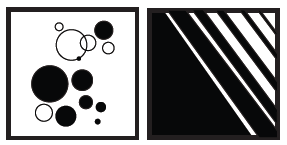
Figure 3.30 Asymmetrical/ Informal balance
Informal balance is achieved when the elements of composition are not arranged along with and/or across the visual ax s. On the other hand informal balance is achieved only in terms of visual weight of all the basic elements spread over the entire composition. To achieve this you need to imagine or assume a visual axis of the composition and then arrange basic elements one by one in such a way that they should not appear like a mirror or repetitive image of each other. For instance if you place one large form mirror image of each other. For instance if you place one large form one place in the composition then other part of the composition elements may be of smaller size but having equal visual weight. You can continue this process of placing visual elements in a composition till you are satisfied with the overall visual balance of the composition. While achieving informal balance many factors play an important role. It requires proper understanding of visual weights of all the basic elements with their relational properties in the composition. For instance, dots and their sizes, lines and their thickness, thinness, and movement, positive and negative space, visual and relational properties of colours, various colours and their relative impact, relative visual weights of colour hues, colour values and colour luminosities. Therefore, achieving informal balance in a composition requires practice and deep understanding. However, it is not difficult because it is a natural tendency of humans to seek balance and therefore, designers follow their visual sensitivity and intuition to achieve informal balance in their compositions.
Rhythm
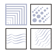

Figure 3.31 Rhythmic forms are created by repeated curved lines and dots with variations
When a basic element or a motif in a composition is repeated with variation to guide the eye movement of the audience gradually from one part of the composition to other parts of the composition in an elegant way, then it is called visual rhythm. If one motif is repeated again and again then that will create a rhythm but it will be boring. But if while repeating the motif there is a little variation with each variation in terms of orientation, size, colour or any attribute of the motif then the resultant rhythm will not be boring. Basic elements and the relational elements can be organised to achieve interesting patterns of rhythm. Visual order leads to a generation of rhythm in a composition.
Proportion
Proportion is the relative ratio between or among various components of a composition as well as between a particular component or a group of components and the overall 'form' of the composition. The ratio can be expressed as a mathematical formula, however, in visual composition, proportion is understood as a relative ratio in terms of visual weight, size, visual thrust and other visual relational properties of the components. There are few well established ratios accepted in the fields of art and design. 'Golden Mean' or 'Golden Ratio' (golden proportion) is based on the Fibonacci series. If two sides of a rectangle follow the ratio of 1:1.618 then that rectangle is called a golden rectangle. A famous painting titled the Last Supper, painted by Leonardo da Vinci follows the golden ratio. Many such ratios are well known and can lead to interesting visual composition. For instance some of the following ratios can result in interesting compositions: 1:1, 1:2, 2:3, 3:4, 4:5, 5:6.


Figure 3.32 Human body grows in proportion from childhood to adulthood. Relative proportion of each part of body with other parts as well as the whole body changes as we grow old.
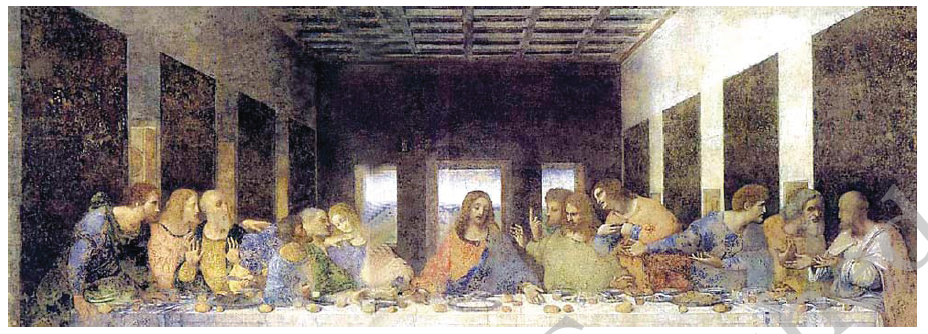
Figure 3.33 Last Supper by Leonardo da Vinci is the ideal example of all the elements and principles of visual composition
and organic unity. The original painting adheres to the 'golden ratio'. Relative proportion of its heigh to width is 1:1.618.
Christ's face is the centre of interest in the painting. All the human figures are either looking at him or their body actions are
directed towards his face including all the lines of perspective of the background architecture. Light coloured sky visible through window creates an impact of an aura around his head. The light sky, dark colours of the interior creates maximum contrast. Due to all this a visual thrust is generated so that our eyes come back to his face repeatedly.
Harmony
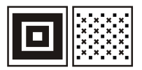
Figure 3.34 Visual harmony
When two or more components in a composition are in complete conformity or unison with each other then their combination results in harmony. If the components are not in perfect unison but adhere to certain ratios then it is considered proportionate unison. Various colour schemes discussed earlier are good examples of proportionate colour harmony. There can be harmony of colour, shape, size, form, etc. Skilful application of the principle of harmony leads to a pleasant visual impact.
Contrast
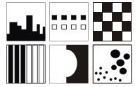
Figure 3.35 Visual contrast
When two or more components of a composition have an opposite visual impact in terms of certain attribute then the resultant impact is called contrast. There can be a contrast of color, value, size, etc. There can also be a proportionate contrast. For example, if white and black come together then they will produce maximum opposite visual impact in terms of value. On a grey scale white has highest value while black has the lowest value in terms of tonality. But if grey and black are put nearby each other then they will produce medium contrast. If any two nearby grey values from the grey scale are put together then they will produce low contrast. Therefore, there can be three categories of proportionate contrast—high, medium and low. If you look at the colour wheel, then any two colours which are opposite to each other on the colour wheel will produce high colour contrast. Therefore we have standard pairs of contrasting colours, viz., yellow-violet, orange-blue, and red-green. Any two nearby colours on the colour wheel will produce low colour contrast. Any two colours on triads will produce medium colour contrast. There can be contrast of value, colour, shapes, size, lines, and form and so on and so forth.
Activity 7
Colour also produces value contrast. Now select any two colours from the colour wheel and find out whether they belong to high, low or medium value contrast.
Activity 8
Explore various possibilities of high, low and medium contrast of lines in terms of width of lines or expressive character of lines.
Centre of Interest
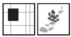
Figure 3.36 Centre of interest in a visual composition
In a visual composition, a component or a group of components are placed in such a way that they attract the attention of the viewer. Visual composition should always have a centre of interest. It is achieved by skilful application of the principle of contrast. It is also achieved through deliberate emphasis on certain elements in a composition and deliberate subordination of certain other elements in a composition. There is another way of achieving it by isolating one element or component from the rest of the components in a composition. The isolated component will capture the attention of the viewer.
Organic unity

Figure 3.37 Organic unity in different forms
Organic unity is the most important principle of composition. It is the quality of a composition that makes it visually complete. In such a composition neither you can add an extra element nor you can remove any. It is the state of achieving visual perfection in a composition. In ature, for instance, if a branch of a tree is cut then you always feel something is missing from the tree. A tree looks incomplete because by cutting a branch, the organic unity of a tree is disturbed. In a visual composition, organic unity is achieved by optimum, appropriate and skilful use of elements and principles of composition.

Activity 9
Observe nature and find out how principles of design or composition are manifested in nature and how they contribute in achieving organic unity. Collect images and photographs of natural things from newspapers or any available source and recognise the presence of principles of balance, rhythm, proportion, contrast, harmony, centre of interest and classify your images accordingly. Write brief description of how a particular principle is visible in the image or a photograph.
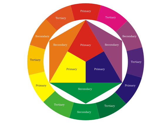
Figure 3.38 A colour wheel, a new colour is obtained by mixing one or two secondary and/or tertiary colours with primary colours
Activity 10
Draw a rectangle of 10 cm by 15 cm (use pencil to draw the rectangle). Using compass, draw a circle of any size inside the rectangle (do not draw a circle in the centre of a rectangle). Then you can draw four rectangles or squares of different sizes. They can overlap each other as well as the circle. Now draw three triangles of different sizes in such a way that overall composition looks good. These triangles can overlap each other as well as circle and rectangles. Now you have a composition with many divisions. Now trace the composition and make at least ten copies. Now fill up these compositions using the abovementioned colour scheme.
Exercises
1. What is the difference between elements of graphic design and principle of graphic design? Explain with your own examples.
2. Explain various types of balances with your own examples?
3. What is organic unity?
Practicals
1. Take a compass and draw a circle in the centre of a white paper. Now fold the paper vertically and then horizontally. Then open it again. The vertical and horizontal lines of the fold act as the axis of symmetry for the circle. So the circle is divided into four parts. In one of the parts draw any shape with a pencil; preferably this shape should touch the centre of a circle as well as both the axis. Now trace this shape on the nearest quarter of a circle (Teacher may explain the process of tracing) so that it will look like a mirror image. Now you have a half circle with a drawing. Trace this half on the remaining half of the circle. You have created radial symmetry. You can try this exercise with eight folds and sixteen folds. More interesting is trying this exercise with three folds, six folds, five folds or any number of folds.
2. Develop a grey scale of nineteen steps.
3. Develop a value scale for any one colour that will match your grey scale. 4. Develop a colour-wheel of twenty four colours as shown in the diagram.