Table of Contents
Chapter 8
MOVABLE METAL TYPE TO DIGITAL IMAGING
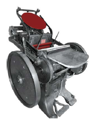
The first printing machine came into existence during the renaissance period. Till then the books were written by hand and each one was decorated and illustrated individually as already discussed in previous chapters. With the advent of a lithographic press, things became a little easy. But still the text was written by hand either directly onto the sensitised stone or on the gum coated transfer paper. Writing with hand was a tedious process. When the letter press (treadle) machine was invented, reproduction became easier. There were individual matrices cast out of lead or woodcut blocks of individual letters which were arranged and fixed in a temporary frame known as the format. The format needed to be mounted on the machine and in a very short time it was ready for printing. After the printing was over, the format was again removed and the type went back to the compositor tray after a thorough cleaning. These could be reused until the shapes of type are deformed or damaged. In case a picture or an illustration was to be inserted, a block for the same was also required which was either a half tone block or a line block. The reusability of the type and the blocks was one major advantage of this type of printing and above all it was quite compact and fast as compared to the lithographic press.
The invention of printing from movable metal type is credited to Johann Gutenberg of Mainz, in 1450. Gutenberg invented a method of creating type which can be transported, moved and used for number of printings. The new invention made possible the production of a book just in a matter of days in contrast to the years of labour put in by scribes and illuminators. This new technique suggested a set of conventions and method already established for many generations. Gutenberg invented the method of casting of individual metal types for each character of the alphabet. A punch or die was cut in the shape of a type character. This was stamped into soft metal to create a mould into which molten lead could be poured to cast the piece of type in a matter of seconds. A printer could rapidly compose type to form words,
lines and pages of books and by using the newly developed screw press could take a hundred impressions.
In spite of the startling innovation of this method, Gutenberg at first kept the process a secret, his printed works (mainly Bibles) were produced as blunt imitations of the manuscript books. The body of the printed text matter and the design of his type closely followed the hand written words of the illuminators, which required very close examination to identify a page as printed.
The invention of Gutenberg introduced many new terminologies in reproduction techniques.
Letterform
Figure 8.1 Letter press
When the signs and symbols which constitute the means of communication known as writing are painted or engraved on wood or stone with mechanical devices then they are called letterforms.
Typefont
Type font is a set of letters having some common elements resulting in a distinctive style of lettering, and is used to composea linguistic text. A standardised digital version of a type font is usually designed by a type designer and released or marketed by a type casting developing firm. The terms type font and a typeface represent a common concept of prefabricated lettering styles.
Typeface
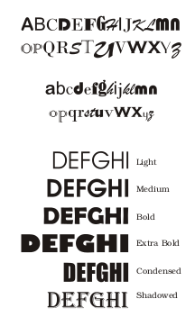
The difference in typefont and typeface is technological in nature. In the early days of hot metal technology an image of a letterform had to be transferred on to the top (face) of a rectangular metal piece called a type; hence term the typeface.
The term type font is indicative of the typeface created through using digital technology consisting of bits and bytes. It also reflects the new profile of a typeface which contains, digital information of a lettering style, and is not an object or an analog image of a letterform. Anoperating system stores the information of digital fonts through an application such as a word processor. A user can select a type font of his/her choice and generate, view, edit, process, print and transmit linguistic text.
Art Lettering
The difference between art lettering and a typeface can be at two levels. Art lettering is constructed by a lettering artist for a given purpose and for single use in short headline. It is not a permanently documented lettering style, whereas a type face is a design activity of a permanent nature and can be used for various purposes. A variety of documents can be created using typefaces.
Calligraphy
Calligraphy is an artistic handwriting as an art. The expressive and aesthetic visual qualities can be associated with calligraphic lettering as compared to hand drawn lettering. Calligraphic letters are usually the authentic outcome of writing tools and the sensitivity of a calligrapher.
Once manifested, calligraphy cannot be (or should not be) retouched or modified.
Typography
The art of printing with movable types is described as typography. Typography is a discipline. It is the art and science of laying out the text as per the requirement of the content/theme. Various type faces are used in a printed document to create the required effects through typographic design. Typography will make use of prefabricated type faces/fonts.
Type Design
Type design is a discipline which deals with planning, designing, executing and testing letter forms for a given purpose in a required script. Type design activity requires sensitivity towards aesthetics of letterforms, as well as knowledge of type face production technology. A type designer is a professional responsible for type designs.
Typographer
A typographer uses his understanding about type faces and technology of text composing. He is responsible for designing the text.
Calligrapher
A calligrapher through his or her commitment to the aesthetics of letterforms spontaneously draws/paints letters, words, sentences and/or statements; with maximum expressive quality using appropriate writing tools and writing surfaces. In the process each work produced by a calligrapher is unique work of art.

Figure 8.2 Calligraphy writing
Importance of Type
Figure 8.3 Posters with image and type
Without a type font, no printed text will ever exist. The effectiveness of written communication will depend upon the visual qualities of a written text. The proper use of type fonts and effective typography would result in an effective piece of written communication, in any language, in any script, anywhere, anytime. The role played by type fonts in printing is extremely important. Printing technology caters to both text and images. In context to text composition and text printing,type fonts are vital input elements. The publishing industry can establish its unique identity, if needed, through a specific type font style. Reputed newspapers have initiated type designs according to their requirements. For example, Times Roman type designed by Stanley Morrison was initiated by Times London as their new identity. Information technology and information design are two vital sides of the information industry. The usage of innovative ideas in information technology, as well as creatively designed and typographically well presented text/images as part of information design, are the two key factors that enhance the quality of content in a visual. Well chosen type fonts and well presented visuals, play an important role in information design.
Font Family
Font Family
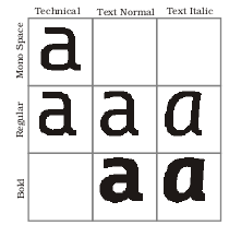
Type font family consists of type font members. The type font family can be identified through its stylistic renderings of elements, weights, transformation variations and sizes. For example, Times Roman has thin smooth serifs at the end of vertical strokes, so this stylistic feature will be observed in all its family members. Different weights of a letterform such as extra light, light, medium, demi-bold, bold, extra bold can expand a given type family. The angular slope given to vertical strokes would result in italic variation of the same font. Condensed, extra condensed, expanded, extra expanded proportions of a letterform would form another feature of a typeface family. For example, Universe type designed by Adrian Frutiger is an excellent example of a Sans Serif type font family in Latin script. Nirnaysagar typeface, a pioneering style in Balabodh Devanagari, is an excellent example of a type face family in India. Generally, a light, medium and bold weight typeface along with its slant (Italic) versions are designed as a minimal font family.
Impact of Typeface on Society
It is a well known fact that copper plates, litho stones and wooden blocks with images of pictures or linguistic signs were used as reproduction tools in the early days. The concept of using an individual letter of a script again and again, as an individual master tool, was initiated by Gutenberg. This revolutionary concept to compose text was handled in a soft material like wood. After many experiments movable types in metal were introduced using hot metal technology.
Fig 8.4 The Type Moulds Moulds for 225 different characters are contained in the frame
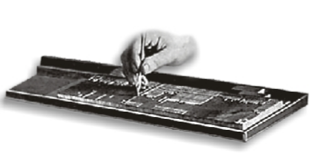
Fig 8.5 Gallery desired at stage As the type is placed in its consecutive order it is passed into a long channel or 'gallery' where
it is broken up into pages or any form. Corrections are also made this stage
The original image of a letter had to be engraved on top of a steel punch. The execution of engraving activity in actual size and shape of a letter on a hard steel was a laborious and painstaking, yet artistic achievement. This punch was to be struck into the side of a metal piece (called Matrix). Then hot metal was poured into such matrix moulds, resulting in individual type metal pieces. On the top face of such metallic rectangular pieces the impression of a letter would emerge as a mirror image.
When such pieces are composed together in a linear fashion, ink applied, pressed and printed on paper, it is called letter press printing technology. From this brief description, one can conclude that it was indeed a long drawn and an individualistic approach to create design and produce a type font. In spite of such pioneering and revolutionary efforts, printing was treated as black magic and learned people did not accept this process of reproducing a text as compared to a handwritten text or calligraphic text. Yet, the art of printing caught on and helped to spread the written word all around. It helped society in general to get literate faster by reading ready-made printed text. Economy and speed of this printed text were two crucial factors. It is now obvious that Gutenberg as well as printers, designers who followed him designed type fonts based on handwritten models, as if the text was handwritten and not printed. 'Gothic' styled typefaces were the outcome. Fractur and Swachbacher, German text fonts would reflect the same spirit. When the typefaces were designed on the basis of 'Gothic Calligraphy', in England they were loosely called old English typefaces. The usage of such and similar typefaces still gives us the ambience and aura of the olden times.
Indian Typography
The type design activity on the Indian scene was also based on the handwritten styles (calligraphy) from old manuscripts. Many European scholars and missionaries such as Dr. William Carey, Sir Charles Wilkins, Thomas Graham, etc. had engaged themselves in creating typefaces and developing composing technology for Indian texts. This era was quite important and relevant for the spread of literacy in the Indian continent. Some attempts of type designing and print were also observed in European countries—(V&J Figgins, London, 1884 (Devanagari), Tamil type cut in Germany (1716), Schlegel's Devanagari, Bonnae, 1848, Devanagari typecast in Rome (1771).
In India the printing machine arrived in Goa in the mid 15th century by accident. Indian font designing and text composing activity started on the Malabar Coast, then Madras in early 18th century, and established its strong identity at Serampore Press near Calcutta in the early 19th century. Then it shifted to Bombay. Influenced by such activities, Indian printers such as Ganpat Krishnaji and others then followed the trend of type designing and text printing in Indian languages.
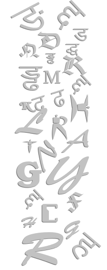
This era can be described as the pre-Nirnayasagar era. The dedicated all-round efforts to design typefaces was truly introduced by Nirnayasagar type font foundry in Bombay in early 19th century. This all round activity including type designing, content creation in the Sanskrit language, casting typefaces, printing and publishing books in Sanskrit and other Indian languages was undertaken by a great pioneer by name Jaojee Dadajee. He established the Nirnayasagar Type Foundry, Nirnayasagar Printing Press and Nirnayasagar Publishing House. This great institution was the centre of scholarly linguistic activities guided by Sanskrit scholars and shastris. The publications printed in Sanskrit by this institution are still treated as the most authentic printed editions of ancient Indian texts all over the world. A punch cutter named Aaru was at the helm of type design activity at the institute. The efforts of Jaojee Dadajee and Aaru had created an unparallel instance of a type family which comprised different weights and variations in early 19th century.
This Nirnayasagar era is a golden era in Indian language font designing and text printing using hot metal technology with international standards. Unfortunately, very little documented archives of this activity are available apart from type catalogues and printed books. Post Nirnayasagar era marked the emergence of many dedicated printers and publishers equipped with modern technology for type foundry and text printing. This printing and publishing activity spread all over India and contributed towards creating content in various fields of art, science and other disciplines. The exposure to western technologies made many of them adopt modern facilities to reproduce Indian languages and scripts. Linear composition of text in the Latin script was the basis of the development of technologies for type designing and text composing/printing in the West. This forced Indian printers and publishers to consider changes in Indian scripts, and thus script reform activity took root in Indian soil. Many Indian engineers, linguists, politicians and enthusiasts have contributed their bit since 1884 till the end of 20th century. Some of the script reforms were incorporated on mechanical machines in order to get faster reproduction of Indian texts.
Digital Imaging
As already explained design existed from the time we existed. Design had been a part of our lives since the world began. When humans got hungry they designed weapons to kill, when they wanted shelter, they designed houses, and when they needed to communicate, they designed symbols and scripts.
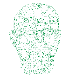
Fig 8.6 Structure of developing digital character
Wherever there is a need to communicate visually; there is potential enhancement of communications through graphic design. With the advancement of modern techniques a simple press of a button unfolds the whole world before us on internet. Different sites offer different modes of information both passive and interactive or with minimal effort. We watch different Television Channels with the help of a remote control sitting in the comfort of our room.
During mid 1980s, the arrival of desktop publishing and the introduction of graphic art software applications introduced a generation of designers to computer image manipulation and 3D image creation that had previously been laborious. Computer graphic design enabled designers to instantly see the effects of layout or typographic changes without using any ink in the process, and to simulate the effects of traditional media without requiring a lot of space.
A computer is now no more a mere accounting machine. If it is a toy for a kid, it is also an office in itself. Just see the flexibility of the medium. For a designer on the move, it is an office on the go, a compact work studio full of innumerous tools. This helps you working without mixing colours with water or oil on a pallet and away from clogging air brush, cleaning brush after every use and also a wrong colour stroke. It has an undo command that comes to your rescue, if you have done something unwanted and want to go back to your previous work.

The computer is loaded with varied software and tools. This huge array of tools follow your command. The precision of a computer remains unmatched. A line can be drawn in curve, straight, angular, thin, thick, etc. of a choice with the help of a line tool. The attributes are defined in the dialogue box. You can cut it, copy it, and paste it any number of times, at any desired place in the design. It can be undone if anything goes wrong and can repeat any command without any problem. Most software provides a whole range of calligraphy tools with varied styles.
All computers use an operating system and some softwares to follow commands. Software is basically of two types, vectors and rasters. Let us see what these vector and raster based softwares are?
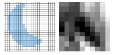
Vector Based Software
This software is linear in nature, all kind of line based work is done through this kind of software, and when enlarged the image remains sharp.
Raster Based Software
This kind of software produces images that are softer at the edges. They are ideal for editing photo and image activities. When enlarged beyond its actual size they become hazy.
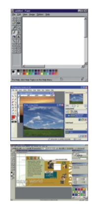
Traditional tools such as pencils or markers are often used to develop graphic design ideas, even when computers are used for finalisation. Computers are generally considered to be an indispensable tool used in the graphic design industry. Computers and software applications are more effective production tools when combined with traditional methods.
The thumbnail sketches or rough drafts on paper can be used rapidly to refine and produce the idea on the computer in a hybrid process. This hybrid process is especially useful in logo design.
Rapid production from the computer allows designers to explore multiple ideas quickly and with more detail than could be achieved by traditional hand-rendering or paste-up on paper. Software enables the designer to venture through the creative process more quickly experimenting with tools and methods, be they traditional or digital. Ideas explored using pencil and paper are executed using fonts, clipart, stock photos, or rendering filters on the computer. One of the key features of graphic design is that it involves selecting the appropriate image making tools out of its ability to generate meaning rather than preference.
Visit
Visit a nearby graphic/ advertisement/ multimedia/ art studio to understand the entire sequence of processes from the layout stage to final design.
Exercises
1. What do you understand by the word typography?
2. Describe the importance of type.
3. How did Johann Gutenberg's hot metal technology make printing simpler?
4. Write a brief history of type foundry in the Indian context.
5. How have computers influenced the life of graphic designers and what role do computers play in the printing industry?
Practicals
1. Draw six parallel lines with equal space and design your own typography, using basic shapes like circle, square and triangle with geometric tools, starting with alphabets and then your name followed by a whole sentence, keeping in mind the geometric relation between all the alphabets.
2. Make a design using your own initials (i.e. the first alphabets of your name and surname).
3. Write a quotation in your own designed typography.
4. Copy typography styles of different products available around you.
5. Make a logo type on a given subject or product.
6. Use roman alphabets to make few 2D/3D designs like a chair, accessories, apparel, a futuristic car, a cartoon or comic character, etc. and then digitally generate the design. Take a print of your work.
