Table of Contents
Chapter 04
Colour
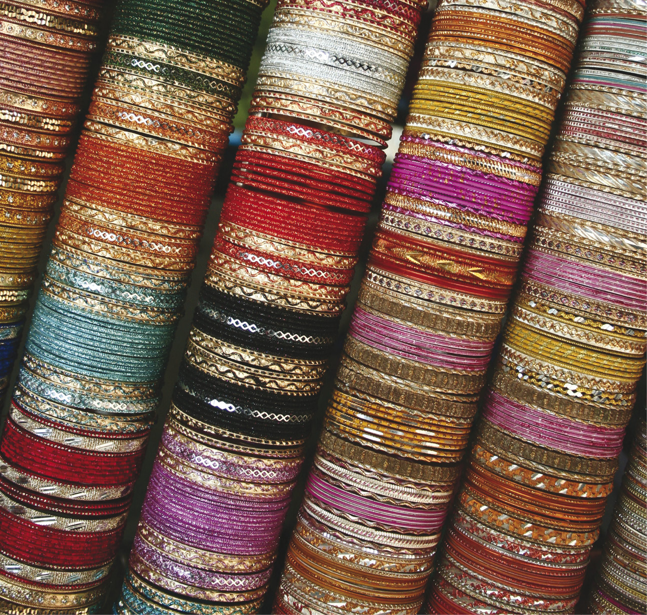
Colour is the most essential component of visual experience. It is the specific perceptual characteristic of visual experience that we refer by a colour name like ‘red colour’, ‘green colour’ and so on. In the XI standard textbook on Graphic Design, basic concepts of colour such as colour hue, colour intensity, colour value, colour saturation etc. have been already introduced. This chapter will try to provide more a comprehensive view on colour and its applications in graphic design. Colour is studied and used by graphic designers, artists, architects, and by many other design professionals. Colours are used in various situations such as coloured lights in a dramatic performance, printing multi-colour calendars, transparent water colours in landscape painting, and powder colours during festival of Holi. Holi is considered as the festival of colours. It is interesting to note that in each of these events properties of colours are different. In a theatre, coloured lights are mixed to get the desired effect. In a water colour landscape painting, layers of transparent colours are put over one another. While printing a calendar coloured printing inks are layered on each other. Apart from the above mentioned situations one realises that colours are everywhere. Few more examples of such situations will demonstrate that colours have varied properties — physical properties apart from perceptual properties. Experience of colours, therefore is governed by these properties. While painting on canvas, oil paints are mixed with each other to get the expected shade of colours. In this case colour pigments are mixed with each other. Even during the festival of Holi, we mix different pigments of colours with each other. When we see a colourful image on the TV or computer we mix colour lights. In the entire above situation colours are used in varied ways. Sometimes pigments of colours are mixed, in some cases colour lights are mixed. Therefore, it can be said that at least there are two different ways by which we use colours. The first is mixing of colour pigments used in a painting, second is mixing of coloured lights in eyes when we watch TV or computer monitor.
Colour Theories
It is important to study colour theories because these theories give comprehensive perspective of colours that help understand different applications of colours. Colour is also studied by scientists to understand the phenomenon of colour experience. As an outcome of scientific studies, two major theories of colour have been developed. These are known as ‘Additive colour theory’ and ‘Subtractive colour theory’.
Additive Colour Theory
As per the additive colour theory there are three primary colour bands of wavelengths of light called Red, Blue and Green. When equal parts of each of the three bands are combined together, the white light is generated. James Clark Maxwell recognised this phenomenon in the mid 1800s. This gave birth to the Additive theory of colours. The color additive theory describes how we perceive colour and how they are created. Essentially white light is a combination of three different colours, a continuum of wavelengths organised into bands which we label with names (blue, green, red etc).
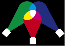
Red, green and blue are the primary colours of this theory. All three colours eventually will result into generation of white light, and the absence of all three will produce black.
When two primary colours of additive theory are added together, you get secondary colours that are brighter than either of its components.
These are the “additive” combinations.
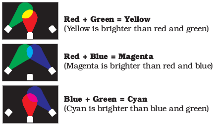
By combining varying amounts of red, green and blue lights you can create new colours. Combining these three primary red, green and blue lights, the entire spectrum of visible light can be created.
A TV monitor uses principles of additive colour theory. In the computer monitor also pixels have sub-parts that can emit three colours; Red (R), Green (G) and Blue (B). In a monitor they are lit with appropriate intensity to produce colour effects. Therefore knowledge of additive colour theory is necessary to understand colour behaviour on TV screen or computer monitor. The term RGB has became popular among designers due to this theory.
Subtractive Colour Theory
Light is the source of all colours. White light has all the colours according to Newton’s theory; from red to violet. The central concept of the subtractive colour theory is that pigments of paints or inks absorb certain rays of light and reflect other rays of light. Combination of these reflected rays create the experience of colour that is perceived by eyes. When we see a white object, all the rays of light are reflected. No ray of light is absorbed as per the theory. When we see a yellow object then only rays of light which create yellow colour are reflected. It means that rest of the rays of light are absorbed or subtracted from the original white sunlight. As per the additive theory red, green and blue are the primary colours and white colour is produced with their combination. Now in the above case of a yellow object, the colour blue from white rays is absorbed by the object. The object has reflected red and green rays. As already discussed as per the additive theory,
red + green = yellow.
Therefore, blue rays are absorbed by the object or subtracted from the white light to get the yellow colour. Objects do not have colours of their own.
When we mix colours using colour pigments, or through the printing inks or dyes in the printing process, we are using the subtractive colour method. The pigments and inks, being materials, have properties to absorb or subtract certain colours from the white light. Subtractive theory of colours demonstrates exactly opposite behaviour that of already discussed in Additive theory of colours. Therefore the secondary colours of the additive theory are taken as the primary colours of subtractive theory. Cyan (C), Magenta (M), Yellow (Y) are supposed to be the primary colours of this system. When we mix pigments or inks of these colours we get secondary colours. If one goes on mixing colours in this fashion, finally it is expected that one should get the Black (K) colour.
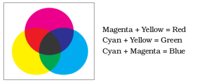
In printing pigments/inks/dyes of black (K) colour is also mixed to get better results. Therefore, the term ‘CMYK’ has become popular in printing.
However, in reality it never happens because as you go on mixing colours the purity of colours is lost and the resultant colours become dull and muddy. In reality one gets a brownish dark grey at the end. There are many outstanding issues with subtractive colour theory. Since the colours are mixed they loose their luminosity and the resultant colour is always with reduced luminosity. So for instance, the shades of orange by mixing yellow and magenta are duller than expected. Similarly, shades of violet after the mixing of cyan and magenta are dull comparatively. Same is the case with brown shades. Therefore, there is a practice of using different material or chemicals to get particular colours. So practically in printing inks or in oil paints and water colours, there is a huge range of colours provided. Colours are not produced by mixing primary colours. For instance, Poster red and Crimson Lake red or Indian red are made up of different materials. Poster green, Chrome green light and Veridian green are made up of different materials. Similarly, violet, orange and other secondary as well tertiary colours are not produced by mixing primary colours. They are produced from different materials that reflect light rays that produce a particular shade of colours.

These two theories came into existence primarily because behaviour of light is different when light is mixed and behaviour of light is different when it is absorbed by the substance and we perceive only the reflected light.
Since colour is a perceptual experience it is bound to be highly subjective in nature. Graphic designer is mainly concerned with the visual impact of the colour in their designs. The response of the viewer varies from person to person since colour experience is subjective. Graphic designer’s task, therefore, is quite complex. Graphic designer needs to understand various perspectives on colour and then through trial and error, one needs to develop one’s own strategies to use colours that will result in maximum impact for majority of the target viewers.
Understanding of Additive theory is required to know the behaviour of colours when colour lights are used. Interestingly the Subtractive theory explains the behaviour of colour pigments Scientifically, but the Traditional theory of the ‘colour wheel’, practiced by artists and designers is more simple to understand the basic concepts of colour behaviour. The colour wheel system is not strictly a scientific system. However, due to its simplicity and explanatory capability, artists and graphic designers study it.
Colour Wheel
The colour wheel or colour circle is a basic visual device where colours are organised in a circular manner for understanding fundamental principles of colour classification, arrangements, and colour relationships. It also helps in understanding colour schemes and their colour interactions. The first such colour wheel was designed by Sir Isaac Newton in 1666 to explain that white light is a combination of seven colours. Goethe, Chevreul, Ogden Rood, Albert Munsell and many others have developed their systems to explain behaviour of colours later on.
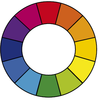
The colour wheel is designed in such a way that one can find out relationship of one colour with any other colour in an easiest way. Over the years, many variations of the basic colour wheel have been made, but the most popular and useful colour wheel is based on twelve colours where Red, Yellow and Blue are considered as primary colours. After combining the primary colours in equal proportions one gets the secondary colours. In the colour wheel Orange, Green and Violet are considered as secondary colours. When the nearby primary and secondary colours are combined, the tertiary colours are generated. Although these nomenclatures of colours such as, red, blue, yellow, orange, green and violet, are popular, it is very difficult to standardise specific hue and their values. Traditionally, graphic designers and artists have used their visual sensitivity and have agreed upon specific colour hues and given the nomenclatures. Therefore, all artists and graphic designers agree upon a range of colour hues that is recognised by the nomenclature ‘Red’, for instance. Scientific perspective may vary on this. There has always been difference of opinion on standardisation of nomenclatures of colours. Also there has been a debate about the status of white and black as colours. The specific point of concern is that from the scientific point of view white is supposed to be a combination of all the colours and black is considered as absence of colours. However, graphic designers use white as well as black as colour pigments in various colour schemes.
The issue of standardisation of colours cannot be resolved in a simple manner. From the graphic designer’s perspective, since there is an agreement on certain range of colour hues and respective nomenclatures, it is practically beneficial to follow the traditional understanding. In this regard traditionally, the colour wheel is being used to generate and understand various colour combinations that happen to be visually pleasing. There are a number of colour combinations that are considered especially pleasing. These combinations are also called colour harmonies. The twelve-colour wheel is sufficient to generate most important and frequently used colour harmonies. For more detailed combinations one can use the twenty-four colour wheel also. Following is the most popular twelve-colour wheel.
Primary, secondary and tertiary colours are as follows:
Primary colours – Red, Yellow and Blue
Secondary colours – Orange, Green and Violet
Tertiary colours – Reddish-Orange, Orangish-Yellow,
Yellowish-Green, Greenish-Blue, Bluish-Violet and Violetish-Red
Colour wheel is a wonderful visual device. With the help of a colour wheel you can understand the nature of colours, their associations with other colours as well as colour schemes.
Warm and Cool Colours
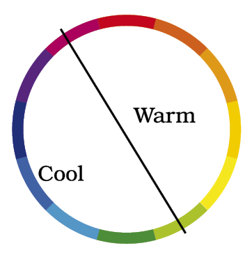
This is the most simplest classification of colours. All the visible colours can be divided into two basic categories— warm colours and cool colours as shown in the figure alongside. Normally, warm colours are considered as aggressive and active colours while the cool colours are considered as passive and receding colours. A range of colour hues from redish-violet to yellowish-green is considered as warm colours. On the other hand hues ranging from green to violet are considered as cool colours.
Colour Harmonies or Colour Schemes
With the use of the colour wheel many colour schemes can be generated. However, there are few colour schemes that are well-established. In the following description, whenever a colour scheme is mentioned it is assumed that the colours in the said colour scheme can be used as pure hues or with its all possible tints, tones, and shades to generate colour harmonies. Normally in any colour scheme, two or three colours are used, of which one colour is used as a dominant colour and the rest of the colours are used as sub-dominant colours or supporting colours. The dominant colour in the colour scheme is responsible for creating the mood or the impact of the colour scheme. It is very difficult to handle more than three colours in a colour scheme. Only experienced graphic designers can handle more number of colours successfully in a colour scheme.
Warm and cool colour schemes
As already mentioned, there is a range of colour hues on the colour wheel that is called warm colours. When some of these hues are used in a colour scheme then that colour scheme is called warm colour scheme. Similarly, a colour scheme using cool colour hues will result in a cool colour scheme.
Complementary colour scheme
Complementary colour schemes are not at all good for the reading texts since they produce a jarring effect.
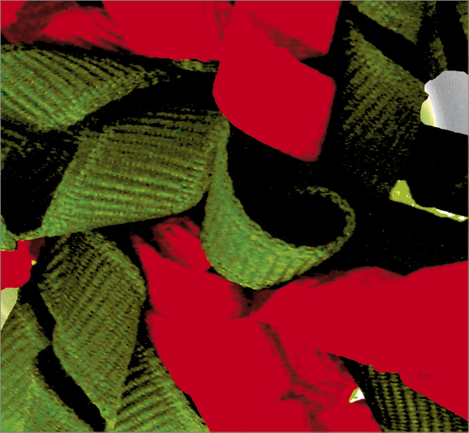
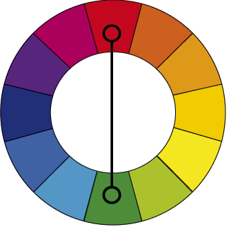
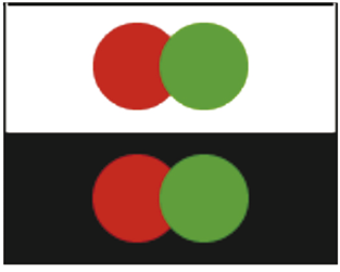
Colours that are opposite to each other on the colour wheel are considered to be complementary colours to each other. They are also called contrasting colours. For example, red and green are opposite to each other on the colour wheel and therefore they are considered as complementary colours of each other. Complementary colours also produce contrast of varying degrees when put close to each other. For instance pairs of colours such as red-green, blue-orange, yellow-violet are also the pairs of contrasting colours. This is also known as ‘hue contrast’ or ‘colour contrast’. When these colours are not put close to each other in a design and rendered with their tints, tones, and shades, they complement each other and produce visually pleasing effects.
Many a times high contrast of complementary colours create a vibrant effect if they are used side by side. Especially it is evident in the case of Green and Red. Such colour schemes must be handled very carefully. Whereever one wants the imapact of contrast one can use complementary colour schemes. When used appropriately, they are good for advertisements because contrast captures the attention of the viewers.
Analogous colour scheme
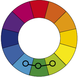
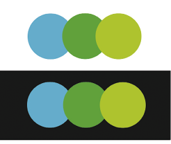
When any three colours that are next to each other on the colour wheel are used in the colour scheme it is called Analogous colour scheme. Such colours match visually well with each other and create serene and pleasing effects.
Analogous colour schemes are abundantly found in nature and are very pleasing to the eyes. While using analogous colour scheme one has to take care that one of the three colours should be used predominantly and out of the remaining two colours, one should be a sub-dominant. The remaining colour adds beauty. It is needless to say that these colours should be used with all their tints, tones and shades.
Triadic colour scheme
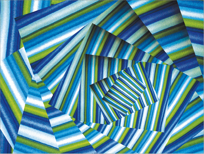
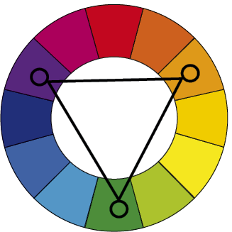
A triadic colour scheme is a colour scheme that uses three colours that are evenly spaced on the colour wheel. Such colour schemes are vibrant but not very aggressive. While using such colour schemes one should take care that only one colour should dominate and other two colours should be sub-dominant.
Activity 1
Select two paintings of contemporary artists based on the colour scheme analyse the mood of the paintings.
Split-Complementary colour scheme

This colour scheme is a kind of variation on the complementary colour scheme. While choosing complementary colour scheme one has to choose any colour on the colour wheel as a base colour first. Then the opposite colour on the colour wheel is the complementary colour of the base colour. In the split-complementary colour scheme, instead of choosing the opposite colour of the base colour,
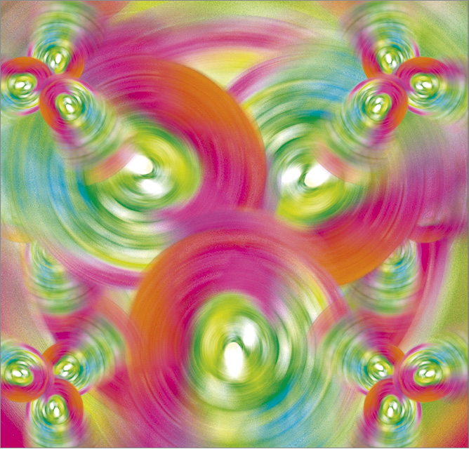
adjacent colours on both the sides of the opposite colour are chosen. So the colour scheme has the base colour and the two adjacent colours of the complementary colour. Normally,
Students will identify two analogous colour schemes and analyse how they are used to unite artwork and finally create a design using analogous colours.
Activity 2
the base colour is considered as the dominant colour and the other two colours act as sub-dominant colours.
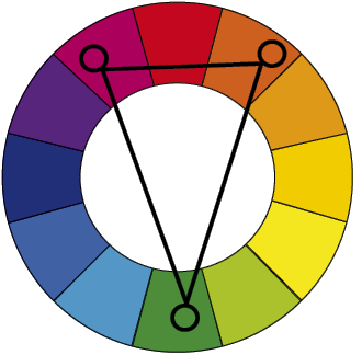
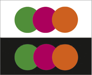
This colour scheme has strong contrasting impact as the complementary colour scheme, but has less distracting. This colour scheme is very easy to handle and equally effective. In the following figure, green is the base colour and two adjacent colours on both the sides of the colour red (complementary of the base colour) are considered as the split-complementary colours of the base colour.
Tetradic colour scheme
Choose two complementary colours on the colour wheel, C1 and C2. Then choose split-complementary colours of C1 and C2. Let us call these as S1C1 and S2C1 for the colour C1 and S1C2 and S2C2 for colour C2. Then the colour scheme using S1C1, S2C1 and S1C2, S2C2 is called the tetradic colour scheme. It uses two pairs of split-complementary colours. Normally pairs of adjacent colours of complementary colours as shown in the figure are used to develop this colour scheme. This colour scheme offers rich possibilities of variations but it is equally difficult because this colour scheme uses four colours.
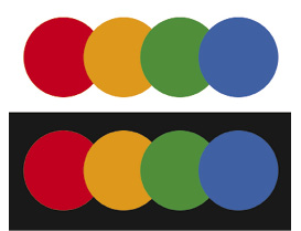
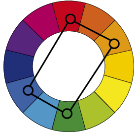
The real challenge in this colour scheme is of choosing the right dominant colour and striking an appropriate balance between warm and cool colours since this colour scheme has two pairs on opposite sides of each other.
Square colour scheme
The square colour scheme is variation of the previous tetradic colour scheme, where all four colours are spaced evenly around the colour circle. All the challenges and qualities of this colour scheme are similar to the above.
Colour Interactions
As already seen in the previous section, colour combinations generate colour harmonies. Colour harmonies are possible because when number of colours with their appropriate tints, tones, and shades are organised in a composition they create collective impact on the viewer’s mind. Colour harmonies are the simpler examples of colour interactions. However, there are more specific interactions of colours that cause peculiar visual effects as well as create illusory effects sometimes. All such combinations of colours are studied under the area called ‘colour interactions’.
Josef Albers was a teacher at the Bauhaus, he realised that colours behave strangely in specific situations. He says that visual perception and interpretation of any colour depends on its environment.
Colour combinations and their interactions are subjective as well as objective in certain sense. Sometimes when two colours are put together, colour boundaries can be so indistinct that they appear to be mixing or blurring with each other. At some other instance they appear to be so active that they cause distracting effect or vibrations.
Sometimes a form painted in a particular colour looks coming forward or recedes, depending on the background colour. Mostly, colour hue and grey value of colours are responsible to create this impact. Size of the form may also contribute greatly in this regard.

Light green colour and light yellow of equal grey value. (For smooth interaction of colours)
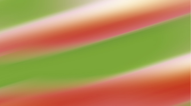
Green and red colours side by side. (For vibrating interaction of colours)
Therefore, there are three major types of possible colour interactions: Interactions due to change in the grey value of nearby colours; Interactions due to change in the hue of nearby colours; and Interactions due to change in the grey value as well as change in the hue of a near by colours. There are other possibilities of creating visual effects due to a phenomenon called after-image, however, they have not been discussed here.
Grey looks darker because grey value of yellow is very high as compared to grey.

Grey looks lighter because the grey value of yellow is very low as compared to the grey.

In the case of hue contrast many striking effects are possible as follows:
Contrasting Hues Create Vibrating Effects
When two contrasting or complementary colours are put together, they create distracting or vibrating effect.
The following example shows that there is an illusion of shadow of the text because of the hue contrast.


Red text on a blue background
In the following examples there is a minimal hue contrast.
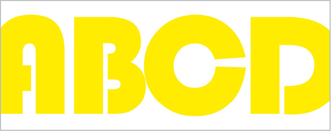
Yellow text on a white background

Blue text on a black background
In both the cases there is very low contrast between two nearby colours and therefore the readability of the text is low.
Colour Symbolism
Colour symbolism and colour psychology are quite fascinating areas of study. However, they are equally controversial. As already mentioned, colour is a basic component of visual experience. When one perceives a colour sensation through eyes, there are multiple reactions to the colour experience. At first, a person reacts to the colour intuitively. Like when you see the vast blue sky you are overwhelmed and do not have words to describe the experience. This is a most natural and intuitive reaction. Then you try to find appropriate words to describe it. But still it is a description. This is an attempt to understand and use words or language to capture the experience. Then sometimes you also try to find out if there is some meaning associated with the colour experience. Colour symbolism becomes relevant at this stage.
Colour symbolism is mostly culture specific. M

Red is often used as a symbol of warning
eaning of colour changes from culture to culture. However, to some extent, origins of meaning can be traced back to physical and biological levels. For instance,
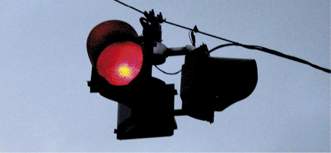
colour red is considered as a symbol of danger. If you see blood you immediately start thinking about an accident or a mishap. If one tries to understand the association of red colour with danger then it appears to be quite natural because the colour of blood is red. Therefore the association of colour red with danger appears to be most obvious. When you see a red signal on the road, you tend to stop. However, when you see a green signal you understand that there is ‘no danger’ you need not stop on the road. The road is clear. In this case, it is very difficult to justify association of green colour with clear road or ‘no danger’. It is just because of the convention that we understand the meaning of green colour in this way. Symbolic meaning of colours is accepted in the society or culture by convention. It is not always possible to find out the origin of the symbolic meaning of colours. Probably, from the graphic design point of view red stands for danger and on the colour wheel green is on the opposite side of the red colour therefore, intuitively green is considered symbol that suggests ‘no danger’. Other possible justification would be that green colour creates feeling of freshness and soothing effect therefore, from psychological point of view green is considered as the symbol of clear road. However, this kind of justification is not possible in case of other colours. Colour symbolism is studied at three levels: Physical/Biological; Psychological and Symbolic levels. Physical and Biological experiences lead to create deeper level impression in our psyche and then these impressions are translated into colour symbolism.
Following is the description of few basic colours and their associated symbolic meaning.
White: White is considered as the symbol of light (moonlight as well as sunlight), reverence, purity, truth, peace, innocence, cleanliness, simplicity, security, humility, life.
Black: Black symbolises absence, mystery, evil, death, fear, emptiness, darkness, seriousness, conventionality, rebellion, anarchism, sorrow.
Grey: Grey is a combination of white and black. It stands for, humility, respect, reverence, stability, subtlety, old age or grey hair, pessimism, boredom, decay, dullness, pollution, urbanity, neutrality, mourning, and formality.
Red: Red symbolises passion, strength, aggression, desire, energy, fire, sex, love, romance, excitement, heat, arrogance, ambition, leadership, courage, masculinity, power, danger, blood, war, anger, revolution, and radicalism.
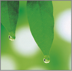
Green symbolises environment
Yellow: Yellow typically symbolises sunlight, joy, happiness, optimism, intelligence, idealism, spirituality, wealth (gold), summer, hope, liberalism, wonder, gladness, sociability, and friendship.
Blue: Blue creates a feeling of overwhelmingness. It is seen as trustworthy, dependable and a symbol of commitment. It is the colour of sky and the sea, and it invokes the feeling of rest, serenity. It is calming, cooling and helps the intuition.
Orange: Orange typically symbolises sacrifice (especially costumes of a sanyasi are orange), happiness, energy (rising sun), balance, heat, fire, enthusiasm, flamboyance, playfulness, and desire.
Activity 4
Select one rasa out of the nine rasas or nine emotional states (Shringāram- Love; Hāsyam- Laughter, Raudram- Fury; Kārunyam- compassion, Bībhatsam- disgust, Bhayānakam- horror; Vīram-heroism; Adbhutam- wonder; Shāntam- peace.) Create a 2D design using organic and geometric shapes. Selection of shapes and colours should support the chosen Rasa.
Green: Green symbolises intelligence, nature (green forest), spring, fertility, youth, environment, wealth, money, prosperity, good luck, vigour, generosity, grass, coldness, life, eternity earth, sincerity, renewal, natural abundance, growth, health, balance, harmony, stability, calming, and creative intelligence.
Violet: Violet is a combination of red and blue. It symbolises royalty, nobility, envy, sensuality, spirituality, creativity, wealth, cosmos, ceremony, mystery, wisdom, enlightenment, pride, and romanticism.
Brown: Brown symbolises calm, boldness, depth, natural organisms, nature, richness, rusticity, stability, tradition, anachronism, fascism, boredom, dullness, filth, heaviness, poverty, roughness, earth, wholesomeness, steadfastness, simplicity, friendliness, and dependability.
Exercise
1. What is the difference between additive and subtractive colour theory?
2. Find out about the traditional symbolism of different colours in your surroundings especially in the socio-cultural context.
3. How does the use of appropriate colour scheme help in setting the mood of a design.
4. Discuss the universal associations of some colours.
5. How will you choose colour in your design if your target audience is international?
6. What do you understand by symbolism of colours? What colours would you choose while making an advertisement for some heavy machinery and why?