Table of Contents
Chapter 05
FUNDAMENTALS OF VISUAL COMPOSITION
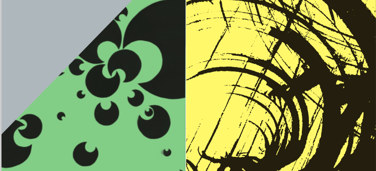
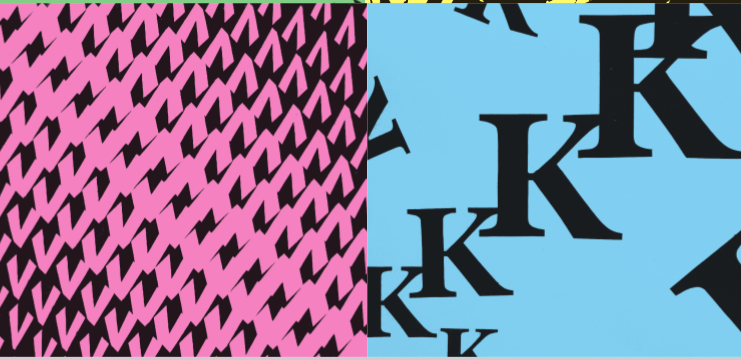
We have studied that a sensible arrangement of components makes a design functional and attractive. We also know that to select and to arrange is to compose. A composition can be two dimensional, three dimensional or temporal. A good composition, like an organic entity does communicate and offer a unique experience of its own. At one level it effectively communicates the message and at another it aesthetically influences the viewers. For a designer it helps show a cohesive oneness among different parts along an implicit order. It helps navigate the attention of the viewers through its explicit hierarchy and hence introducing a proper order to read it as per his/her interest. An effective composition entices and affects viewers making it so to be seen again and again, leaving a lasting impression and as a result, consolidating its recall. Disorderly and chaotic arrangements of parts fail to function or to communicate hence leaving viewers confused and disinterested in seeing it. Preciseness with affective aesthetic quality of work is a decisive factor in visual communication. A sensitive designer is conscious about it and hence is respected for this talent. In graphic design, knowledge and sense of good composition is a prerequisite for every graphical work.
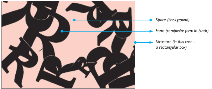
A composition is made with three basic constituents. These are space, form and the structure. Wherein, space as a passive background or negative space supports all elements appearing over it. It appeals to perception as an abstract and experiential entity. There are finite and infinite natures of spaces. A form is a thing that isolates itself from the background. It appeals to perception as a positive, concrete and informative visual entity. Structure means a cohesive relationship among the forms as well as negative and positive spaces. Space is marked by the ‘frame’ and relationship of forms with the frame is of equal significance. Structure is understood at two levels—first on the physical level, where it is supposed to be binding all components together and not letting them to disperse or collapse. And secondly, on the conceptual level as an intension, a thought, theme, an idea or story that inspires the character of relationship among the forms and forms with space. In visual communication, compositions are usually of two dimensional natures. In graphic design format is flat and it is a given space to overlay text and images as component parts on it. Often forms like typeface and text boxes are also flat and wherever needed, an illusion of third dimension and visual hierarchy is achieved by application of visual devices like depth, gradation and perspective. Pictures and photographs showing volume and depth are more realistic in nature and are treated as spaces within the space of the given format. You will study the principles and skills of making layouts consisting words and images in chapters on layout design. Let’s look into the concept of‘ frame’ or ‘format’ and its relationship with the ‘form’ and framed space or the ‘field’. By framing we select or isolate our design from the rest, just like segregating different thoughts by boxes in a flow chart. Inside a frame a thing acquires emphasis and it helps viewers to concentrate upon and appreciate it comfortably. In the process of perception frame supports our selective attention on a thing. More so, otherwise loose thoughts and commonly overlooked visual gestures become noteworthy and beautiful when positioned properly in a frame. There are certain basic ways with which relationship among the frame, forms and field is exploited in communication design. Those are broadly consolidated in the following manner:
- In painting and graphic arts, Frame and Field are passive (static) and forms are active (movable).
- In photography and observational drawings, Frame is active and Field and Forms are regarded as passive.
- In cinematography and animation, Frame, Field and Forms all three can be simultaneously active.
Principles of Composition
An appealing composition contains universal aesthetic principles in it. Principles are those aspects which are implicit and active in the structure and appearance of a composition. All work of arts that offer an aesthetic experience are based on these principles, such as music, dance, architecture, fine arts, design etc. Principles are present in all the effective art forms in different nature and importance. There are various schools of thoughts about the numbers and order of principles in visual composition however, there makes an interesting sequence of gradually increasing complexity of experiences in an order. For clearer understanding aesthetic principles can be grouped according to their relative effect in two types. In first type they are physical and visible in the composition, and in second they are, felt and invisible in a composition. Generally, there are seven principles considered in an order of growing complexity — pattern, rhythm, contrast, unity, proportion, balance, and harmony wherein:
Rhythm is repetition with variation.
Contrast is dissimilarity between the elements brand on some criteria.
Unity is complimentarity among all the elements.
Proportion is relative ratio among elements.
Balance is sensed equilibrium among elements based on some criteria.
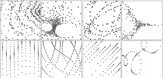
Repetition with variation
produces rhythm. Note the repetition of uniform dots with a gradual variation in compositional devices of position, direction, spacing and
alignment in all. It is easy to learn composition with basic, non-characteristic elements and on non-figurative, abstract and experiential themes. Examples of compositions with dots depicting movement.
Harmony is similarity among elements based on some criteria.
Elements of Composition
We have studied the basic elements of composition and now let’s understand their inherent nature and types. They are dot, line, shape, and form. These are made visible in the space with the help of explicit or external elements of value texture, and colour. A good arrangement of elements can be communicative and expressive simply because of an order in structure like in a composition made with a pleasing arrangement of uniform, neutral dots. Although a purely structural arrangement as a composition is also effective, it is further ‘optimised’ by means of relational visual devices of size, orientation, alignment etc.
Activity 1
Using uniform dots make a composition in 18 cm x 18 cm squares that will depict a type of ‘movement’. Make it abstract by avoiding concrete or identifiable forms. Display and discuss variety of approaches followed by each one of you.
Relational Visual Devices
While working on visual compositions we need to master the use of different variables which are called visual devices or tools. Generally there are three broad types of visual devices— Relative devices, Affective devises and Intuitive devices.
Relative devices are used to develop adequate contrast in composition and they are size, orientation, position, spacing, alignment, direction, overlap, density, gradation, intensity, weight, etc.
Affective devices are emotive and influence the mind. They are medium, style, character, centre of interest, view point, emphasis, hierarchy, gestures, expressions, ornamentation, symbols, words and captions, etc.
Intuitive devices are contextual and related to the creative ability and interest of the designer. They are selection, synthesis, variability, connectivity, fluency, economy, modification, optimisation etc.
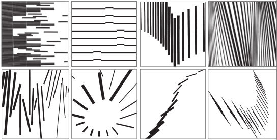
Visual devices help construct and control the impact, effect and specificity of meaning in a composition. They fine tune and specify interrelation of different parts and help generate unity, order and hierarchy among elements.
Composition
Make a 2-dimensional geometrical composition on size 12 x 10 using basic elements like dots, lines and shapes and colour it using a complementary, split complementary or any other colour scheme of your choice.
Activity 2
It is often seen that without adequate confidence in these basics, artist and designers switch over to ‘style’ which so overpowers the compositions that the presentation is seen nowhere close to the intent and having any appropriate structure. In a good composition, attributes are subtly and indirectly presented without disturbing finer experiential aspects like harmony and overall mood it is offering. Loud, showy and pretentious projections distract and confuse very purpose of a composition.

Selection as Composition: Lines carry our attention along their path. Lines can depict expressive movements. From a sheet of such rhythmic strokes one can select a part as a composition that represents the whole, a category of composition in which a well composed center of interest stands as a complete composition. This processes somewhat resembles with the photographic composition where the frame adjusts itself to compose a passive content.
Composition is an organisation of parts at the skeletal level and hence generic. Basic visual elements are like building blocks in a structure.
Activity 3
Using coconut husk as brush make repetitive marks of strokes with black ink on a half empirical sheet. Display and discuss about the disturbing strokes from the entire sheet. In the second stage select smaller areas from these sheets as complete compositions and enlarge them.
They come together or are put together for a purpose. In the same way composition is a purposeful organisation of such units or blocks. Principles are part of that sublime universal order which is prevalent in our environment. All of us are part of it and having grown with more or less like and dislike similar features in it. For example, we all dislike a broken or dismantled object and want to fix it and see it as a whole as soon as possible. Certain things we share so unknowingly, that we simply ignore them.
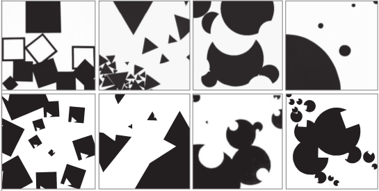
Shapes of planes with their characteristic edges show gestures which vary by subtle change in orientations. Overlap and variation of size introduces depth. Where as a minimal modification introduces expressions and interactivity in a shape. In an interactive shape mind always look for and discriminate head and body, as well as front and back portions. Along with other concerns an engaging interaction among the elements is of equal importance.
Activity 4
Make circles of different sizes, cut them and place them on 18cm x18cm square sheet to make interesting compositions. Paste these circles once the compositions have been set. You may set the compositions choosing depicting movement or actions like rising, flowing, rotating, running, falling, resting, hanging, swinging, pulling, pushing etc. Make sure, identity of chosen unit–a circle–should be preserved and should not be lost in excessive overlaps or in cropping at margins. Chosen shade of the entire composition should be black on white or the other way. Make 4–6 compositions and then put them together on a board or a sheet leaving margins inbetween. Compositions should be balanced in an asymmetrical arrangement.
Aesthetic principles are among such. It is said that, every material manifestation in nature is true to the order of these hidden principles. Likewise every manmade creation leaving enduring impressions on us embodies them in it! This way learning composition is learning to understand that beautiful interrelation, interdependence and perfectly embedded symbiotic integrity as well as order in the nature.

A form is a form and a space a space: Following the same process as in previous example of ‘Selection as Composition,’ we notice here the distinguishing characters of form and space and the relationship between the two. Due to certain qualities, they retain their roles and identity even after reversal of colour in figure and ground areas.

Emphasis and de-emphasis of certain elements result in an essential order and hierarchy in the composition. A strongly contrasting and relatively complete looking and comprehensive element obtains dominance over the rest.
Activity 5
Make another series of composition using an enlarged letter form in place of previously used dots, lines and basic shapes.
In the previous year we were introduced to the basic concepts and definitions of the principles and elements of design. Principles coexist and are manifested according to the need. When we use these principles in a composition we can regulate their respective influence which is often emphasised or improved with the help of other principles to achieve a sought effect and overall aesthetic unity of the composition. Therefore, one needs to understand interdependence of these principles and elements on each other.

Notice how the movement of an airplane is emphasised by the use of converging lines in the photo composition
Activity 6
Find a photograph from magazines that show a panoramic view of several activities in one frame – like a view of a bazaar. Using right angle paper strips to cover, mark over new frames of smaller compositions of different activities and portraits. At the second stage cut them separately, enlarge and trace or sketch on a drawing sheet. Make sure you avoid the symmetrical arrangement and use asymmetrical balance in your compositions.
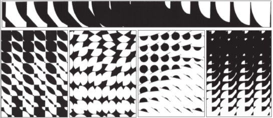
Relationship of part to part and parts to whole: A register of rhythmic interaction and transition of more than one shape, leaves a fine transformation in a strip; however, it asks for a visual judgment over the calculated and geometrical shapes while handling changing shapes, spaces, position and interval. Variety of visual effects can be created by repeating a single strip of transition as shifting and forming a progressive relationship with the surrounding units. It also can be worked on as a progressive but asymmetrical distribution of mass. In an effective whole every cell synchronises successfully with the rest.
Exercise
1. How can appropriate use of Visual Devices result in an effective visual composition?
2. Discuss the interdependence of principal and elements of design on each other for creating a good composition.
3. What are implicit and explicit elements of a composition?
4. Explain the relationship of space, form and structure in a composition.