Table of Contents
CHAPTER 12
Graphic Design for Interactive Media
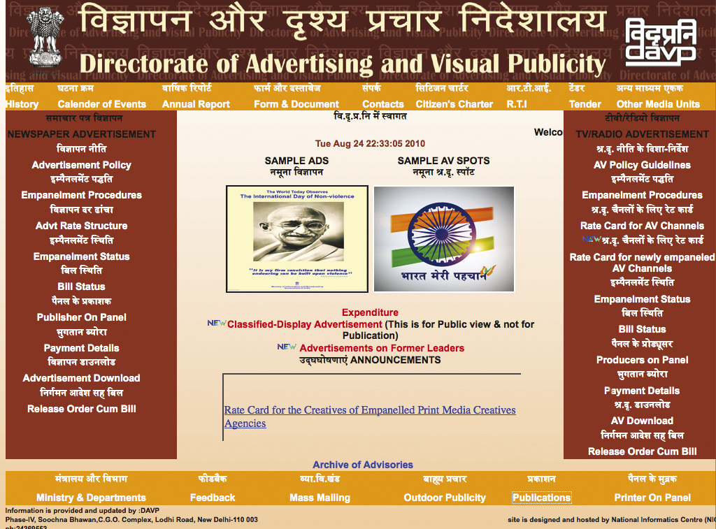

With the advent of the Information Technology (IT), there was a great revolution in media. For the first time in the history of ‘communication media’, the traditional ‘passive user’ was bestowed with the power to control and dictate the media. User-control and ‘Interactivity’ has become critical factors in digital communication. As a result, there was an emergence of new concept called Interaction Design. It has become the most important component of media. This involves new ways of interacting with computers, interface design, navigation design, human computer interaction and user-centered design. Collectively put together it is termed as ‘Interaction Design’. By and large, Interaction Design includes Multimedia CD/DVD, Internet and web-based applications, Hand-held Devices, Mobile Technology and all possible future applications using technologies. Therefore, a graphic designer needs understanding of all the emerging media and technologies to apply the knowledge of graphic design meaningfully. Although, the phrase ‘Interaction Design’ has wider connotations and applications that go beyond the realm of Internet and Information Technology, in the current context ‘Interaction Design’ is understood as follows:
Interaction Design is defined as an interactive and meaningful transaction and management of information using all the possible media and emerging technologies.
It is evident that there are overlapping areas between Interaction Design and rest of the established media disciplines. In a certain sense Interaction Design is an extension of visual media and therefore it is bound to share methods and processes of designing with graphic design. Interaction Design shares concepts of visual design, composition, page layout, typography, and illustration with graphic design. It shares concepts viz., content design, scriptwriting, and animation with film, video, and animation. Interaction Design is an amalgamation and convergence of various traditional media viz., graphics, audio, video, text etc. however, Interaction Design has additional components called web-technology and interactivity. Therefore, a graphic designer has a different and special role to play at every stage of design and development of Interaction Design application.

An electronic mailer to be sent through an e-mail, prepared by a graphic designer
Therefore, in the age of information, communication and technology (ICT), a graphic designer has to reorient to adapt to contemporary challenges. Earlier the domain of a graphic designer was limited to print media. However, slowly with the arrival of film-making and then animation the graphic designers found new horizons. Of course they had to learn relevant technologies. In due course graphic designers started extending their knowledge and visual sensitivity to film and animation to make them more visually pleasing and enriching. By the advent of Internet graphic designers have further extended their role. The technology augmented Interaction Design offers fascinating opportunities and challenges to graphic designers. This led to the emergence of highly specialised field called Graphical User Interface Design or GUI Design. In the industry it is called by various titles such as User Interface Design, Interaction Design, User Experience Design, Information Architecture, GUI Design, Interaction Design and Information Design and so on and so forth. Although, each of the above name suggests subtle shades of variations in job description, by and large it means the same thing i.e. Interaction Design. Therefore, it may be stated that graphic designer has a highly important role in Interaction Design.
User interaction opens up new ways of information collection or acquisition, storage of information, display and distribution of information. Although, information design was already in practice as information graphics, Interaction Design devised new strategies of classification, chunking and organising the information required for web-design, e-commerce, e-learning, instructional design and so on. Therefore, graphic designer deals with static as well as dynamic design, development, management and dissemination of information and has become an integral part of Interaction Design. Graphic designers have very important role in Game design, Interactive Storytelling, website for designing visually appealing Graphical User Interfaces (GUI).
Basic Concepts
In this context it is necessary to understand various concepts related to Interaction Design.
Internet
Internet is a global system of inter-connected computers and computer networks that allow communication and transfer of data among millions of computers worldwide. A computer that is connected to the Internet can access information from all the other computers or computer networks on the Internet.
World Wide Web (www)
The World Wide Web (WWW) commonly abbreviated as “Web”, is a system of interlinked documents, websites, portals etc. accessed through the Internet. Since these links are not physical or mechanical, they are called `virtual’ links or `hyperlinks’. Software engineers have developed a special tagging system called HTML (Hyper Text Markup Language) to provide hyperlinks among various web resources.
Website
A website (or web site) is a collection of web pages that provide various types of information. These web pages may contain documents, images, animations, videos or other digital assets. They also may offer a broad array of resources and services, such as e-mail, search engines, news, financial information, chats, forums, games, entertainment, on-line communities and on-line shopping malls etc. For the user a website appears as a single location on the web since all the above mentioned resources are skillfully organised and inter-connected in such a way that they are addressed with a common name or single address of the website. This address is called URL (Unique Resource Locator) of the website.
Did you know?
• 1976 APPLE 1 home computer invented.
• 1984 Apple Macintosh and IBM PC AT released.
• First nationwide programming in US – via satellite implemented by Ted Turner.
• In 1990 Internet got a public face.
• In 1994 American Government released its control of Internet and WWW was born – making global communication at light speed.
• In 1996 Web TV was introduced.
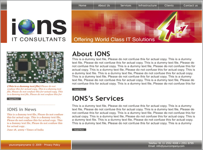
A typical web page layout with navigational links on top, image and text information at the middle and at the bottom.
Types of Websites
The World Wide Web is so huge that it is very difficult to classify all the websites in very simplistic way. There are many ways by which websites can be classified. All the websites can be broadly classified into two categories: static websites and dynamic or Interactive websites. Although, there cannot be so strict watertight compartment, it can be stated that always there will be some element of interactivity in static websites as well as all interactive web sites will share many features of static websites. For instance, a static website will have a search engine that will provide information to user and in a sense is an interactive element. On the other hand the interactive website will have huge number of pages that give static information. By and large, what is more important is that to see whether a website is information intensive or interaction intensive. If a graphic designer understands this distinction properly then it will be easier for the designer to develop overall graphical design strategy for the website. The following classification of websites or web resources needs to be understood from this angle.
Static Websites
Static websites don’t change the information or the interface or GUI so frequently. They change the information only when a website is updated. The vast majority of websites use static pages since it is highly cost-effective. Static websites are simple, relatively more secure, and easily accessible for search engines.
Activity 1
Using design based software, plan the home page of your personal website. The objective of the website should be to display your graphic design portfolio.
Static websites can be further subdivided into sub-categories based on the nature of the information or content they provide.

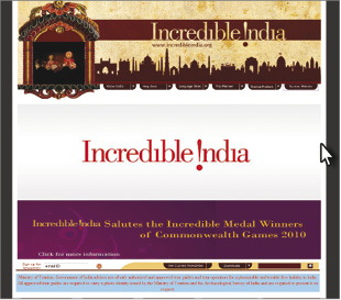
Home page example of a static site with only updates on few areas
Personal websites
Personal websites are websites which belong to individuals and they have their personal information presented on it along with their areas of interests. A personal website is usually targeted to a person’s friends and family and has limited and specific audience. It is expected that a personal website should visually and graphically project the personality. Normally such websites are informal, casual and evoke personal feelings. Therefore, the GUI of a personal website should reflect such emotions.

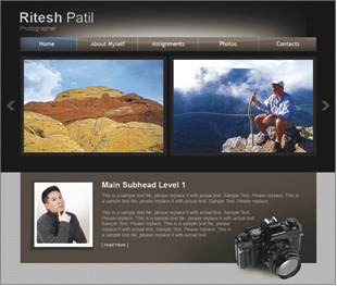
View of a personal marriage site. Such sites are mainly viewed by family and friends.
Corporate websites
Objective of the corporate websites is to project the image of the organisation in an effective way. They are not mere corporate presentations but indicate the goals and vision of the organisation. They provide information to users about the company and also provide contact information. The corporate websites are many times extended into a commercial and marketing tool.
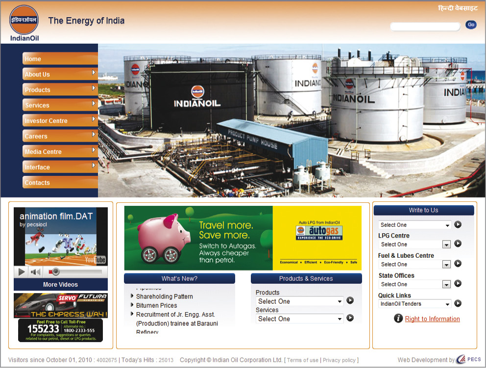
Corporate website of Indian Oil Corporation. Notice the subjects of different primary links
Web Directories
Web directory is a dedicated website for providing specialised information in a particular field. Such directories are useful for educational purpose. However, most of the time they provide specialised information at cost and make money from both, display of advertising and sale of premium information.
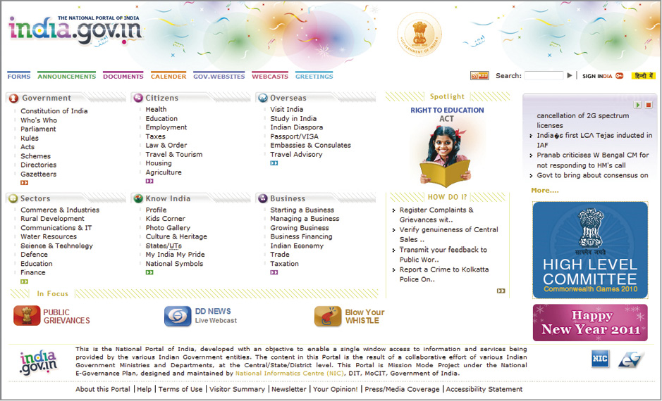
Dynamic Websites
Information on the Dynamic websites is changed frequently and in many cases modified with user interaction. Such websites can adapt their information or interface i.e. visual appearance and layout depending on the user’s interactions and requirements or preferences. Using scripting technologies, content of the website can be changed quickly on the user’s computer display. Technology makes it possible to design a multifaceted website or web applications with constantly changing content and complex interactive features. Dynamic websites offer enormous flexibility to the user. If the graphic designer has some good understanding of these technologies then the designer can take advantage of these technologies and comes up with fascinating GUI.
Dynamic websites can be further subdivided into sub-categories based on the nature of the information, interactions, and applications or content they provide.
E-Commerce Websites
E-commerce websites allow the user to buy products online and complete a monitory transaction by paying for it online. E-commerce websites make it possible with the help of some third party banking or financial organisations that provide technology for online banking services. Such websites are quite complicated to design since they involve issues of financial security of the users. Apart from usual buying and selling transactions many websites conduct auctions and sell through such websites.
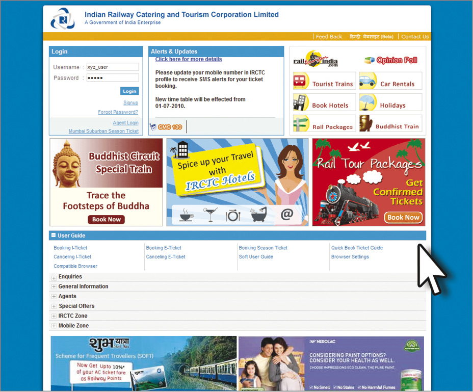
View of the Indian railways e-commerce website, where users can do various transactions online
Web-based Applications
Web-based applications allow you to perform various types of activities on-line. Such websites are the real interactive websites. Such websites provide all the interactive facilities such as to have online meetings, transact with world wide customers and even do banking online. They also provide many on-line tools that include spell-checkers, picture editors, file converters and various webmaster’s tools for web design as well as web-analysis. They may also provide specialised search engines, intelligent search agents for data mining and so on.

On-line web based banking application of State Bank of India
Gaming Websites
These websites provide enormous options to play on-line games. Designing such websites is highly challenging since it involves graphics and animations to a great extent.
Blogs
The word Blog is derived from the combination of two words: web and log. Blogs are the web-based interactive applications to express and share your ideas and thoughts with interested people. It is an open platform that can be used as on-line diaries, a journal, or editorial. A user registers to the website and dedicated web space is provided to the user. Then the user can log-on daily, weekly, or whenever, and write about whatever is going on in their lives or business, or they may comment on politics and news. Blogs allow their thoughts to be read by anyone in the world who is interested and have the access Internet. Blogs provide interactive facilities to the creator as well as the user to share and express their views.
E-Learning Websites
Many websites provide on-line educational and training facilities. Some of them even offer degree programmes through the web. Graphic designer can really make the teaching and learning process effective using graphical devices like, visuals, animation and so on. The entire educational environment is created on the web to facilitate education.
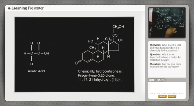
The above classification of websites is just suggestive and many more categories of website can be formulated. Graphic designer should be aware about such schemes of classification because GUI and the whole design of a website depends upon the purpose of the website and its target audience. Above classification helps in understanding the same in an appropriate manner.
Portal
A Portal or a web portal is a mega website. It is a collection of multiple websites normally related to each other in some sense. It can be a combination of various types of websites mentioned above. Literally, a portal means a grand and imposing entrance, in this context when extended metaphorically it means a grand opening to the whole new world on the web.
The Website Development and Management Process
Website designing generally follows six major stages that one can think of before beginning to develop a website. These steps are broadly as follows:
1. Website planning
2. Development of Information architecture
3. Visual design
4. Website construction
5. Site marketing
6. Tracking, evaluation, and maintenance
In the first four stages of this overall process there is a constructive role for a graphic designer since final result needs to be visually effective apart from being functional. Apart from that the stage two and three are critically important from graphic design point of view. The last two stages are important from management point of view, however, a graphic designer should be aware about various issues.
Site planning
It is the initial stage where goals and objectives for the website are defined and the work begins by collecting and analysing the information to justify the budget and resources required. The website design team needs to conduct an online survey of similar website to understand the state of the art in the industry. This is also the time to define the overall look and feel of the website as well as the content, the interactive functionality and technology support required.
Information Architecture
At this stage, the content architecture for the website is sketched out. This involves
• user studies and user requirement.
• detailed site design specification.
• classification of information, chunking of information, task-flow analysis of information, navigational schema etc.
• detailed description of the site content or the available information, site maps, thumbnails, outlines, tables of contents etc.
• options for graphic design and interface design possibilities.
• user-testing of paper prototypes or wire-frames.
• detailed technical support specification that may include Browser technology, server resources etc.
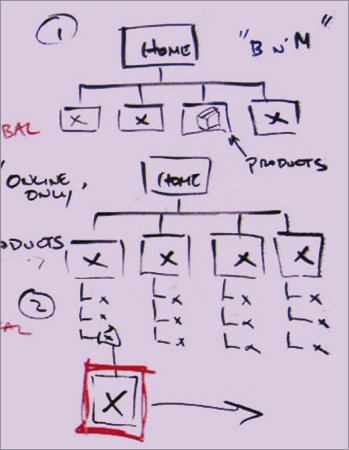
Illustrated below is a typical way in which the visual architecture of a website is planned linking different sections
Site design
This is the most important stage from the graphic design point of view. At this stage the overall look and feel, as the page grid, page design, and overall graphic design standards are envisaged. This is the time when it is estimated that what type of images, visual illustrations, photographs, and other graphic or audio-visual content for the site is required. Research, writing, organising, assembling, and editing the site’s visual as well as text content collectively termed as the stage of ‘assets creation’ or ‘assets collection’. Any programming specifics, database design and other technical specifications are also planned in parallel to this activity and coordinated.
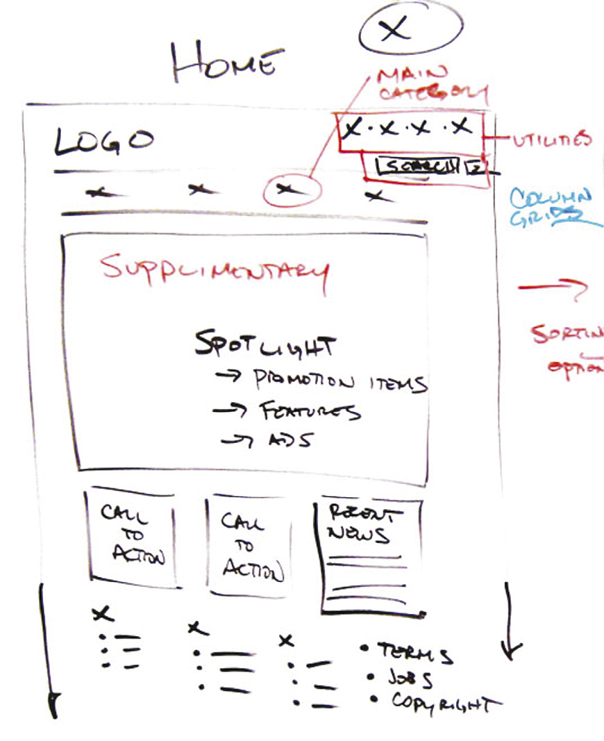
Then further detailing is done as follows:
• Text, edited and proofread
• Graphic design specifications for all page with categories types finished interface graphics for pages, header and footer graphics, logos, buttons, backgrounds
• Detailed page compositions or finished examples of key pages, site graphic standards as per the manual, if available or referred, for large, complex sites
• Interface design and master page grid templates, finished template pages
• Illustrations
• Photographs
• Audio and video content if any
• Other technological detailing
Broad Structure of a Website
Generally any website will have the following components:
• Home page or Splash screen
• Logo
• Site identity or titles
• Page title headlines
• Navigational scheme
• Search facilities
• All types of Links
• Global navigation
• Local navigation
• Primary page content
• Mailing address and email information
• Copyright statements
• Contact information
There are number of visual patterns for a web page which are also important from the graphical design point of view.
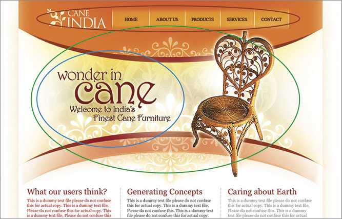
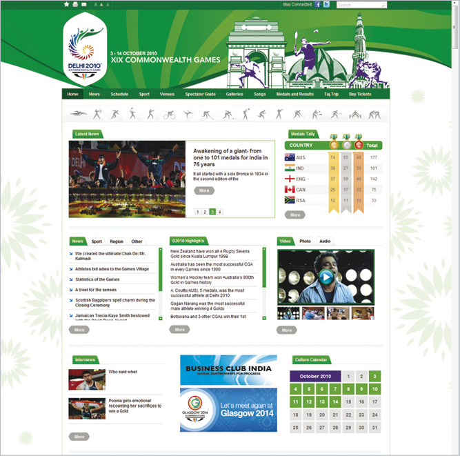
Website with different stuctural zones meant for logo, primary navigation or global navigation, spotlight zone, headlines and other data under different subheads
Graphic Design Approach
As already studied in the previous standards, understanding of elements and principles of design is absolutely important for a website designing. These principles of design are discussed elsewhere in thorough details. These principles are applicable for any visual and graphic presentation or representation. Here it will be appropriate to understand their application for GUI design, of course at slightly advanced level without repeating them.
Visual Composition
Apart from the principles of composition viz. visual balance, visual rhythm, proportion etc., there are two important factors that have to be taken into account while designing a website. One of them is the principle of ‘centre of interest’ and the other is the ‘user habits’. The first one is related to the focal awareness of the user while browsing a website, while the second one important due to reading habits of the users. As far as the first one is concerned, in any composition, corners and middle of a visual space attract immediate attention from the viewer’s point of view. In a visual composition the “rule of thirds” is practiced to place the centers of interest within a visual space and a grid is worked out accordingly. These compositional rules are purely based on visual practices, however, and therefore are probably most useful for displays or home pages of a website.
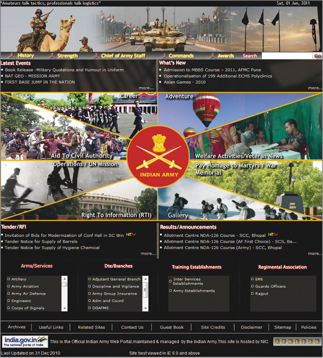
Apart from the visual composition, reader habits need to be taken into account for GUI design. Web page is normally dominated by text, and therefore, reading habits are the primary forces that shape the way users scan pages although readers also scan holistically. Normally, users read from top to bottom, scanning left to right down the page in a “Gutenberg Z” pattern. This preference for attention flow down the page is also called “reading gravity”. Following webpage is an example explaining the above principles.
Apart from that there are some interesting eye-tracking studies that also support the above rules.
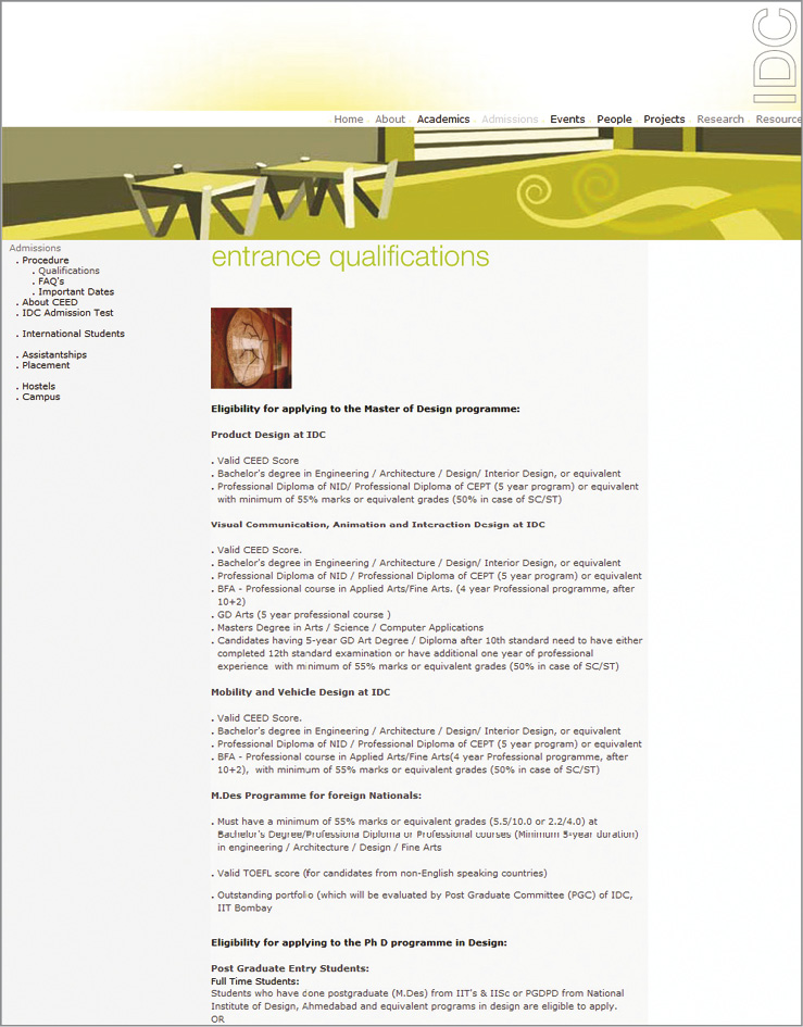
Web page of an institution with text flow in ‘Z’ pattern from top to bottom. Notice the position of important words and links on top-left side of the page
Eye-tracking studies by Poynter show that normal page- scanning patterns are dominated by top-left scanning for the most important words and links on a page.
There are many such intuitive patterns that are based on the principle of Golden Mean as well as the well-known ‘F’ pattern. With the combination of both many such interesting patterns can be developed. Of course, these patterns are just suggestive and not absolute in any sense. Users will always deviate from these patterns however; these patterns definitely provide very important insight into designing a website. Therefore, some of the patterns can be used for specific purposes. Certain patterns are more comfortable for specific functionalities. Also it gives an idea about a generic template for a typical web page. However, graphic designers need not restrict to these patterns alone. On the other hand experimentation in layout designing will help develop many more new patterns. Some of the patterns and their visual affinity and gravity are shown below. For different functionalities and user preferences, some of the patterns are identified and they are supposed to be useful. However, these patterns are not the only patterns possible; on the other hand they are just suggestive and give inspiration for further explorations.
Visual Impact and Design
Visual look and feel of a website is the heart of website development process since it is always the ‘first impression is the last impression’.
The primary purposes of graphic design are to
• create a clear visual hierarchy of contrast, so that the user can see at a glance what is important and what is secondary.
• identify and define appropriate locations for appropriate functionalities.
• provide visual relationship of visuals and contents across the website with consistent visual clues.
To achieve this, a graphic designer should use the knowledge of visual composition discussed elsewhere in this book. For example a graphic designer should know where to use the principles of composition such as visual balance, contrast, harmony, rhythm, proportion etc. appropriately and build visual hierarchies by using them.
Consistency
A consistent approach to layout and navigation allows users to adapt quickly to the design and to predict with confidence the location of information and navigation controls across the pages of the website.

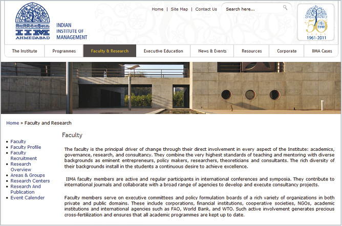
Web page of IIM Ahmedabad. Notice the consitent approach to layout and navigation across different sections
Contrast
The primary task of graphic designer is to create a strong, consistent visual hierarchy in which important elements are emphasized and content is organised logically and predictably. Graphic design is in a sense visual information management, using the tools of layout designing, typography, buttons, menus and illustration to lead the reader’s eye through the page. Readers first see pages as large visual masses of forms and colour, with foreground elements contrasting against the background. Then the users start reading and scanning the text and begin to read individual words and phrases.
The overall graphic balance and organisation of the website in terms of relation of visuals and textual masses is crucial for drawing the user attention. A page too much of text will repel the reader. A page dominated by poorly designed or over-loaded with bold graphics or typography will also distract or repel users. Graphic designer needs to strike an appropriate balance between attracting the eye with visual contrast and providing a clear sense of visual harmony, through the variations in contrast that result from proper chunking, grouping, figure-ground relationships, and headings. Visual balance and appropriateness to the intended audience are the keys to successful design decisions.
The Gestalt for the Web Design
The fundamental principles of human visual processing follow Gestalt principles. Web design adds the dimensions of interactivity but the core principles of Gestalt are valid. Similarly, all the principles of visual composition are also equally valid. They need to be adapted to the paradigm of interactivity and other concerns of a website. The Interaction Design as it evolved is clearly an extension of print media, because centuries of designing documents for readers have taught the world useful practices of how humans read and absorb information.
The Gestalt psychology focuses on the phenomenon of the mind’s ability to see unified “wholes” from the sum of complex visual parts (“Gestalt” in German means a “shape” or “whole shape”). Gestalt psychology looks into the perception of visual patterns and finds out number of consistent principles that dominate human visual reasoning and pattern recognition, and these principles form the theoretical basis for much of modern graphic design. Proximity and uniform connectedness are the most powerful Gestalt principles in website design. Elements, whether textual, visual or their combinations that are grouped within defined regions form a Gestalt. This provides a basis for content modularity and “chunking” of information or the web content. This helps user in scanning the content. A well organised page with clear groups of content shows the user at a glance how the content is organised and sets up the expectations for the rest of the content that form a predictable pattern over pages throughout the site. It means that there should be a consistency in design in terms of visual flow as well as textual flow in terms of repeated patterns.
The following principles are most relevant to web design:

Proximity
Elements that are close to each other are perceived as more related than elements that lie farther apart.
Similarity
Users will associate and treat as group elements that share consistent visual characteristics.
Continuity
Users prefer continuous, unbroken contours and paths, and the vast majority of users will interpret c, below, as two crossed lines, not four lines meeting at a common point.

Closure
Humans have a powerful bias to see completed figures, even when the contours of the figure are broken or ambiguous. Humans see a white rectangle in four circles and not four circles that each has a section missing.
Uniform connectedness
Uniform connectedness refers to relations of elements that are defined by enclosing elements within other elements, regions, or discrete areas of the page.
1 + 1 = 3 effects
The “white space” between two visual elements forms a third visual element and becomes visually active as the elements come closer together. The well known visual illusion below of gray “spots” appearing in the spaces between the dark squares shows the worst-case scenario for 1 + 1 = 3 effects, but this principle applies to all closely spaced elements in which the ground forms an active part of the overall design.
Principles of Gestalt are useful to organise information on the website. These principles are universal in nature and are used by graphic designers over a long period of time and in this sense are time-tested.
Designing Navigation
Navigation is a term used in the context of web design to suggest the path that user takes while browsing a website. User opens a website with some purpose in mind, either for information or for some specific functionality. GUI designer is a facilitator of this process. Firstly, c+ it is the designer’s responsibility to help and guide the user reach the desired destination as quickly as possible, may be in less than three to four clicks. Secondly, web users should be able to go from any web page to any other web page or link. Therefore, a graphic designer should put himself or herself into the shoes of the user and develop a navigational schema for a website. Following are some of the primary concerns of a user and a designer needs to have proper understanding of these concerns.
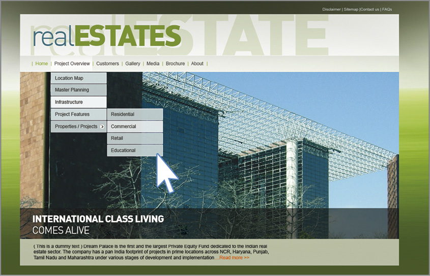
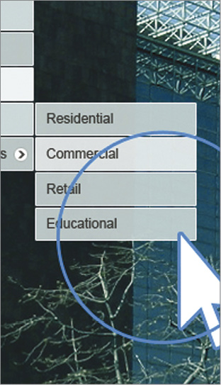
Navigation has following core components:
• Orientation: the user should know where he or she is located at any given moment on the website while browsing it.
• Route decisions: the user should be able to know what is the shortest route for the desired destination.
• Mental models and mapping: the graphic designer should have proper understanding of users’ mental model for navigation that is the general user preferences, habits and styles of thinking.
• Closure or conclusion of the navigational process that means the process of navigation should complete with satisfaction.
In this regard, following points are necessary to keep in mind by a graphic designer.
• Paths and branching: the way user proceeds towards the destinations.
• Edges: blocks or critical hindrances in navigation.
• Sub-Destinations: all possible sub-destinations for the user.
• Nodes: intersecting points where user might change the desired path.
• Landmarks: points that will provide intuitive clues that are mostly visual.
Following are the Navigational points to be kept in mind while envisaging a navigational scheme:
• Usability: location of global as well as local links where users expect them.
• Semantic logic: develop a consistent scheme of links, buttons, menus etc. with their hierarchies and provide meaningful visual language for them, typically use verbs for actions.
• Accessibility: this is the primary need of the user. User should know intuitively how and where to begin browsing.
• Home Link: this gives the sense of orientation to the user
• Global and local website navigation schema with details.
• Design framework at macro level to organise content consistently.
• Visual palette to establish the effective look and feel of the site.
Interactivity
There are three broad categories of user interactions referred to as ‘reactive’ (in response to a given stimuli), proactive (user generation of unique constructions) and mutual (artificial intelligence).
• Reactive Interaction: in this case a website provides visual or verbal clues to the user and then the user reacts to it in a certain desired way. A simple example would be to fill up a form on the website. In this case the website provides the format and space for the entries by the user. User responds to it and fills up the entries into the fields provided.
• Proactive Interaction: here a user initiates the process of interaction and then the website responds to it in a certain way. In this case a website provides a range of possible options to the user and a user proactively chooses one of them and begins the interaction. At every level of such interaction, multiple options are provided to the user.
• Mutual Interaction: in the mutual interactivity, the website adapts to the user’s progress, advises, help the user to perform the desired task. Such action suggests both intelligent and adaptive behaviour on the part of the website. Adaptability suggests that a website knows something about the user and uses this knowledge to adapt with the user behaviour and requirements.
Thus, website design is an art as well as a science. It involves artistic sensitivity, technological know-how and high degree of analytical capability. The field of Interaction design has opened up a whole new world of opportunities and challenges to the graphic designer.
Exercises
1. Discuss the changing role of a graphic designer in the contemporary scenario?
2. Compare and contrast static website and dynamic websites?
3. What things should a graphic designer keep in mind while designing an e-learning website?
4. What are the various steps involved in planning a design for a website?
5. How can the different rules of composition be helpful in making an impactful visual composition?
6. Interaction design is an extension of the print media. Write your views on the same.