3
Graphical Representation of Data
You must have seen graphs, diagrams and maps showing different types of data.
For example, the thematic maps shown in Chapter 1 of book for Class XI entitled
Practical Work in Geography, Part-I (NCERT, 2006) depict relief and slope, climatic
conditions, distribution of rocks and minerals, soils, population, industries,
general land use and cropping pattern in the Nagpur district, Maharashtra. These
maps have been drawn using large volume of related data collected, compiled
and processed. Have you ever thought what would have happened if the same
information would have been either in tabular form or in a descriptive transcript?
Perhaps, it would not have been possible from such a medium of communication
to draw visual impressions which we get through these maps. Besides, it would
also have been a time consuming task to draw inferences about whatever is
being presented in non–graphical form. Hence, the graphs, diagrams and maps
enhance our capabilities to make meaningful comparisons between the
phenomena represented, save our time and present a simplified view of the
characteristics represented. In the present chapter, we will discuss methods of
constructing different types of graphs, diagrams and maps.
Representation of Data
The data describe the properties of the phenomena they represent. They are
collected from a variety of sources (Chapter 1). The geographers, economists,
resource scientists and the decision makers use a lot of data these days. Besides
the tabular form, the data may also be presented in some graphic or diagrammatic
form. The transformation of data through visual methods like graphs, diagrams,
maps and charts is called representation of data. Such a form of the presentation
of data makes it easy to understand the patterns of population growth,
distribution and the density, sex ratio, age–sex composition, occupational
structure, etc. within a geographical territory. There is a Chinese proverb that ‘a
picture is equivalent to thousands of words’. Hence, the graphic method of the
representation of data enhances our understanding, and makes the comparisons
easy. Besides, such methods create an imprint on mind for a longer time.
General Rules for Drawing Gwing Graphs, Diagrams and Maps
1. Selection of a Suitable Method
Data represent various themes such as temperature, rainfall, growth and distribution of the population, production, distribution and trade of different commodities, etc. These characteristics of the data need to be suitably represented by an appropriate graphical method. For example, data related to the temperature or growth of population between different periods in time and for different countries/states may best be represented using line graphs. Similarly, bar diagrams are suited best for showing rainfall or the production of commodities. The population distribution, both human and livestock, or the distribution of the crop producing areas may suitably be represented on dot maps and the population density using choropleth maps.
2. Selection of Suitable Scale
The scale is used as measure of the data for representation over diagrams and maps. Hence, the selection of suitable scale for the given data sets should be carefully made and must take into consideration entire data that is to be represented. The scale should neither be too large nor too small.
3. Design
We know that the design is an important cartographic task (Refer ‘Essentials of Map Making’ as discussed in Chapter 1 of the Practical Work in Geography, Part-I (NCERT, 2006), a textbook of Class XI). The following components of the cartographic designs are important. Hence, these should be carefully shown on the final diagram/map.
Title
The title of the diagram/map indicates the name of the area, reference year of the data used and the caption of the diagram. These components are represented using letters and numbers of different font sizes and thickness. Besides, their placing also matters. Normally, title, subtitle and the corresponding year are shown in the centre at the top of the map/diagram.
Legend
A legend or index is an important component of any diagram/map. It explains
the colours, shades, symbols and signs used in the map and diagram. It should
also be carefully drawn and must correspond to the contents of the map/diagram.
Besides, it also needs to be properly positioned. Normally, a legend is shown
either at the lower left or lower right side of the map sheet.
Direction
The maps, being a representation of the part of the earth’s surface, need be oriented
to the directions. Hence, the direction symbol, i. e. North, should also be drawn
and properly placed on the final map.
Construction of Diagrams
The data possess measurable characteristics such as length, width and volume.
The diagrams and the maps that are drawn to represent these data related
characteristics may be grouped into the following types:
1. One-dimensional diagrams, such as line graph, poly graph, bar diagram, histogram, age, sex, pyramid, etc.;
2. Two-dimensional diagram, such as pie diagram and rectangular diagram;
3. Three-dimensional diagrams, such as cube and spherical diagrams.
It would not be possible to discuss the methods of construction of these many types of diagrams and maps primarily due to the time constraint. We will, therefore, describe the most commonly drawn diagrams and maps and the way they are constructed. These are :
• Line graphs
• Bar diagrams
• Pie diagram
• Wind rose and star diagram
• Flow Charts
Line Graph
The line graphs are usually drawn to represent the time series data related to the temperature, rainfall, population growth, birth rates and the death rates. Table 3.1 provides the data used for the construction of Fig 3.2.
Construction of a Line Graph
1. Simplify the data by converting it into round numbers, such as the growth rate of population as shown in Table 3.1 for the years 1961 and 1981 may be rounded to 2.0 and 2.2, respectively.
2. Draw X and Y-axis. Mark the time series variables (years/months) on the X axis and the data quantity/value to be plotted (growth of population in per cent or the temperature in
0
C) on Y axis.
3. Choose an appropriate scale and label it on Y-axis. If the data involve anegative figure, then the selected scale should also show it as shown in Fig. 3.1.
Fig. 3.1 : Construction of a Line Graph
4. Plot the data to depict year/month-wise values according to the selected scale on Y-axis, mark the location of the plotted values by a dot and join these dots by a free hand drawn line.
Example 3.1 : Construct a line graph to represent the data as given in Table 3.1:
Table 3.1 : Growth rate of Population in India – 1901 to 2011
Year
|
Growth rate in percentage
|
1901
|
-
|
1911
|
0.56
|
1921
|
-0.30
|
1931
|
1.04
|
1941
|
1.33
|
1951
|
1.25
|
1961
|
1.96
|
1971
|
2.20
|
1981
|
2.22
|
1991
|
2.14
|
2001
|
1.93
|
2011
|
1.79
|
Fig. 3.2 : Annual Growth of Population in India 1901-2011
Activity
Find out the reasons for sudden change in population between 1911 and 1921as shown in Fig. 3.2.
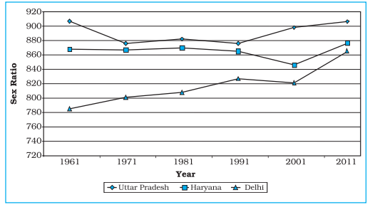
Polygraph
Polygraph is a line graph in which two or more than two variables are shown by
an equal number of lines for an immediate comparison, such as the growth rate
of different crops like rice, wheat, pulses or the birth rates, death rates and life
expectancy or sex ratio in different states or countries. A different line pattern
such as straight line ( ____ ), broken line (- - - ), dotted line (……) or a combination
of dotted and broken line (-.-.-) or line of different colours may be used to indicate
the value of different variables (Fig 3.3).
Table 3.2 : Sex-Ratio (Female per 1000 male) of Selected Sates – 1961-2011
States/UT
|
1961
|
1971
|
1981
|
1991
|
2001
|
2011
|
Delhi
|
785
|
801
|
808
|
827
|
821
|
866
|
Haryana
|
868
|
867
|
870
|
860
|
846
|
877
|
Uttar Pradesh
|
907
|
876
|
882
|
876
|
898
|
908
|
Fig. 3.3 : Sex-Ratio of Selected States 1961-2011
Bar Diagram
The bar diagrams are drawn through columns of equal width. It is also called a columnar diagram. Following rules should be observed while constructing a bar diagram:
1. The width of all the bars or columns should be similar.
2. All the bars should be placed on equal intervals/distance.
3. Bars may be shaded with colours or patterns to make them distinct and attractive.
The simple, compound or polybar diagram may be constructed to suit the data characteristics.
Simple Bar Diagram
A simple bar diagram is constructed for an immediate comparison. It is advisable to arrange the given data set in an ascending or descending order and plot the data variables accordingly. However, time series data are represented according to the sequencing of the time period.
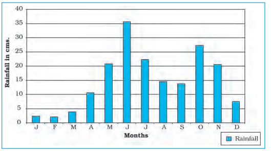
Example 3.3 : Construct a simple bar diagram to represent the rainfall data of Thiruvananthapuram as given in Table 3.3 :
Table 3.3 : Average Monthly Rainfall of Thiruvananthapuram
Month
|
J
|
F
|
M
|
A
|
M
|
J
|
J
|
A
|
S
|
O
|
N
|
D
|
Rainfall in cm
|
2.3
|
2.1
|
3.7
|
10.6
|
20.8
|
35.6
|
22.3
|
14.6
|
13.8
|
27.3
|
20.6
|
7.5
|
Construction
Draw X and Y-axes on a graph paper. Take an interval of 5 cm and mark it on Yaxis to plot rainfall data in cm. Divide X-axis into 12 equal parts to represent 12
months. The actual rainfall values for each month will be plotted according to
the selected scale as shown in Fig. 3.4.
Fig. 3.4 : Average Monthly Rainfall of Thiruvananthapuram
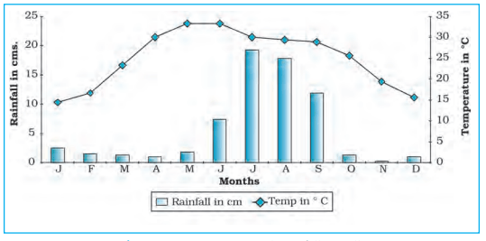
Line and Bar Graph
The line and bar graphs as drawn separately may also be combined to depict the
data related to some of the closely associated characteristics such as the climatic
data of mean monthly
temperatures and rainfall. In
doing so, a single diagram is
drawn in which months are
represented on X-axis while
temperature and rainfall data
are shown on Y-axis at both
sides of the diagram.
Example 3.4 : Construct a
line graph and bar diagram to
represent the average monthly
rainfall and temperature data
of Delhi as given in Table 3.4 :
Table 3.4 : Average monthly Temperature
and Rainfall in Delhi
Month
|
Temp. in C
|
Rainfall in cm.
|
JAN.
|
14.4
|
2.5
|
FEB
|
16.7
|
1.5
|
MAR
|
23.30
|
1.3
|
APR
|
30.0
|
1.0
|
MAY
|
33.3
|
1.8
|
JUNE
|
33.3
|
7.4
|
JUL
|
30.0
|
19.3
|
AUG
|
29.4
|
17.8
|
SEP
|
28.9
|
11.9
|
OCT
|
25.9
|
1.3
|
NOV
|
19.4
|
0.2
|
DEC
|
15.6
|
1.0
|
Construction
1. Draw X and Y-axes of a suitable length and divide X-axis into 12 parts to show months in a year.
2. Select a suitable scale with equal intervals of 5° C or 10°
C for temperature data on the Y-axis and label it at its right side.
3. Similarly, select a suitable scale with equal intervals of 5 cm or 10 cm for rainfall data on the Y-axis and label at its left side.
4. Plot temperature data using line graph and the rainfall by bar diagram as shown in Fig. 3.5.
Fig. 3.5 : Temperature and Rainfall in Delhi
Multiple Bar Diagram
Multiple bar diagrams are constructed to represent two or more than two variables for the purpose of comparison. For example, a multiple bar diagram may be constructed to show proportion of males and females in the total, rural and urban population or the share of canal, tube well and well irrigation in the total irrigated area in different states.
Example 3.5 : Construct a suitable bar diagram to show decadal literacy rate in India during 1951–2011 as given in Table 3.5 :
Construction
1. Multiple bar diagram may be chosen to represent the above data.
2. Mark time series data on X-axis and literacy rates on Y-axis as per the selected scale.
Table 3.5 : Literacy Rate in India, 1951–2011 (in %)
Year
|
|
Literacy Rate
|
|
|
Total population
|
Male
|
Female
|
1951
|
18.33
|
27.16
|
8.86
|
1961
|
28.3
|
40.4
|
15.35
|
1971
|
34.45
|
45.96
|
21.97
|
1981
|
43.57
|
56.38
|
29.76
|
1991
|
52.21
|
64.13
|
39.29
|
2001
|
64.84
|
75.85
|
54.16
|
2011
|
73.0
|
80.9
|
64.6
|
Source : Census, 2011
3. Plot the per cent of total population, male and female in closed columns (Fig 3.6)
.
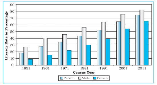
Fig. 3.6 : Literacy Rate in India, 1951-2011
Table 3.6 : Gross Generation of Electricity in India (in Billion KWh)
Year
|
Thermal
|
Hydro
|
Nuclear
|
Total
|
2008-09
|
616.2
|
110.1
|
14.9
|
741.2
|
2009-10
|
677.1
|
104.1
|
18.6
|
799.8
|
2010-11
|
704.3
|
114.2
|
26.3
|
844.8
|
Source: Economic Survey, 2011-12
Construction
1. Arrange the data in ascending or descending order.
2. A single bar will depict the gross electricity generation in the given year and the generation of thermal, hydro and nuclear electricity be shown by dividing the total length of the bar as shown in Fig 3.7.
Fig. 3.7 : Gross Electricity Generation in India
Pie Diagram
Pie diagram is another graphical method of the representation of data. It is drawn to depict the total value of the given attribute using a circle. Dividing the circle into corresponding degrees of angle then represent the sub-sets of the data. Hence, it is also called Divided Circle Diagram.
The angle of each variable is calculated using the following formulae
Value of given State/Region X 360 / Total Value of All States/Regions
If data are given in percentage form, the angles are calculated using the given formulae.
Percentage of x X 360 / 100
For example, a pie diagram may be drawn to show the total population of India along with the proportion of the rural and urban population. In this case, the circle of an appropriate radius is drawn to represent the total population and its sub-divisions into rural and urban population are shown by corresponding degrees of angle.
Example 3.7: Represent the data as given in Table 3.7 (a) with a suitable diagram.
Table 3.7 (a) : India’s Export to Major
Regions of the World in 2010–11
Unit/Region
|
% of Indian Export
|
Europe
|
20.2
|
Africa
|
6.5
|
America
|
14.8
|
Asia and ASEAN
|
56.2
|
Others
|
2.3
|
Total
|
100
|
Calculation of Angles
1. Arrange the data on percentages of Indian exports in an ascending order.
2. Calculate the degrees of angles for showing the given values of India’s export to major regions/ Source : Economic Survey 2011-12 countries of the world, Table 3.7 (b). It could be done by multiplying percentage with a constant of 3.6 as derived by dividing the total number of degrees in a circle by 100, i. e. 360/100.
3. Plot the data by dividing the circle into the required number of divisions to show the share of India’s export to different regions/countries (Fig. 3.8).
Table 3.7 (b) : India’s Export to Major Regions of the World in 2010-11
Countries
|
%
|
Calculation
|
Degree
|
Europe
|
20.2
|
20.2 x 3.6 = 7.2
|
73o
|
Africa
|
6.5
|
6.5 x 3.6 = 23.4
|
23o
|
America
|
14.8
|
14.8 x 3.6 = 53.28
|
53o
|
Asia and ASEAN
|
56.2
|
56.2 x 3.6 = 202.32
|
203o
|
Others
|
2.3
|
2.3 x 3.6 = 8.28
|
8o
|
Total
|
100
|
|
360o
|
Construction
1. Select a suitable radius for the circle to be drawn. A radius of 3, 4 or 5 cm may be chosen for the given data set.
2. Draw a line from the centre of the circle to the arc as a radius.
3. Measure the angles from the arc of the circle for each category of vehicles in an ascending order clock-wise, starting with smaller angle.
4. Complete the diagram by adding the title, sub-title, and the legend. The legend mark be chosen for each variable/category and highlighted by distinct shades/colours.
Precautions
1. The circle should neither be too big to fit in the space nor too small to be illegible.
2. Starting with bigger angle will lead to accumulation of error leading to the plot of the smaller angle difficult.
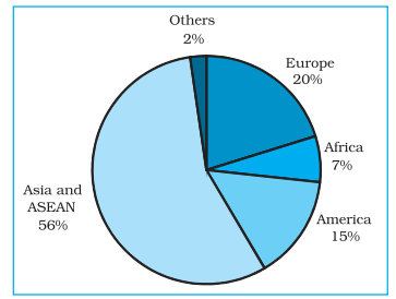
Fig. 3.8 : Direction of Indian Exports 2010–11
Flow Maps/Chart
Flow chart is a combination of graph and map. It is drawn to show the flow of commodities or people between the places of origin and destination. It is also called Dynamic Map. Transport map, which shows the number of passengers, vehicles, etc., is the best example of a flow chart. These charts are drawn using lines of proportional width. Many government agencies prepare flow maps to show density of the means of transportation on different routes. The flow maps/ charts are generally drawn to represent two the types of data as given below:
1. The number and frequency of the vehicles as per the direction of their movement
2. The number of the passengers and/or the quantity of goods transported.
Requirements for the Preparation of a Flow Map
1. A route map depicting the desired transport routes along with the connecting stations.
2. The data pertaining to the flow of goods, services, number of vehicles, etc., along with the point of origin and destination of the movements.
3. The selection of a scale through which the data related to the quantity of passengers and goods or the number of vehicles is to be represented.
Table 3.8 : No. of trains of selected routes of Delhi and adjoining areas
S.No.
|
Railway Routes
|
No. of Trains
|
1.
|
Old Delhi – New Delhi
|
50
|
2.
|
New Delhi-Nizamuddin
|
40
|
3.
|
Nizamuddin-Badarpur
|
30
|
4.
|
Nizamuddin-Sarojini Nagar
|
12
|
5.
|
Sarojini Nagar – Pusa Road
|
8
|
.6.
|
Old Delhi – Sadar Bazar
|
32
|
7.
|
Udyog Nagar-Tikri Kalan
|
6
|
8.
|
Pusa Road – Pehladpur
|
15
|
9.
|
Sahibabad-Mohan Nagar
|
18
|
10.
|
Old Delhi – Silampur
|
33
|
11.
|
Silampur – Nand Nagari
|
12
|
12.
|
Silampur-Mohan Nagar
|
21
|
13.
|
Old Delhi-Shalimar Bagh
|
16
|
14.
|
Sadar Bazar-Udyog Nagar
|
18
|
15.
|
Old Delhi – Pusa Road
|
22
|
16.
|
Pehladpur – Palam Vihar
|
12
|
Example 3.10 : Construct a flow map to represent the number of trains running in Delhi and the adjoining areas as given in the Table 3.8.
Construction
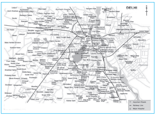
1. Take an outline map of Delhi and adjoining areas, in which railway line and the nodal stations are depicted (Fig.3.9).
2. Select a scale to represent the number of trains. Here, the maximum number is 50 and the minimum is 6. If we select a scale of 1cm = 50 trains, the maximum and minimum numbers will be represented by a strip of 10 mm and 1.2 mm thick lines, respectively, on the map.
3. Plot the thickness of each strip of route between the given rail route (Fig. 3.10).
(d) Draw a terraced scale as legend and choose distinct sign or symbol to
show the nodal points (stations) within the strip
Fig. 3.9 : Map of Delhi
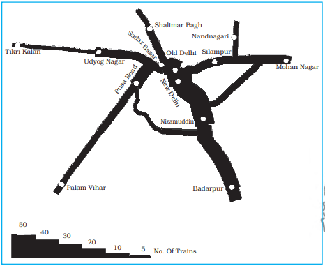
Fig. 3.10 : Traffic (Railway) Flow Map of Delhi
Example 3.10 : Construct a water flow map of Ganga Basin as shown in Fig. 3.11.
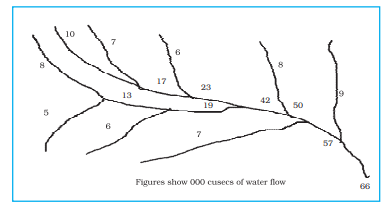
Fig. 3.11 : Ganga Basin
Construction
1. Take a scale as a strip of 1cm width = 50,000 cusecs of water.
2. Make the diagram as shown in Fig. 3.12.
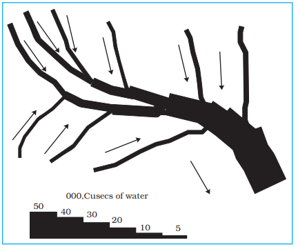
Fig. 3.12 : Construction of a Flow Map
Thematic Maps
Graphs and diagrams serve a useful purpose in providing a comparison between the internal variations within the data of different characteristics represented. However, the use of graphs and diagrams, at times, fails to produce a regional perspective. Hence, variety of maps may also be drawn to understand the patterns of the regional distributions or the characteristics of variations over space. These maps are also known as the distribution maps.
Requirements for Making a Thematic Map
1. State/District level data about the selected theme.
2. Outline map of the study area alongwith administrative boundaries.
3. Physical map of the region. For example, physiographic map for population distribution and relief and drainage map for constructing transportation map.
Rules for Making Thematic Maps
1. The drawing of the thematic maps must be carefully planned. The final map should properly reflect the following components:
1. Name of the area
2. Title of the subject-matter
3. Source of the data and year
4. Indication of symbols, signs, colours, shades, etc.
5. Scale
2. The selection of a suitable method to be used for thematic mapping.
Classification of Thematic Maps based on Method of Construction
The thematic maps are, generally, classified into quantitative and non-quantitative maps. The quantitative maps are drawn to show the variations within the data. For example, maps depicting areas receiving more than 200 cm, 100 to 200 cm, 50 to 100 cm and less than 50 cm of rainfall are referred as quantitative maps. These maps are also called statistical maps. The non-quantitative maps, on the other hand, depict the non-measurable characteristics in the distribution ofgiven information, such as a map showing high and low rainfall-receiving areas. These maps are also called qualitative maps. It would not be possible to discuss drawing these different types of thematic maps under the constraint of time. We will, therefore, confine to discuss the methods of the construction of the following types of quantitative maps :
1. Dot maps
2. Choropleth maps
3. Isopleth maps
Dot Maps
The dot maps are drawn to show the distribution of phenomena such as population, cattle, types of crops, etc. The dots of same size as per the chosen scale are marked over the given administrative units to highlight the patterns of distributions.
Requirement
1. An administrative map of the given area showing state/district/block boundaries.
2. Statistical data on selected theme for the chosen administrative units, i.e., total population, cattle, etc.
3. Selection of a scale to determine the value of a dot.
4. Physiographic map of the region, especially relief and drainage maps.
Precaution
(a) The lines, demarcating the boundaries of various administrative units, should not be very thick and bold. (b) All dots should be of same size.
Example 3.12 : Construct a dot map to represent population data of 2001 as given in Table 3.9.
Table 3.9 : Population of India, 2001
Sl. No
|
States/Union Territories
|
Total Population
|
No. of dots
|
1.
|
Jammu & Kashmir
|
10,069,917
|
100
|
2.
|
Himachal Pradesh
|
6,077,248
|
60
|
3.
|
Punjab
|
24,289,296
|
243
|
4.
|
Uttarakhand
|
8,479,562
|
85
|
5.
|
Haryana
|
21,082,989
|
211
|
6.
|
Delhi
|
13,782,976
|
138
|
7.
|
Rajasthan
|
56,473,122
|
565
|
8.
|
Uttar Pradesh
|
166,052,859
|
1660
|
9.
|
Bihar
|
82,878,796
|
829
|
10.
|
Sikkim
|
540,493
|
5
|
11.
|
Arunachal Pradesh
|
1,091,117
|
11
|
12.
|
Nagaland
|
1,988,636
|
20
|
13.
|
Manipur
|
2,388,634
|
24
|
14.
|
Mizoram
|
891,058
|
89
|
15.
|
Tripura
|
3,191,168
|
32
|
16.
|
Meghalaya
|
2,306,069
|
23
|
17.
|
Assam
|
26,638,407
|
266
|
18.
|
West Bengal
|
80,221,171
|
802
|
19.
|
Jharkhand
|
26,909,428
|
269
|
20.
|
Odisha
|
36,706,920
|
367
|
21.
|
Chhattisgarh
|
20,795,956
|
208
|
22.
|
Madhya Pradesh
|
60,385,118
|
604
|
23.
|
Gujarat
|
50,596,992
|
506
|
24.
|
Maharashtra
|
96,752,247
|
968
|
25.
|
Andhra Pradesh
|
75,727,541
|
757
|
26.
|
Karnataka
|
52,733,958
|
527
|
27.
|
Goa
|
1,343,998
|
13
|
28.
|
Kerala
|
31,838,619
|
318
|
29.
|
Tamil Nadu
|
62,110,839
|
621
|
Fig. 3.13 : Population of India, 2001
Construction
1. Select the size and value of a dot.
2. Determine the number of dots in each state using the given scale. Forexample, number of dots in Maharashtra will be 9,67,52,247/100,000 = 967.52. It may be rounded to 968, as the fraction is more than 0.5.
3. Place the dots in each state as per the determined number in all states.
4. Consult the physiographic/relief map of India to identify mountainous,desert, and/or snow covered areas and mark lesser number of dots in such areas.
Choropleth Map
The choropleth maps are also drawn to depict the data characteristics as they are related to the administrative units. These maps are used to represent the density of population, literacy/growth rates, sex ratio, etc.
Requirement for drawing Choropleth Map
1. A map of the area depicting different administrative units.
2. Appropriate statistical data according to administrative units.
Steps to be followed
1. Arrange the data in ascending or descending order.
2. Group the data into 5 categories to represent very high, high, medium,low and very low concentrations.
3. The interval between the categories may be identified on the followingformulae i.e., Range/5 and Range = maximum value – minimum value.
4. Patterns, shades or colour to be used to depict the chosen categoriesshould be marked in an increasing or decreasing order.
Example 3.13: Construct a Choropleth map to represent the literacy rates in India in 2001 as given in Table 3.10.
Construction
1. Arrange the data in ascending order as shown above.
2. Identify the range within the data. In the present case, the states recording the lowest and highest literacy rates are Bihar (47%) and Kerala (90.9%), respectively. Hence, the range would be 91.0 – 47.0 = 44.0
3. Divide the range by 5 to get categories from very low to very high. (44.0/5 = 8.80. We can convert this value to a round number, i. e., t 9.0
4. Determine the number of the categories alongwith the range of eachcategory. Add 9.0 to the lowest value of 47.0 as so on. We will finally get following categories :
47 – 56 Very low (Bihar, Jharkhand, Arunachal Pradesh, Jammu and Kashmir)
56 – 65 Low (Uttar Pradesh, Rajasthan, Andhra Pradesh, Meghalaya,Odisha, Assam, Madhya Pradesh, Chhattisgarh)
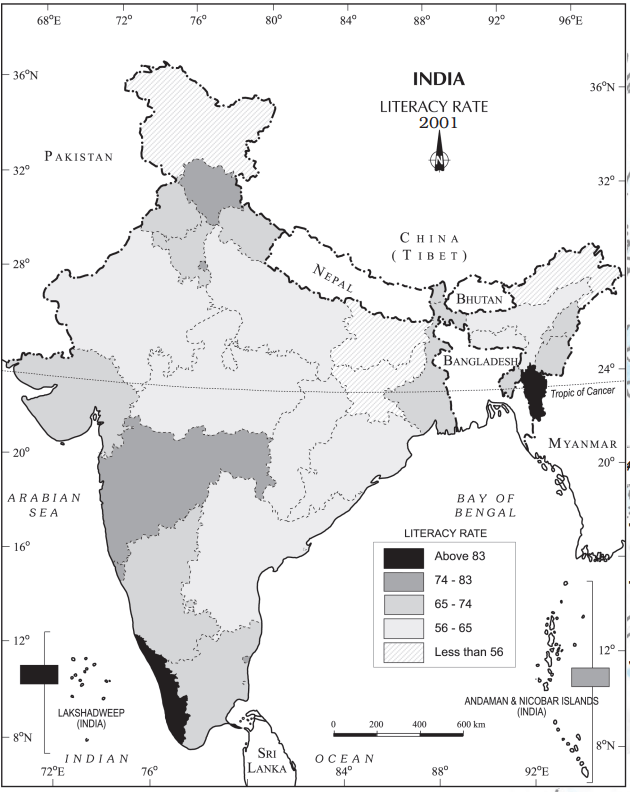
Fig. 3.14 : Literacy Rate, 2001
Table 3.10 : Literacy Rate in India, 2001
|
Original Data on Literacy in India
|
|
S.No.
|
States / Union Territories
|
Literacy Rate
|
1.
|
Jammu & Kashmir
|
55.5
|
2.
|
Himachal Pradesh
|
76.5
|
3.
|
Punjab
|
69.7
|
4.
|
Chandigarh
|
81.9
|
5.
|
Uttarakhand
|
71.6
|
6.
|
Haryana
|
67.9
|
7.
|
Delhi
|
81.7
|
8.
|
Rajasthan
|
60.4
|
9.
|
Uttar Pradesh
|
56.3
|
10.
|
Bihar
|
47.0
|
11.
|
Sikkim
|
68.8
|
12.
|
Arunachal Pradesh
|
54.3
|
13.
|
Nagaland
|
66.6
|
14.
|
Manipur
|
70.5
|
15.
|
Mizoram
|
88.8
|
16.
|
Tripura
|
73.2
|
17.
|
Meghalaya
|
62.6
|
18.
|
Assam
|
63.3
|
19.
|
West Bengal
|
68.6
|
20.
|
Jharkhand
|
53.6
|
21.
|
Odisha
|
63.1
|
22.
|
Chhattisgarh
|
64.7
|
23.
|
Madhya Pradesh
|
63.7
|
24.
|
Gujarat
|
69.1
|
25.
|
Daman & Diu
|
78.2
|
26.
|
Dadra & Nagar Haveli
|
57.6
|
27.
|
Maharashtra
|
76.9
|
28.
|
Andhra Pradesh
|
60.5
|
29.
|
Karnataka
|
66.6
|
30.
|
Goa
|
82..0
|
31.
|
Lakshadweep
|
86.7
|
32.
|
Kerala
|
90.9
|
33.
|
Tamil Nadu
|
73.5
|
34.
|
Puducherry
|
81.2
|
35.
|
Andaman & Nicobar Islands
|
81.3
|
|
Data on Literacy in India as arranged in Ascending order
|
|
S.No.
|
States / Union Territories
|
Literacy Rate
|
10.
|
Bihar
|
47.0
|
20.
|
Jharkhand
|
53.6
|
12.
|
Arunachal Pradesh
|
54.3
|
1.
|
Jammu & Kashmir
|
55.5
|
9.
|
Uttar Pradesh
|
56.3
|
26.
|
Dadra & Nagar Haveli
|
57.6
|
8.
|
Rajasthan
|
60.4
|
28.
|
Andhra Pradesh
|
60.5
|
17.
|
Meghalaya
|
62.6
|
21.
|
Odisha
|
63.1
|
18.
|
Assam
|
63.3
|
23.
|
Madhya Pradesh
|
63.7
|
22.
|
Chhattisgarh
|
64.7
|
13.
|
Nagaland
|
66.6
|
29.
|
Karnataka
|
66.6
|
6.
|
Haryana
|
67.9
|
19.
|
West Bengal
|
68.6
|
11.
|
Sikkim
|
68.8
|
24.
|
Gujarat
|
69.1
|
3.
|
Punjab
|
69.7
|
14.
|
Manipur
|
70.5
|
5.
|
Uttarakhand
|
71.6
|
16.
|
Tripura
|
73.2
|
33.
|
Tamil Nadu
|
73.5
|
2.
|
Himachal Pradesh
|
76.5
|
27.
|
Maharashtra
|
76.9
|
25.
|
Daman & Diu
|
78.2
|
34.
|
Puducherry
|
81.2
|
35.
|
Andaman & Nicobar Islands
|
81.3
|
7.
|
Delhi
|
81.7
|
4.
|
Chandigarh
|
81.9
|
30.
|
Goa
|
82..0
|
31.
|
Lakshadweep
|
86.7
|
15.
|
Mizoram
|
88.8
|
32.
|
Kerala
|
90.9
|
65 – 74 Medium (Nagaland, Karnataka, Haryana, West Bengal, Sikkim, Gujarat, Punjab, Manipur, Uttarakhand, Tripura,Tamil Nadu)
74 – 83 High (Himachal Pradesh, Maharashtra, Delhi, Goa)
83 – 92 Very high (Mizoram, Kerala)
5. Assign shades/pattern to each category ranging from lower to higher hues.
6. Prepare the map as shown in Fig. 3.14.
7. Complete the map with respect to the attributes of map design.
Isopleth Map
We have seen that the data related to the administrative units are represented
using choropleth maps. However, the variations within the data, in many cases,
may also be observed on the basis of natural boundaries. For example, variations
in the degrees of slope, temperature, occurrence of rainfall, etc. possess
characteristics of the continuity in the data. These geographical facts may be
represented by drawing the lines of equal values on a map. All such maps are
termed as Isopleth Map. The word Isopleth is derived from Iso meaning equal
and pleth means lines. Thus, an imaginary line, which joins the places of equal
values, is referred as Isopleth. The more frequently drawn isopleths include
Isotherm (equal temperature), Isobar (equal pressure), Isohyets (equal rainfall),
Isonephs (equal cloudiness), Isohels (equal sunshine), contours (equal heights),
Isobaths (equal depths), Isohaline (equal salinity), etc.
Requirement
(a) Base line map depicting point location of different places.
(b) Appropriate data of temperature, pressure, rainfall, etc. over a definite
period of time.
(c) Drawing instrument specially French Curve, etc.
Rules to be observed
(a) An equal interval of values be selected.
(b) Interval of 5, 10, or 20 is supposed to be ideal.
(c) The value of Isopleth should be written along the line on either side or
in the middle by breaking the line.
Interpolation
Interpolation is used to insert the intermediate values between the observed values
of at two stations/locations, such as temperature recorded at Chennai and
Hyderabad or the spot heights of two points. Generally, drawing of isopleths
joining the places of same value is also termed as interpolation.
Method of Interpolation
For interpolation, follow the following steps:
(a) Firstly, determine the minimum and maximum values given on the map.
(b) Calculate the range of value i.e. Range = maximum value – minimum
value.
(c) Based on range, determine the interval in a whole number like 5, 10,
15, etc.
The exact point of drawing an Isopleth is determined by using the following
formulae.
Point of Isopleth = Distance between two points in cm / Difference between the two values of corresponding points x Interval
The interval is the difference between the actual value on the map and
interpolated value. For example, in an Isotherm map of two places show 28 oC
and 33 oC and you want to draw 30 oC isotherm, measure the distance between
the two points. Suppose, the distance is 1cm or 10 mm and the difference between
28 and 33 is 5, whereas, 30 is 2 points away from 28 and 3 points behind 33,
thus, exact point of 30 will be
Thus, isotherm of 30
o
C will be plotted 4mm away from 28
o
C or 6mm ahead of 33
o
C.
(d) Draw the isopleths of minimum value first; other isopleths may be drawn accordingly.
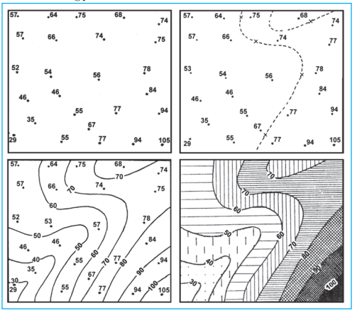
Fig. 3.15 : Drawing of Isopleths
Excercises
1. Choose the right answer from the four alternatives given below:
(i) Which one of the following map shows the population distribution:
(a) Choropleth maps
(b) Isopleth maps
(c) Dot maps
(d) Square root maps
(ii) Which one of the following is best suited to represent the decadal growth of population?
(b) Bar diagram
(c) Circle diagram
(d) Flow diagram
(iii) Polygraph is constructed to represent:
(a) Only one variable
(b) Two variables only
(c) More than two variables
(d) None of the above
(iv) Which one of the following maps is known as “Dynamic Map”?
(a) Dot map
(b) Choropleth
(c) Isopleth
(d) Flow map
2. Answer the following questions in about 30 words:
(i) What is a thematic map?
(ii) Differentiate between multiple bar diagram and compound bar diagram.
(iii) What are the requirements to construct a dot map?
(iv) Describe the method of constructing a traffic flow map.
(v) What is an Isopleth map ? How an interpolation is carried out?
(vi) Describe and illustrate important steps to be followed in preparing a choropleth map.
(vii) Discuss important steps to represent data with help of a pie-diagram.
Activity
1. Represent the following data with the help of suitable diagram.
India : Trends of Urbanisation 1901-2001
Year
|
Decennial growth (%)
|
1911
|
0.35
|
1921
|
8.27
|
1931
|
19.12
|
1941
|
31.97
|
1951
|
41.42
|
1961
|
26.41
|
1971
|
38.23
|
1981
|
46.14
|
1991
|
36.47
|
2001
|
31.13
|
2. Represent the following data with the help of suitable diagram.
India : Literacy and Enrolment Ratio in Primary and Upper Primary Schools
Year
|
|
Literacy Ratio
|
|
|
Enrolment
Ratio Primary
|
|
|
Enrolment Ratio Upper Primary
|
|
|
Person
|
Male
|
Female
|
Boys
|
Girls
|
Total
|
Boys
|
Girls
|
Total
|
1950-51
|
18.3
|
27.2
|
8.86
|
60.6
|
25
|
42.6
|
20.6
|
4.6
|
12.7
|
1999-2000
|
65.4
|
75.8
|
54.2
|
104
|
85
|
94.9
|
67.2
|
50
|
58.8
|
3. Represent the following data with help of pie-diagram.
India : Land use 1951-2001
|
1950-51
|
1998-2001
|
Net Sown Area
|
42
|
46
|
Forest
|
14
|
22
|
Not available for cultivation
|
17
|
14
|
Fallow Land
|
10
|
8
|
Pasture and Tree
|
9
|
5
|
Cultruable Waste Land
|
8
|
5
|
4. Study the table given below and draw the given diagrams/maps.
Area and Production of Rice in major States
States
|
Area in 000 ha
|
% to total area
|
Production 000 tones
|
% to total production
|
West Bengal
|
5,435
|
12.3
|
12,428
|
14.6
|
Uttar Pradesh
|
5,839
|
13.2
|
11,540
|
13.6
|
Andhra Pradesh
|
4,028
|
9.1
|
12,428
|
13.5
|
Punjab
|
2,611
|
5.9
|
9,154
|
10.8
|
Tamil Nadu
|
2,113
|
4.8
|
7,218
|
8.5
|
Bihar
|
3,671
|
8.3
|
5,417
|
6.4
|
1. Construct a multiple bar diagram to show area under rice in each State.
2. Construct a pie-diagram to show the percentage of area under rice in each State.
3. Construct a dot map to show the production of rice in each State.
4. Construct a Choropleth map to show the percentage of production of rice in States.
5. Show the following data of temperature and rainfall of Kolkata with a suitable diagram.
Months
|
Temperature in º C
|
Rainfall in cm
|
Jan
|
19.6
|
1.2
|
Feb
|
22.0
|
2.8
|
Mar
|
27.1
|
3.4
|
Apr
|
30.1
|
5.1
|
May
|
30.4
|
13.4
|
June
|
29.9
|
29.0
|
Jul
|
28.9
|
33.1
|
Aug
|
28.7
|
33.4
|
Sep
|
28.9
|
25.3
|
Oct
|
27.6
|
12.7
|
Nov
|
23.4
|
2.7
|
Dec
|
19.7
|
0.4
|

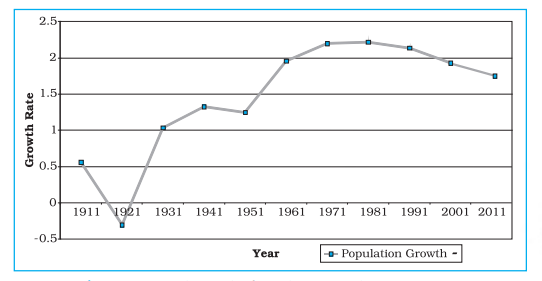 Fig. 3.2 : Annual Growth of Population in India 1901-2011
Activity
Fig. 3.2 : Annual Growth of Population in India 1901-2011
Activity