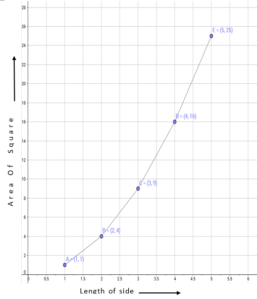
The following table gives the information regarding length of a side of a square and its area
Length of a side (in cm) | 1 | 2 | 3 | 4 | 5 |
Area of square (in cm2) | 1 | 4 | 9 | 16 | 25 |
Draw a graph to illustrate this information.
Here, we take length of a side on the x-axis and area of square on the y-axis.
Let us choose the following scale:
On x-axis: 1 cm = 0.5 cm
On y-axis: 1 cm = 2 cm2
Now we plot (1,1), (2,4), (3,9), (4,16), (5,25). These points are joined to get the graph representing the given information as shown in the figure below.
Scale:
On x axis: 1cm = 0.5 cm
On y-axis: 2 cm = 1 cm2
4