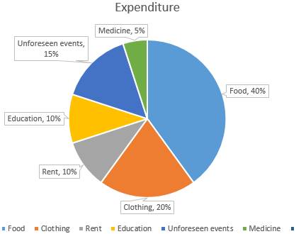
Draw a pie diagram for the following data of expenditure pattern in a family :
Items | Food | Clothing | Rent | Education | Unforeseen Events | Medicine |
Expenditure (in %) | 40% | 20% | 10% | 10% | 15% | 5% |
Here, total expenditure = 100 %
So,
The central angle = ![]() × 360°
× 360°
Hence, the central angle for each activity will be calculated as follows
Item | Expenditure | Sector angle (degree) |
Food | 40% | 40/100 × 360 = 144 |
Clothing | 20% | 20/100 × 360 = 72 |
Rent | 10% | 10/100 × 360 = 36 |
Education | 10% | 10/100 × 360 = 36 |
Unforeseen events | 15% | 15/100 × 360 = 54 |
Medicine | 5% | 5/100 × 360 = 18 |
Steps for construction of representation of data in pie chart
Step 1: Draw the circle of appropriate radius.
Step 2 : Choose a radius anywhere inside the circle.
Step 3 : Now draw a sector of calculated component’s central angle. It is always preferable to choose component with largest central angle first and then continue in descending order of magnitude of their central angle.
Step 4: After drawing sectors, shade them with different colours and label them as shown in the figure.