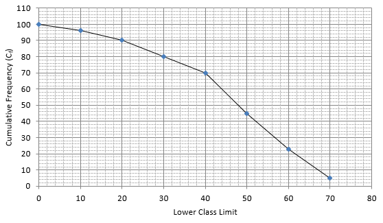
Draw a 'more than' ogive for the data given below which gives the marks of 100 students.
Marks | 0 - 10 | 10 - 20 | 20 - 30 | 30 - 40 | 40 - 50 | 50 - 60 | 60 - 70 | 70 - 80 |
Number of students | 4 | 6 | 10 | 10 | 25 | 22 | 18 | 5 |
The frequency distribution table for ‘more than’ type is:
MARKS | CUMULATIVE FREQUENCY (Cf) |
more than 0 | 96 + 4 = 100 |
more than 10 | 90 + 6 = 96 |
more than 20 | 80 + 10 = 90 |
more than 30 | 70 + 10 = 80 |
more than 40 | 45 + 25 = 70 |
more than 50 | 23 + 22 = 45 |
more than 60 | 5 + 18 = 23 |
more than 70 | 5 |
Lets plot a graph of ‘more than’ ogive, taking lower limits of the class intervals on x - axis and cumulative frequencies on y - axis.
3